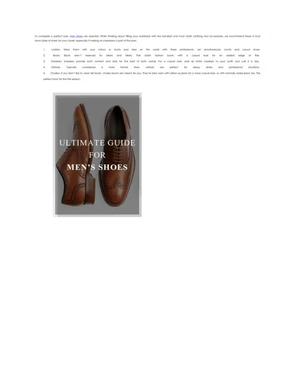
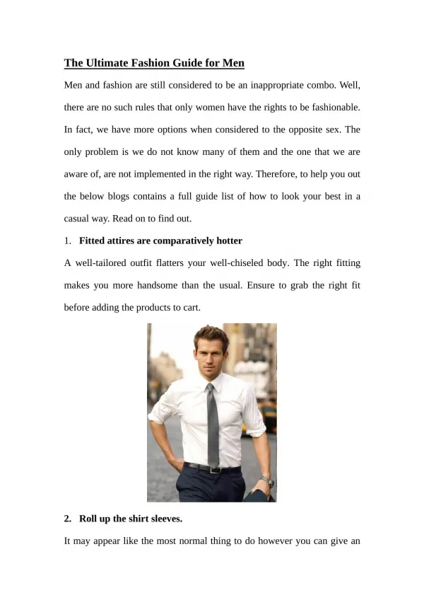
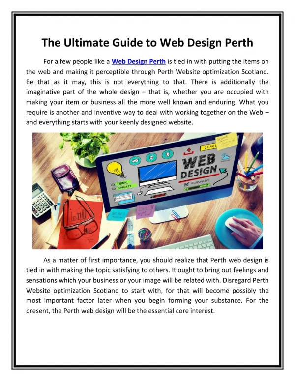
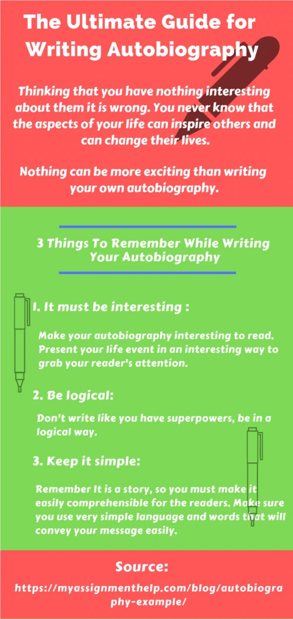
Download
1 / 9
90 likes | 104 Views
AIS Technolabs is one of the specialized iPad Pro App UX-UI Interface Design and Development Company offering dynamic and enterprise mobility solutions for diverse industry verticals. Connect with us now!<br><br>Visit More Info : https://www.aistechnolabs.com/ipad-app-ui-design/

E N D
The Ultimate Guide For UI Design https://www.aistechnolabs.com/
Table of contents • Overview • Typography in UI design is about accessibility • Pick the right colour palette for your UI design • Consider style links and buttons in your UI design • Create your UI design components https://www.aistechnolabs.com/
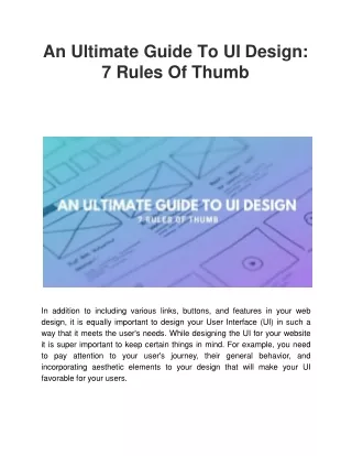
Overview Good iPad app UI design can make a world of difference to users and to the success of a product, but despite more awareness of UI and UX than ever before, we still see many examples that don't cut it. In our ultimate UI design guide, we delve into the concepts and techniques that make for great user interface design and look at some of the questions and confusions that arise around UI. https://www.aistechnolabs.com/
Typography in UI design is about accessibility In UI design, great typography (like many aspects of UI design) is all about accessibility. Visual design adds to the user's overall experience but at the end of the day, users are interacting with the UI, not viewing it as art. Legible letters result in clarity and readable words are what help users digest content efficiently. Both are more important than any visual aesthetic. https://www.aistechnolabs.com/
Pick the right colour palette for your UI design Selecting the perfect colours for your design goes way beyond aesthetics: it can inform the entire hierarchy of your site. When it comes to UI design, colour is habitually one of the first things that we enjoy dabbling with but we're taught that diving straight into visual design is a bad thing. This is certainly true, however when it comes to visual consistency, colour should be a top concern because it plays other roles. https://www.aistechnolabs.com/
Consider style links and buttons in your UI design Buttons and links, much like typography, should have a few variations. After all, not all actions are of an equal level of importance and, as we discussed earlier, colour is an unreliable method of communication, so it cannot be the main method of influencing visual hierarchy. We also need to toy with size. https://www.aistechnolabs.com/
Create your UI design components Components are a huge time saver and all UI design tools offer this feature (eg in Sketch, they're called Symbols). In Studio we can create components by selecting all of the layers that should make up the component and using the ⌘K shortcut. https://www.aistechnolabs.com/
CONTACT US https://www.aistechnolabs.com/ +1 (917)746 0700 biz@aistechnolabs.com 104 Esplanade ave 120 Pacific, CA 94044