Download
1 / 11
110 likes | 134 Views
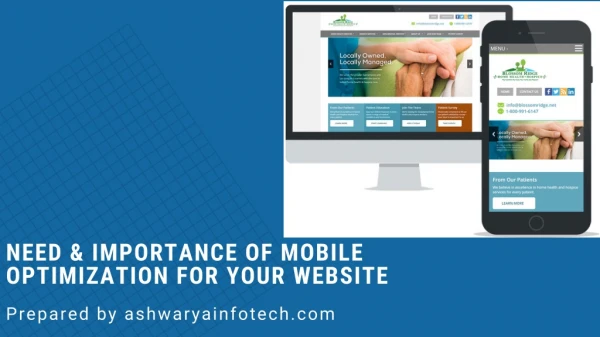
Mobile optimization is the process of ensuring that visitors who access your site from mobile devices have an experience optimized for the device. To know more benefits of mobile optimization of website check out this post https://bit.ly/2SfpYjM

E N D
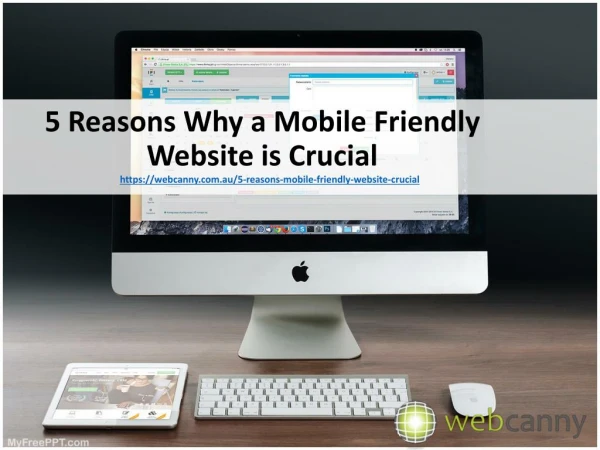
NEED & IMPORTANCE OF MOBILE OPTIMIZATION FOR YOUR WEBSITE Prepared by ashwaryainfotech.com
WHAT IS A MOBILE-FRIENDLY WEBSITE? A MOBILE-FRIENDLY WEBSITE IS ONE THAT CORRECTLY DISPLAYS ON MOBILE & HAND-HELD DEVICES SUCH AS YOUR IPHONE, ANDROID OR BLACKBERRY AS WELL AS YOUR IPADS & TABLETS. ALSO KNOWN AS RESPONSIVE WEB DESIGN, THESE WEBSITE DESIGNS WILL “RESPOND” TO ANY DEVICE OR DISPLAY, BE IT YOUR CELL PHONE OR YOUR 46″ LCD SCREEN. THIS MAKES FOR A STREAMLINED EXPERIENCE WHEN VIEWING THE WEBSITE.
WHAT DOES MOBILE OPTIMIZATION MEAN? Mobile optimization refers to the process of making sure that people who visit your website through their mobile device won’t have a difficult time navigating around the pages. The number of people who use tablets and mobile devices for searching or surfing is increasing each year but despite the growth in numbers, most websites still haven’t been optimized for mobile use. As a result, the pages take an awfully long time to load, the images overlap, and the site layout looks like a total mess. This makes the site visitor click the close button because really, who wants to explore a website that looks like it does not want to accept visitors?
MOBILE-FRIENDLY WEBSITES CONSIDER THE FOLLOWING FACTORS: Legible and bigger text size and content that fits the page Easy to follow navigation Large touch-friendly buttons/navigation Download speed is faster
Difference Between Mobile Friendly & Mobile Optimized? It is important to note that just because a website is mobile-friendly doesn’t mean that it is mobile optimized. When we say mobile-friendly, we’re only talking about websites that display properly on your tablet or mobile device but when we say mobile optimized, it means that we are able to access the website, pages, tabs, buttons, etc, just as we would on a desktop screen.
Benefits of a Mobile Friendly Website Streamlined experience across devices Positive ranking signal Improve mobile conversion rate Improved user experience Faster download speed More flexible and cost-effective than app development
BENEFITS OF HAVING YOUR WEBSITE OPTIMIZED FOR MOBILE VIEWING MOBILE OPTIMIZATION IS CHEAPER THAN APP DEVELOPMENT. WHEN YOU DEVELOP AN APP, YOU NEED TO PRODUCE APPS FOR VARIOUS PLATFORMS (ANDROID, SYMBIAN, ETC). YOU ALSO NEED TO SUBMIT IT TO AN APP STORE. YOUR USERS NEED TO DOWNLOAD THE APP BEFORE THEY CAN USE IT. THESE ARE SOME THINGS THAT USERS DON’T NEED TO THINK OF WHEN A WEBSITE IS OPTIMIZED FOR DEVICES. ALL THEY HAVE TO DO IS TYPE THE ADDRESS OF THE WEBSITE ON THE SEARCH BAR AND THEY’RE GOOD TO GO.
BENEFITS OF HAVING YOUR WEBSITE OPTIMIZED FOR MOBILE VIEWING MOBILE OPTIMIZATION ALLOWS VISITORS TO ENGAGE WITH MOBILE- SPECIFIC FEATURES SUCH AS MAPPING FUNCTIONS AND CLICK-TO- CALL. IT WILL INCREASE THEIR TRAFFIC ONLINE AND MAYBE EVEN OFFLINE. ASIDE FROM A BOOST IN SALES, THIS WILL ALSO TRANSLATE TO AS AN IMPROVED SEO PERFORMANCE FOR GOOGLE AND YAHOO.
AT THE END OF THE DAY, IT’S ALL ABOUT MAKING THINGS EASIER FOR YOUR SITE VISITORS. THE LAST THING THEY SHOULD WORRY ABOUT IS NAVIGATING AROUND YOUR WEBSITE.
Reach Us Online FACEBOOK https://www.facebook.com/as hwarya.infotech/ LINKEDIN https://www.linkedin.com/co mpany/2724418 TWITTER https://twitter.com/ashwaryai nftch