Download

1 / 6
0 likes | 1 Views
From startups to global brands, UK 2D animation studios deliver on-brand visuals that entertain, inform, and drive measurable results.

E N D
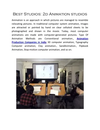
Corporate stories used to live in slide decks and mission statements. Now they travel as short films, explainers, stings, and looping product sequences. The message has not changed much, but the medium has. Across sectors, brands are commissioning 2D animation to make complex ideas intelligible, to bring products to life without a camera, and to build recognition in a noisy feed. If you look closely at the work winning pitches, grabbing engagement, and converting prospects, a pattern emerges: a high percentage is coming from 2D animation studios in the UK. The UK’s advantage did not appear overnight. It is the product of a distinctive creative culture, a practical production ecosystem, and a talent pipeline that blends design with storytelling. I have sat on both sides of the table, as a client commissioning campaigns and as a producer shaping scripts and boards. The same reasons keep showing up when a UK studio outperforms: visual clarity, narrative craft, discipline in process, and a gut sense for brand. The strategic edge: narrative over novelty There is a lot of animated content that looks good and says very little. UK teams tend to invert that order. They start with the point of view, then design the aesthetic to serve it. A product demo, for instance, will often be built around a single strong metaphor - a data pipeline becomes a flowing river, a compliance journey becomes a tidy train line - and every scene earns its place. When a sales director somewhere says, It feels inevitable, that is the effect. It helps that many 2D animation studios in the UK grew up close to broadcast and editorial work, not just advertising. When your portfolio includes explainer segments for current affairs or idents for public broadcasters, you develop a feel for compression, cadence, and how to respect the viewer’s time. That discipline travels well into corporate animation. Instead of a string of highlights, you get a clear arc: setup, reveal, proof, and payoff. A frequent mistake in corporate briefs is to overload the video with features. The smarter approach, and one I see UK motion graphics companies champion, is to reduce aggressively. If a feature does not shift understanding or behavior, it goes. What remains is memorable, and that is what marketing teams actually need. Why 2D suits corporate stories better than most techniques Live action is persuasive when you need faces and spaces, but it becomes expensive and constrained when products are invisible or abstract. 3D has its place, especially for hardware, but it can balloon timelines and budget, and often invites too much detail. 2D animation sits in a sweet spot for corporate needs. It abstracts complexity without losing credibility. You can show a cross-border payment as a clean motion path, a cybersecurity threat as a morphing shape, a workflow as layered cards that assemble in sequence. It flexes to brand quickly. A studio can tune stroke weight, palette, and typography to match existing guidelines, then build a visual system that can be extended across campaigns. It scales well to series. Once a visual language and motion grammar are set, new episodes can be produced fast and consistently without compounding cost. I have watched product marketers shift an entire launch plan after a single 90-second 2D piece beat their best performing landing page. It is not that motion replaces everything else. It primes the funnel, clarifies the value, and gives sales a common reference. The UK ecosystem: craft, education, and practical economics The UK has cultivated animation talent for decades, but a few ingredients matter most for corporate work. First, the design foundation. Graduates from schools like Kingston, Falmouth, Central Saint Martins, AUB, and Glasgow School of Art arrive with strong illustration and motion design fundamentals. They can draw, yes, but they also understand typographic hierarchy, color theory, and how to direct the eye across a frame. Put that into a corporate brief and you get compositions that read instantly even at mobile sizes. Second, the editorial sensibility. There is a through-line from British broadcast design and idents to today’s motion graphics teams. Short, purposeful sequences trained a generation to communicate quickly. Corporate clients benefit from this muscle memory: scripts land under two minutes, scenes carry one idea each, and transitions communicate logic rather than show off. Third, practical budgets. London is not cheap, yet UK studios have learned to do more with less. Clear pre-production, asynchronous feedback cycles, and modular asset builds keep costs in line. As a client, you feel it in the lack of waste.
Animatics are tight, style frames are decisive, and revisions are managed with choreographed notes and drawovers rather than vague requests. Finally, access to multilingual voiceover and compliance-aware writing. Many campaigns need localization across Europe or the Middle East. UK studios are used to swapping VO, typesetting right-to-left when required, and planning compositions that survive when German strings expand by 20 percent. The extra thought saves headaches down the line. From brief to board: how UK teams structure the work Every studio has its rituals, but successful UK projects share a rhythm. The process is not there to slow things down. It is there to prevent expensive late changes. The kickoff clarifies the message in one sentence that a salesperson could repeat. If a team cannot reduce the story to that line, they keep sharpening until it clicks. Messaging pillars are ranked, not listed, because everything cannot be primary. Discovery includes voice samples and visual references, but not too many. The better studios curate a small set and annotate what is useful in each. I am wary when a deck shows thirty styles. That often means there is no strong point of view yet. The script reads like it wants to be animated. It cues motion with verbs and structure with rhythm. You can feel where a pause sits, where a reveal lands, where the VO should get out of the way and let the visuals carry. Storyboards and animatics arrive with a sense of timing. You see the mathematics of motion - how many seconds each segment needs to breathe. A good rule of thumb: if a frame contains more than three elements that move in different directions, expect cognitive load to spike. Skilled supervisors dial it back. Style frames prove the world. They do not just look pretty; they test the hard bits: layered UI, small type at mobile resolution, brand colors on light and dark backgrounds, and the edge cases like color-blind accessibility. I once saw a studio render a screen design in four color blindness profiles before the first animation pass. That is the kind of detail that prevents rework. Production then becomes an exercise in discipline. Vector rigs keep character motion consistent. After Effects or Toon Boom pipelines are set for reusability. Compositing checklists prevent bloom and glow from muddying the brand palette. The difference between competent and exceptional often shows up here: easing curves tuned by eye, not presets; transitions that communicate cause and effect, not just wipe across. The storytelling playbook that lands with executives Executives do not buy art direction, they buy outcomes. UK teams know how to frame creative decisions in business terms. Here is the playbook they tend to run, whether they label it this way or not. Start with the user’s friction, not the company’s feature. Thirty seconds showing the cost of confusion earns permission to explain. Prove with a concrete scenario. A named role, a plausible setting, a measurable before and after. I have seen conversion lifts when a 5 percent time saving is stated plainly instead of saying streamlined workflow. Use visual metaphors that map to how the product actually works. If your architecture does not route
data like a subway, do not use a subway map. Audiences sniff out metaphors that stretch too far. Signal differentiation with one unmistakable move. It might be a visual motif, a signature transition, or a tone of voice. Make it yours, and repeat it in the campaign so it becomes shorthand. That last point matters. Campaigns perform when the audience can recognize the brand in three seconds without a logo. Measuring what matters, and designing to those metrics When a motion graphics video agency pitches success, they talk about watch time, engagement, and conversion. The trick is to design for the metric you care about. If watch time is the priority, front-load value. A cold open with a strong visual puzzle often buys you ten more seconds. I have split-tested a version that revealed the logo first against one that delayed brand until after the setup. The delayed reveal held viewers longer by 8 to 12 percent on LinkedIn. If click-through is the goal, do not hide the call to action behind a flourish. Place a verbal CTA at the moment of peak clarity and freeze the frame briefly on a legible URL or button. That tiny pause can lift clicks noticeably because the brain has a beat to act. If sales alignment matters most, build modular cuts early. A 90-second hero is fine for top-of-funnel. Sales teams often need a 20-second feature cut and three 6-second stings for outbound. When you plan those from the start, you avoid tearing apart the hero later. The budget question: where the money actually goes Clients sometimes ask why a 90-second 2D film can cost as much as a small live action shoot. The short answer: the cost sits in thinking time and skilled labor that scales linearly with complexity. Script and concept may be 10 to 20 percent of the budget, storyboarding and design 25 to 35 percent, animation 35 to 45 percent, and the rest split across sound, VO, and project management. Complexity, not length, drives cost. Ten scenes with simple motion will be cheaper than four scenes with nested interactions and character performance. You will save money by making decisions early, by appointing a single point of contact for feedback, and by protecting the schedule. I have seen a project lose two weeks because a single word in the product name changed at sign-off, which triggered rerecording VO, retypesetting, re-rendering, and remixing. A good producer will warn you where those traps lie. How UK studios handle compliance, regulation, and risk Corporate animation is not just pretty pictures. In finance, healthcare, and energy, the legal sign-offs can be brutal. The teams that thrive build compliance into the process. They pitch scripts with bracketed claims and citations, they present frames with space for disclaimers, and they keep alternate takes ready in case legal asks to remove an assertion.
A fintech client I worked with needed a visual metaphor for anti-money-laundering checks without implying law enforcement involvement. The studio proposed a neutral scanner motif, vetted colors to avoid police associations, and avoided any iconography that might imply surveillance of individuals. The film sailed through compliance on the first pass because risk had been designed out up front. Localization is a second risk vector. UI shots with screenshots can break when strings expand, currencies switch, and decimal separators flip. UK teams used to pan-European work plan for it. Flexible layout systems, adjustable margins, and vectorized UI components let you swap languages overnight without a tedious rebuild. The creative signatures you tend to see from UK teams There is no single British style, but a few habits recur in the work that moves markets. Strong typographic storytelling. Headlines do a lot of lifting, often paired with purposeful kinetic type. The words are short, the verbs active, and the pacing gives time to read without feeling slow. Palette restraint. Even when brands allow six colors, you will see two or three dominate a scene, with accent colors used sparingly to draw attention. It keeps frames clean and purposeful. Transitions that carry meaning. Rather than arbitrary wipes, transitions often map to the narrative: a tile expands to become a dashboard, a path line resolves into a workflow, a spotlight reveals key data. The motion is the explanation. Sound design with taste. You will hear subtle whooshes and https://www.oksocial.co.uk/ tactile clicks, not a wall of swells. Good sound designers in these studios leave air between beats and make sure UI sounds are plausible rather than cartoonish. When 2D is not the answer, and what to do instead Experienced teams also know when not to use 2D. If you need to showcase real-world craft, human touch, or physical scale, live action wins. If the product is a complex mechanical assembly that benefits from exploded views, high-fidelity 3D may be essential. If interactivity is the point, consider a lightweight product walkthrough or micro-interaction capture rather than fully animated simulation. The hybrid option often delivers the best of both worlds. Shoot hands on a device, then overlay crisp 2D UI and data layers. Or open with live action to establish context, then switch to 2D to explain the invisible mechanisms. UK studios are comfortable orchestrating those blends without making the seams obvious. Choosing the right partner: questions that separate the pros Procurement can push you toward the lowest bid. Your marketing outcomes will depend more on fit than on cost per second. A quick test I use in chemistry meetings: Ask them to describe a past project’s trade-offs. You are listening for honesty about what they cut, not just what they added. Request a rough articulation of your story in one sentence during the call. If they find the core quickly, the project will likely go well. Probe their plan for alt deliveries. If social, sales, and localization are afterthoughts, expect problems later. Check their approach to feedback. The best teams can show you how they structure notes into actionable lists with priorities and owner names. Also, ask to see raw storyboards and animatics from past jobs, not just polished finals. You will learn how they think and how they manage ambiguity. Inside a typical production calendar Timelines vary, but here is a realistic cadence for a 90-second corporate animation with moderate complexity: two weeks for discovery and scripting, one week for storyboards, one for style frames, three to four for animation and compositing, and a week for sound and final deliverables. That puts you in the 8 to 10 week range, faster if assets are simple and approvals swift. Rushed projects are possible. I have delivered a cohesive 60-second explainer in 15 working days with a small team by removing character animation, using a restricted color palette, and reducing scene count. Every shortcut was a deliberate
choice to protect clarity, not a hidden compromise that would bite later. What motion graphics companies do beyond the hero film A good motion graphics video agency thinks in systems, not just single outputs. The same asset set can generate short social loops, product page banners, event stings, email headers, and internal training snippets. When you brief with that ecosystem in mind, the studio designs assets to be recomposed easily. Shapes sit on separate layers, type is live, and UI is built as nested components. Your brand feels bigger because it repeats itself consistently across touchpoints. UK agencies are particularly good at delivering these kits of parts. It is a mentality borrowed from broadcast toolkits for channel launches, where you need months of programming dressed in the same motion identity. Corporate teams benefit from that discipline. It saves time, and it multiplies the impact of a single investment. The ROI conversation, with numbers you can defend Executives will ask whether animation pays back. The strongest data lives inside your own funnel, but I can offer typical ranges I have seen across B2B and tech campaigns. Top-of-funnel ads using a concise 2D explainer often see view-through rates 15 to 35 percent higher than static or live- action equivalents on LinkedIn and X, especially when the first three seconds deliver motion that feels purposeful. Landing pages that swap a dense hero banner for a 45 to 60-second motion piece commonly see time-on-page lift by 20 to 50 percent. Sales teams report shorter discovery calls when prospects arrive with a shared mental model, which you can feel in reduced meeting length or higher second-call conversion by a few percentage points. These are ranges, not promises. The levers that move outcomes are within your control: message sharpness, scene economy, the presence of a clear call to action, and distribution that matches audience habits. A brief case vignette from the field A SaaS company in the compliance space needed to reposition from a feature checklist to a risk-reduction narrative. The UK studio we engaged threw out the original script, which listed six benefits, and proposed a story anchored on one before-and-after snapshot: a compliance officer navigating an audit with and without the tool. The visuals leaned on a calm gray palette with a single accent color for risk. Animatics showed a rhythm that matched an anxious heartbeat at the start, resolving to a steadier pace as the tool took over. We delivered a 90-second hero, three 15-second cuts, and a motion toolkit. On the first quarter post-launch, the hero piece accounted for 38 percent of new MQLs from paid social, with a 27 percent lower cost per lead than previous campaigns. Sales feedback cited prospect clarity on the two features that mattered most, which shortened demos. None of this would shock a veteran producer, but it felt notable to the client because nothing else in their mix had simplified the story in that way. Practical pointers for clients before you brief Getting the best from a studio is easier if you arrive prepared. Clarity beats volume in the brief. State the single behavior you want to change, the audience’s biggest worry, and two proof points you can stand behind. Provide brand assets and examples of what not to do, especially if there is a sensitive industry context. Decide early who signs off on what and by when. If you need a range, set it upfront. A healthy mid-market UK engagement for a 60 to 90-second 2D piece often lands somewhere between the low five figures and low six figures in pounds, depending on complexity and deliverables. If your budget is tight, say so. A seasoned producer will propose a scope that protects the story rather than slicing quality randomly. Where the market is heading, and what to watch Shorter formats are not just for ads. Six to twelve-second loops are becoming the currency of product pages and social feeds, with a hero film acting as the anchor rather than the single performer. Design systems for motion are codifying, which means brands are documenting easing curves, transition motifs, and typographic motion rules the way they document color palettes.
Interoperability is improving as well. Vector-first pipelines mean assets can be used in After Effects, Lottie, and WebGL with minimal rebuilding. That opens the door to animated product UIs that look consistent on the web and in video. UK studios that invest in these flexible workflows will outpace those stuck in monolithic software stacks. Finally, expect more collaboration between 2D specialists and product design teams. When the line between marketing animation and in-product motion gets thin, the result is a brand that feels cohesive from advert to interface. The same care you apply to an onboarding video should inform a micro-interaction in the app. Studios that can speak both languages will lead. The quiet reason UK studios keep winning corporate work It is tempting to credit style, or humor, or a particular school of illustration. The real reason is less glamorous. UK studios take the business problem seriously and then apply taste, restraint, and process to solve it. They keep the story central, they sweat the arc, they tune the motion until it carries meaning, and they honor constraints without letting them flatten the work. If you are choosing among motion graphics companies, look for those qualities more than any particular visual trend. The right partner will ask blunt questions, cut what is not essential, and still produce something that feels like your brand at its most lucid. When that happens, corporate animation stops being a line item and becomes a working part of your growth engine.