Download
1 / 8
0 likes | 20 Views
A powerful feature revolutionizing the creation of responsive and flexible grid layouts.<br><br>Read our blog for further details : https://purecode.ai/blogs/tailwind-grid/

E N D
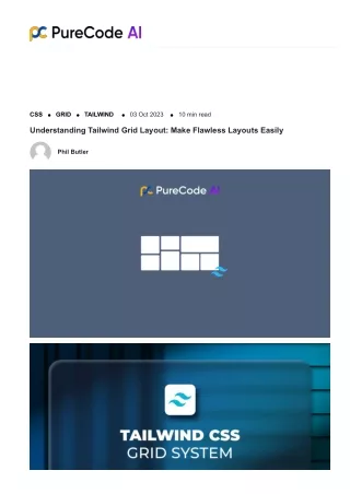
UNDERSTANDING TAILWIND GRID A powerful feature revolutionizing the creation of responsive and flexible grid layouts.
WHAT IS TAILWIND GRID Tailwind Grid emerges as a standout feature within the Tailwind CSS framework, streamlining UI creation with its unique utility-first approach. At its core, Tailwind Grid serves as the foundation for building robust grid systems. It plays a pivotal role in crafting responsive and well- designed layouts, offering developers a versatile tool for effective web design.
TAILWIND GRID CONTAINER The grid container, acting as the parent element, serves as the foundational structure for Tailwind Grid layouts, providing a framework for organizing and structuring content on web pages. Using a simple HTML element, <div class="grid">, developers can initiate the grid container, setting the stage for the organized placement of grid items within the layout.
CREATING A GRID WITH TAILWIND CSS Define Container: Begin by creating a grid container using the <div> element and applying the grid class. Specify Columns: Tailwind makes it easy to specify the number of columns within the grid. Add the grid-cols-{number} class to set the desired column count. Customize Layout: Tailwind's simplicity allows for easy customization. Adjust the grid structure according to your layout requirements. This step-by-step guide helps users understand the process of creating a grid using Tailwind CSS, from defining the container to customizing the layout.
TAILWIND GRID COLUMNS AND ROWS Column Spanning: Use col- span-{number} to control how many columns a grid item should span. For example, col-span-2 makes an item span two columns. Row Spanning: Employ row- span-{number} to determine the number of rows a grid item should span. For instance, row- span-2 makes an item span two rows.
RESPONSIVE DESIGN WITH TAILWIND GRID Tailwind CSS Grid excels in responsiveness, enabling seamless adaptation of grid layouts to various screen sizes. Utilize responsive classes effortlessly to ensure optimal presentation on both small and large screens. Adjusting Column Numbers: Change the column numbers based on screen size using responsive classes. Fine-tuning Spacing: Modify the margin around grid items based on screen size.
UNLOCK THE POWER OF TAILWIND GRID Tailwind Grid empowers developers with a versatile and flexible system for creating responsive layouts, streamlining UI development and offering fine-tuned control over grid structures. visit our original article for in-depth insights https://purecode.ai/blogs/tailwind- grid/


