Download
1 / 20
200 likes | 206 Views
Read brand style guide by wise crow media, one of the leading branding agency in Pune. At Wise Crow Media, we are storytellers at heart. We create engaging content shaped into appealing designs & videos. Combined with a great strategy. Learn more about Wise Crow Media, an advertising agency in Pune, on our website.

E N D
WISE CROW MEDIA wisecrowmedia.com Copyright @2021 All rights reserved
01 Intent Of This Guide 02 About The Brand WHAT’S INSIDE 03 Logo - Usage & Guidelines 04 Colour Palette 05 Our Typeface 06 Textures & Patterns 07 Image & Iconography
This style guide is a reference for our internal design team, vendors and others who are authorised to work with Wise Crow Media. While some of our brand executions and graphics have been standardized - like business cards, letterhead, and envelopes - these are not intended as the focus of misguide. Each one of our execution templates java internal documentation that is easier to update, follow and implement in today’s digital environment. The standards, guidelines, and references within this document are grounded in the years of research, experimentation, and brand executions that have preceded our new brand look and feel. INTENT OF THIS GUIDE Instead, the focus of this guide is to empower you, the creative, with the elements you need to create. By utilizing these tools, resources and adhering to the guidelines, you’ll make things that look like the Wise Crow Media brand, everytime. Our intent with this guide is not to restrict creativity and innovation: far from it. We believe in the creative spirit, and innovation is one of our core values. What we strive for is a coordinated, consistent, and efective brand presence in everything we create, if we make something, we want to make sure that people know where it came from. Please refer back to this guide often. We believe that our style guide is a living document, it should evolve over time, just as our brand inevitably will. If you have any questions concerning the content of this guide, please don’t hesitate to reach out to our Design Team at design@wisecrowmedia.com.
Wise Crow Media provides branding & promotional content solutions to business entities in a rapidly changing market with a sustainable voice, helping them remain consistent & true to their service/ product. ABOUT THE BRAND OUR STORY to a Not so long ago we realised that we love to create things that help convey or represent an idea. Our love translated into dif ferent forms of communication and landed in the likes of visually driven content. At Wise Crow Media, we make sure that an idea meets it’s full potential in terms of its representation. Wa-hiser World! Let’s Create The Flow Before We Go With It.
WHO WE ARE BOLD,But Mindful WHAT WE DO Provide Branding & Marketing Solutions. FRIENDLY,But Firm PASSIONATE,But Patient DYNAMIC,But Sustainable WHY WE DO WHAT WE DO Help people and businesses grow by sharing their ideas or message effectively. CRAZY,But Rational WACKY,But Wise HOW WE DO IT Research | Strategy | Content | Execution UNIQUE TERMINOLOGY The word ‘Wa-hiser’ is a part of our brand tagline which says: ‘Welcome To A Wa-hiser World!’ The word is a spin-off of the english word ‘Wise’, and is to be used only in special cases, which shall be mentioned in the brief if/ when required.
WHAT OUR LOGO STANDS FOR LOGO - USAGE & GUIDELINES Crow Wearing Spectacles Play & Pause Button A Pencil A crucial part of our identity is the ‘wise’element which has been nuanced through the image of a crow wearing big geeky spectacles. The play and pause button represent our video production vertical, whereas the pencil denotes that we create & develop content. PRIMARY LOGO LOCKUP ASSEMBLY
VISUALIZED CLEAR SPACE 33.961px 33.961px 32.563 32.563 Our logo needs to stand out and not merge with anything else. Therefore, the mentioned spaces around the logo need to be adhered. 68.571px 68.571px LOGO SPACING & LAYOUT GUIDELINES 32.563 32.563 33.961px 33.961px ALTERNATE MONOCHROME VERSIONS #020202 #FFFFFF
APPROVED PAIRINGS COMMON ERRORS #000000 #FFFFFF #EC6225 #212121 #F79050 #F3D4AB Here’s how our logo should be used. The usage of our logo on any other colour is strongly prohibited.
FULL-COLOUR LOGO The full colour logo can be used on a light or a dark background. LOGO ON PHOTOS MONOCHROME LOGO If the background colour makes the logo hard to see, a monochrome logo should be used instead.
PRIMARY PALETTE RGB ORANGE - 236,98,37 BLACK - 10,10,10 WHITE - 255,255,255 CMYK ORANGE - 2,76,99,0 BLACK - 75,68,67,90 WHITE - 0,0,0,0 COLOUR PALETTE HEX ORANGE - #EC6225 BLACK - #000000 WHITE - #FFFFFF PMS ORANGE - PANTONE 7579 C BLACK - PMS BLACK WHITE - PMS WHITE EXTENDED PALETTE
Helvetica Neue 45 OUR TYPEFACE Light Clean - Bold 75 Bold Our typography is used as a tool to create impact. Other than putting out information, it is also used as a visual gear to emphasize on an idea. 95 Black
PRIMARY TYPEFACE SECONDARY TYPEFACE Helvetica Neue LT Std 35 THIN ABCDEFGHIJKLMNOPQRSTUVWXYZ abcdefghijklmnopqrstuvwxyz Helvetica Neue LT Std 45 LIGHT ABCDEFGHIJKLMNOPQRSTUVWXYZ abcdefghijklmnopqrstuvwxyz Silver Forte Grunge Avenir Avenir LT Std 35 Light ABCDEFGHIJKLMNOPQRSTUVWXYZ abcdefghijklmnopqrstuvwxyz Nexa Nexa Text Demo Light ABCDEFGHIJKLMNOPQRSTUVWXYZ abcdefghijklmnopqrstuvwxyz Helvetica Neue Lt Std 65 Medium ABCDEFGHIJKLMNOPQRSTUVWXYZ abcdefghijklmnopqrstuvwxyz Avenir LT Std 45 Book ABCDEFGHIJKLMNOPQRSTUVWXYZ abcdefghijklmnopqrstuvwxyz Nexa Light ABCDEFGHIJKLMNOPQRSTUVWXYZ abcdefghijklmnopqrstuvwxyz Helvetica Neue Lt Std 75 Bold ABCDEFGHIJKLMNOPQRSTUVWXYZ abcdefghijklmnopqrstuvwxyz Avenir LT Std 55 Roman ABCDEFGHIJKLMNOPQRSTUVWXYZ abcdefghijklmnopqrstuvwxyz Nexa Demo Bold ABCDEFGHIJKLMNOPQRSTUVWXYZ abcdefghijklmnopqrstuvwxyz Helvetica Neue Lt Std 85 Heavy ABCDEFGHIJKLMNOPQRSTUVWXYZ abcdefghijklmnopqrstuvwxyz Avenir LT Std Regular ABCDEFGHIJKLMNOPQRSTUVWXYZ abcdefghijklmnopqrstuvwxyz Nexa Text Demo Bold ABCDEFGHIJKLMNOPQRSTUVWXYZ abcdefghijklmnopqrstuvwxyz Helvetica Neue Lt Std 95 Black ABCDEFGHIJKLMNOPQRSTUVWXYZ abcdefghijklmnopqrstuvwxyz Nexa Bold ABCDEFGHIJKLMNOPQRSTUVWXYZ abcdefghijklmnopqrstuvwxyz
TEXTURES & PATTERNS BOLD URBAN CONTEMPORARY Our backgrounds can be grungy, glitchy and need to have a slight bit of ruggedness in terms of their texture. Our visuals are highly motivated by photography. A juxtaposition of images and shapes is preferred in our design style.
The use of sharp-edged shapes is preferred, except for a circle which is a key part of our design language. luv Our typography is cohesive with our visual imagery, especially for posters, social media and banners.
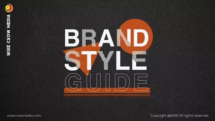
IMAGE & ICONOGRAPHY
is the beginning... @wisecrowmedia
WISE CROW MEDIA