Download
1 / 16
0 likes | 6 Views
A responsive web design adeptly delivers a smooth web presence across multiple devices. The adaptive web layouts seamlessly cater to multi-device users without web design glitches. In return, this benefits the brand website in gaining substantial web traffic.

E N D
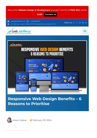
Hire us for Website Design & Development and get 1 month of FREE SEO, worth £499 Contact us sales@webskitters.uk +442036331877 Follow Us: Unit 212, East London Works, 65 Whitechapel Road, London, E1 1DU Responsive Web Design Bene?ts – 6 Reasons to Prioritise Atanu Sarkar February 29, 2024
In whichever digital era we live in, responsive web design will always Contents be the big thing. Now that mobile devices have the highest number of users, responsiveness is of optimum importance. And today, we will learn how your business can bene?t from it. nding Responsive Web The Core Principles As a visitor, you will expect a clean and smooth website, whether on ry of Responsive Web your desktop, tablet or smartphone. The web presence must have ment easy navigation and smooth functionality. The absence of key design s a responsive mobile-?rst elements, complicated design structure and lack of information will pproach work? instantly leave a poor impression. As a result, you will abandon the omponents of Responsive website. It is prevalent user behaviour, and brand-new websites need gn help meeting expectations. Grid Systems Media Queries It is where the signi?cance of responsiveness comes into play. s-device compatibility ce-Agnostic Layouts A responsive web design adeptly delivers a smooth web presence le-?rst approach across multiple devices. The adaptive web layouts seamlessly cater to s to Prioritise Responsive multi-device users without web design glitches. In return, this gn bene?ts the brand website in gaining substantial web traf?c. rtance of Mobile Optimisation onsive Design Therefore, whether yours is a full-?edged e-commerce store or a ness Growth and Responsive service-based web presence, investing in responsive web design in London is advantageous. ct of Responsive Layouts on In this comprehensive read, we discuss the priority of responsiveness nced Website Speed with for mobile device users. We will also explore the multiple responsive siveness web design bene?ts. Ef?cient and Time-Saving s Let us begin. rging Trends in Responsive evelopment Understanding Responsive Web Design – The Core Principles e some of the current trends onsive web development: sing Responsive Web Design nd Success sive Web Design – Frequently Questions Responsive web designs are adaptable website structures that adjust to the user’s viewport effortlessly. The web page content is rendered differently depending on the screen size. This responsiveness imparts an optimal user experience and adds to browsing satisfaction—the web page loads swiftly across multiple devices without design glitches. Consult with a professional, responsive web designer, and they will elaborate on the importance of responsive web design for business growth. User behaviour has evolved manifold through the years. How they explore websites has changed and made it mandatory for brands to embrace user-centric responsive web solutions. Consider the United Kingdom alone – there are more than 59 million mobile device users. These users prefer ?uid web content across their devices without manual adjustment. Image sizing issues, unstructured design frames, and resizing glitches, these website adaptability concerns fail to thrive in the competitive landscape.
Therefore, in 2024, websites must practise responsive design trends in web development to succeed as digital brands. The History of Responsive Web Development The ?rst adaptive web structure was created in 2001 for Audi’s web presence. Various responsiveness jargons were practised during this period, such as ?uid grid systems, ?exible web design, user-friendly web design, etc. Famous web designer Ethan Marcotte coined the term responsive web design. He introduced the user-centric design approach and revolutionised web presence to cater to the evolving landscape. Before responsiveness, websites focused on adaptive web layouts. This practice utilised a static design. Multiple versions of a webpage were developed for seamless functioning across devices. In 2015, Google announced the vitality of responsive web designs for higher SERP ranking. It led brands to convert to mobile-friendly web designs. The websites shifted from static design elements to dynamic ones, leading to effortless responsiveness. Since then, responsiveness has been one of the signi?cant qualities of professional website designs. The various website responsiveness factors and strategies have changed several times. The future entails further evolution to align with user behaviour. How does a responsive mobile-?rst design approach work? Responsive development and design practice utilises an amalgamation of ?exible layouts, imagery and CSS media queries. When users switch devices, the design structure automatically adapts to the required device resolution. It includes the various visual elements such as colour capability, resolution, orientation and screen size of the device. Professionally crafted website design does not require layout con?guration based on device. From the users’ point of view, this translates to a smooth transition without design glitches. Businesses that have shifted to responsive website design have experienced increased user engagement, potential leads and sales. Critical Components of
Responsive Web Design Now that you understand the mobile-friendly design approach let us look into the critical components of responsive web design. These components form the core of the design and translate to smooth website adaptability. 1. Fluid Grid Systems A ?uid grid is a ?exible web design grid structure with an adaptive scale that caters to multiple device resolutions. It seamlessly manages the element resizing to contrast with one another whenever there is a design switch. However, ?uid grid systems require elaborate proportions and calculations. Always consult an expert web design agency in London for ideal layouts. 2. CSS Media Queries CSS media queries are utilised to detect the characteristics of various devices. A practical understanding of device intricacies results in top- notch styling and immaculate responsiveness. The media queries allow targeted device optimisation, including speci?c fonts, images and design elements. 3. Cross-device compatibility While cross-compatibility is a critical component of responsiveness, its bene?ts go beyond device adaptation. Responsiveness ensures a web presence is adaptable to multiple devices. Cross-device compatibility provides responsiveness across operating systems and browsers and caters to ?uctuating internet speed. 4. Device-Agnostic Layouts Device-agnostic layouts or device agnosticism is another form of responsive web design solution. Before deciding upon the content element of a webpage, the approach focuses on design. Often confused with responsiveness, agnosticism does not just ensure webpage compatibility across devices. It provides compatibility of the functionalities across software and user devices. 5. Mobile-?rst approach Professional responsive web designers develop designs with the mobile device in mind. The design is enhanced for other screen sizes with multiple compatibility testing. Each stage emphasises smooth transition and inclusion of design elements.
These are the core components of a responsive web design. These signi?cant features ensure a cohesive and consistent web presence for elevated user experience. As web design experts inform, a brand will only become obsolete with responsive web design in the coming years. 6 Reasons to Prioritise Responsive Web Design Now that we have recognised the fundamentals of responsive website design let us explore how businesses can bene?t. These advantages of responsiveness cater to several websites across industries and have a proven positive track record. So, prioritise responsiveness for the following bene?ts, whether you seek the ?rst- ever web design or revamping a website. 1. Importance of Mobile Optimisation in Responsive Design With the growing demand for mobile devices, the signi?cance of mobile optimisation of web designs cannot be overstated. Let us talk statistics before we discuss strategies. A substantial number of online users access websites through mobile devices. To be speci?c, it is 98% of the UK population. The mobile-?rst design approach is a crucial development strategy for this paradigm shift. Mobile optimisation involves crafting the mobile version of the website and then gradually enhancing it for larger screens. This design approach prioritises the mobile browsing experience and ensures a seamless user journey. The primary advantage of the mobile-?rst design approach is improved web presence performance. The optimisation leads to instant faster loading of web pages. It is a signi?cant quality and appeals to 86% of the global audience, who prefer pages that load in 5 seconds. The smooth and streamlined browsing enables a satisfactory web experience and translates to an increased engagement rate. The improved browsing experience positively impacts the users’ decision-making: mobile-friendly web design and effortless functionality spike up revenues substantially. As a business, you can bene?t from mobile optimisation in the following ways –
Increased mobile traf?c because of smooth accessibility across multiple devices and browsers. Faster-loading web pages lead to enhanced user experience and increased conversions. Since this is a dynamic domain, mobile-optimised websites possess a competitive advantage over competitors. Google’s algorithm prefers websites with mobile-?rst web designs and considers the web experience user-relevant. This results in better ranking in the SERPs and improved visibility. Mobile-optimised web presence enhances the brand identity by portraying a user-centric approach and modern design principles. It assures accessible web content and promotes inclusivity by welcoming users of diverse needs and preferences. Professional web design agencies practice several strategies to craft mobile-friendly web design. The methodology goes beyond adapting the design layout for various screens. The web design process optimises images, compresses ?les, and minimises unnecessary elements to enhance performance. The mobile-?rst design approach is instrumental in shaping a positive user experience. Brands must embrace mobile-?rst design to thrive in this evolving digital landscape. 2. Business Growth and Responsive Design At its core, responsive design refers to the ability of a website or application to adapt seamlessly across multiple device variants. This adaptability unfolds numerous opportunities to foster business expansion. Let us understand the know-how of business growth using responsiveness. The shift in user behaviour has made responsive design a linchpin of digital success. Responsiveness, when professionally developed, signi?cantly in?uences business growth. It bene?ts a brand in multiple digital sectors – usability, user experience, visibility, and web satisfaction. In return, this leads to smooth functionality and increased user engagement. A few consumers increasingly navigate between smartphones, tablets, and desktops for various digital activities. A responsive web design ensures a consistent and optimised experience across these platforms. The consistency keeps users engaged and mitigates the risk of potential customers deterring from the presence due to a subpar mobile experience. Responsiveness cannot be omitted since offering a positive user experience is the primary goal. Additionally, the positive journey contributes to increased customer loyalty and assured conversion. Beyond the user experience, responsive design is interlinked with
visibility and search engine rankings. The feature captivates users and Google’s algorithm similarly, resulting in an optimum tool for success. Moreover, like the digital landscape, user behaviour has a dynamic ?ow. The responsiveness effortlessly embraces changes and expectations to deliver the best. So, when investing in a responsive web design, you retain potential users at multiple touch points. Alternatively, the design principles are prepping the presence for the evolving future. Responsive design for business growth is more than a technical feature; it is a strategic asset. It helps the brand stay relevant, accessible, and engaging in the ever-evolving online landscape. 3. Impact of Responsive Layouts on SEO A prolonged and impactful relationship exists between responsive web layouts and Search Engine Optimisation. It is the de?ning character of a modern and winning web design and a favoured choice of Google. So far, we have clearly understood how responsive designs function. These layouts dynamically adjust to various screen sizes and devices. It is a smooth and glitch-free web experience that creates a credible digital atmosphere for users. These user-centric responsive web solutions are relevant and user-focused to the search engines. Additionally, responsive layouts play a crucial role in reducing bounce rates. It is signi?cant metric search engines consider in ranking algorithms. When users encounter a non-mobile-friendly website, they abandon it quickly, leading to higher bounce rates. Responsive design ensures a consistent and optimised experience across devices. It encourages users to engage and explore content, ultimately reducing bounce rates. It signals the search engines that the website is valuable and relevant, thus improving rankings. Accessibility in responsive design is another factor interlinked to SEO. Accessible websites are usable by people of all abilities and disabilities. The search engines favour such user-centric websites. The inclusivity caters to a diverse audience and aligns with ethical web accessibility standards. The impact of responsive layouts on SEO is multifaceted. It encompasses mobile-?rst indexing, user engagement, and accessibility. Therefore, in this increasingly mobile-centric digital landscape, responsiveness holds supreme priority in terms of SEO and growth. 4. Enhanced Website Speed
with Responsiveness Mobile optimisation and SEO efforts only succeed in digital success with effective website speed. Website speed is a crucial factor that affects the usability and performance of a website. Did you know? More than 53% of mobile users abandon a website immediately if it takes longer than 3 seconds to load. So, if your potential customers are not shopping from you, they are going to your competitors. When cumulatively judged, this leads to reduced conversions, sales and engagement. Therefore, it is essential to prioritise page speed for different devices and screen sizes, especially for mobile devices. Responsive web design is a saviour and functions effectively under less reliable internet connections. Responsive web design enhances website speed in the following ways – Responsive websites utilise a single codebase and URL for all devices and screen sizes. It reduces separate resources and code loading for different versions of the website. As a result, there are a reduced number of HTTP requests, ?le size, and bandwidth consumption. Responsive websites use ?exible images of variable resizing frames using different sources or sunsets. This feature displays images in appropriate resolutions and quality for each device frame. These website backends have mini?ed CSS and JavaScript. It means professional web developers reduce unnecessary lines of code or code that can be reduced. It includes code comments, semicolons and even whitespace. Mini?cation of code offers an instant performance boost and is still a prevalent practice. Apart from these are several other responsive-focused practices, such as limited external scripts, render-blocking JavaScripts, HTTP caching, etc. These strategies improve the website speed effectively and ensure a smooth web page load across devices. Page speed is essential to responsive web design and improves engagement, retention, and conversion. It provides the brand a competitive edge in the online market. 5. Cost-Ef?cient and Time- Saving Bene?ts Before the prominence of responsive web design, the digital landscape experienced the advantages of adaptive layouts. It involved creating and maintaining multiple versions of your website for different devices and screen sizes. With time and evolution, this
proved time-consuming and expensive, especially for small business websites. One of the primary advantages of responsive web design is that it is cost-ef?cient and convenient. A single codebase website works effortlessly on all devices and screen sizes. The only essential maintenance required is code updates and modi?cations based on business requirements. It translates to a reduced web development timeline and quick curation of a streamlined web presence. For a small business with a tight budget, this is a boon. Besides saving time and money, the businesses are offered multiple bene?ts, such as increased sales and revenue. If you are a novice digital brand in the UK reading this, consult a professional web design agency in London to learn more. The experts will thoroughly explain the bene?ts of responsiveness and offer custom design solutions. No two brands are the same, and neither can be their responsive website design. 6. Emerging Trends in Responsive Web Development In whichever year you opt for a web design revamp, responsiveness has to be a core concept. The industry embraces numerous trends with the continual introduction of brand-new devices and changing consumer behaviour. The responsive design trends in web development are the marks of an evolving domain. These trends, you must understand, are necessary for the growth and future. Numerous brands and professional web design companies incorporate these trends each year. This strategy helps in staying: Relevant Competitive Modern Positive These four factors ensure your targeted users experience a full- ?edged, positive web presence. The presence must deliver the necessary information and entice them to convert. For professionals in the ?eld of responsive web design, staying abreast of these trends is crucial. It ensures their crafted online presence remains cutting-edge and user-friendly. Here are some of the current trends in responsive web
development: We have listed some of the most promising responsive web design trends that have delivered higher conversions. These suggestions are based on data and years of experience in the ?eld of web design in London. 1. Dark Mode Implementation Dark mode has gained signi?cant popularity due to its aesthetic appeal. Additionally, the web design offers potential energy savings for speci?c device types. It is an appealing alternative to traditional light-themed web structures. Most users prefer this trend on mobile devices for its ease on the eyes during prolonged usage. Successful brands are incorporating dark mode as an option. Users can opt for whichever preferred theme based on convenience, location and time. 2. Variable Fonts for Enhanced Typography Variable fonts provide a ?exible typography with adjustable weight, width, and slant. It utilises a single font ?le that adapts to represent multitudes. Additional attributes can be incorporated within the single ?le for variations. This trend allows for responsive text that adapts seamlessly to various screens and resolutions. It improves the website’s accessibility, readability and brand appeal. 3. Ai-powered personalisation Arti?cial Intelligence (AI) is increasingly integrated into responsive web development to enhance user experience. Professional responsive website designers analyse user behaviour and preferences via AI algorithms. This method helps determine what appeals to the target consumers and delivers personalised content. AI-powered web design layouts are tailored to individual users and assure increased conversions. 4. Accelerated Mobile Pages (AMP) AMP is an open-source initiative designed to improve the performance of web content on mobile devices. It emphasises fast- loading pages, which contributes to a better user experience. Additionally, AMP web pages align with search engine preferences for mobile-friendly content. AMP has long been part of the digital domain and differs from RWD or Responsive Web Design. RWD emphasises the adaptability of the web pages and caters to multiple devices. Alternatively, AMP or Accelerated mobile pages are mobile-device-centric developments and stress superfast page load.
5. Motion UI for Interactive Experiences Motion UI is an emerging eye-catching trend in the design ?eld and is heavily embraced by leading web design agencies. This design trend incorporates simple to complex animations and transitions in a web design. The trend enables engaging and interactive websites, enhancing engagement and lower bounce rates. These subtle animations also enhance visual appeal and guide users through the interface towards a conversion touch point. Some brands also invest in high-quality, custom Motion UI for elevated design success. For such cases, always hire experienced web design experts to avoid glitches and design turbulences. 6. Progressive Web Apps (PWAs) PWAs are a trendy asset to the digital industry. These applications combine the best web and mobile and offer a reliable and smooth browsing experience, similar to native apps. PWAs are highly responsive and work seamlessly on various devices. It also provides of?ine capabilities and push noti?cations. PWA frameworks are a feasible option for the constantly broadening mobile device market. These consume less space and are convenient for the low-end mobile device user. From the business perspective, developing PWAs is cost-effective and less time-consuming while offering similar results. 7. Voice User Interface (VUI) VUI is a powerful responsive web design trend that allows users to engage with digital platforms through voice commands. Over the last few years, there has been a visible rise in voice-activated devices. More and more people are using commands to act; this is a convenient option. It has led to an increased focus on responsive Voice User Interfaces. Responsive web development is adapting to cater to VUI, ensuring that websites are optimised for voice interactions and commands. 8. WebXR in Web Design Integrating WebXR or Extended Reality is transforming future user interactions with web content. This feature amalgamates real and virtual environments to offer a dramatically enhanced user experience. This trend is especially prevalent in gaming, e- commerce, and virtual tours. The primary bene?t of the responsive design trend is an immersive experience, irrespective of device type or size. WebXR is also a future- proof design trend and will be standard in the immersive design landscape.
These are a few emerging trends in the responsive web design market. Each of the technologies enhances the user experience and simpli?es the user journey. The improved functionalities and brand appeal contribute to higher conversions and increased revenue. Responsive web designers and developers must stay abreast of the emerging trends and create immaculate websites. This knowledge helps them stay relevant to the current design standards and anticipate the future evolutions of the digital landscape. Invest in professional web design services to ensure websites remain competitive, appealing, modern and technologically advanced. Prioritising Responsive Web Design for Brand Success In 2024 and beyond, the usage of mobile devices will continue to grow exponentially. Therefore, responsive web design is essential for a well-structured, user-centric web presence. There are multiple bene?ts of responsiveness that we have already discussed. Businesses proactively seeking user-friendly web approaches will bene?t from improved user experience, visibility, engagement and more. Although responsiveness has come a long way, multiple future innovations are yet to be embraced. Newer trends will bring forth more unique possibilities and enhance the business’s manifold for tremendous success. Responsive design is the way forward in the digital space and will prepare the websites for future growth. We recommend investing in a seasoned web design agency in London and seeking custom solutions for business expansion. Is your website responsive? If not, this is the perfect time to hire professionals. At Webskitters Ltd., we believe in embracing technological innovations for optimum business growth. Our team of responsive web designers excels in crafting visually appealing and conversion- friendly websites for various brands. Get in touch to learn more about our responsive web development bene?ts. Responsive Web Design – Frequently Asked Questions Here are some of the FAQs related to responsive web design and their bene?ts for digitally active web presence – 1. What is Responsive Web Design?
Responsive web design enables websites to adapt seamlessly to multiple screen sizes and orientations based on user device. These websites utilise ?exible grids, layouts, images, and CSS media queries for an optimal user experience and enhanced functionalities. 2. Why is Responsive Web Design important? Responsive web design is vital because it can improve the usability, accessibility, and performance of websites, especially in the era of mobile devices. Responsive websites can cater to the needs and preferences of different users, regardless of the device they use to access the web. Responsiveness also enhances SEO, conversions and retention rates of websites. It can provide faster loading, better navigation, and higher satisfaction. 3. How does responsive web design work? Responsive web design works by using a combination of ?exible grids, layouts, images, and media queries. These components adjust the website content according to the screen size and orientation of the device. 4. What are the bene?ts of responsive web design? Here are some of the bene?ts of responsive web design: Seamless user experience across different devices and screen sizes. Improved engagement and retention of users, as they can access the website content quickly and comfortably. Reduced bounce rate and increased the conversion rate of the website Improved SEO performance, as search engines favour mobile- friendly and fast-loading websites. Simpli?ed maintenance and website updates due to a single codebase. 5. What are the best practices of responsive web design? Some of the best practices for responsive web design are: Mobile-?rst approach- designing for the smallest screen size ?rst and then scaling up. Media queries to apply different styles based on the device characteristics, including width, height, resolution, and orientation. Flexible images that resize or crop themselves to ?t the
available space. Compatible Web fonts that is readable across different devices and browsers. Also, icons and SVGs can scale without losing quality. A ?uid grid system that adapts to the screen size and orientation or a framework that provides a ready-made grid system. Responsive navigation menu that collapses or expands according to the screen size and orientation. Alternatively, a hamburger menu that hides or showcases the navigation options on demand. 6. What are the challenges of responsive web design? Some of the challenges of responsive web design are: Creating and maintaining a responsive web design can be time-consuming and complex, requiring more planning, designing, coding, testing, and updating than a static web design. Ensuring the consistency and quality of the website content across different devices and screen sizes can be challenging. Other devices may have additional capabilities, limitations, and speci?cations. Therefore, professional responsive web designers are recommended. It can be challenging to optimise the website’s performance and speed. This is because responsive websites load more resources and code than static websites. The singular codebase must be immaculately developed to mitigate these risks. Providing a user-friendly and intuitive navigation and interaction can be challenging. Responsive websites accommodate different user behaviours and expectations on other devices and screen sizes. Research and planning are vital to minimise such challenges. Atanu Sarkar Atanu Sarkar, the Founder and Chief Executive Of?cer of Webskitters LTD. and Webskitters Technology Solutions Pvt. Ltd, has strong data analytics, business development and entrepreneurship skills. He keeps himself updated about latest technological innovations in his past time and encourages his team to incorporate new technologies and move beyond the de?ned boundaries of design, development and digital marketing. His inquisitive nature constrains
him from ?attering any limits and that’s made him a successful entrepreneur, a great leader for his team and a wonderful human being. UI / UX Design Web Development Mobile App Development Digital marketing UX ProtoTyping Ecommerce Hybrid SEO WordPress React Native SMM Shopify Flutter PPC WooCommerce Native App Development ORM Magento Content Marketing Swift CMS Kotlin Java Objective-C United Kingdom Suite 2759, Unit 3a 34- 35 Hatton Garden, Holborn, London, United Kingdom, EC1N 8DX +442036331877 sales@webskitters.uk
United Kingdom USA USA India 7950 NW 53rd Street 2803 Philadelphia Eco Intelligent Park, Unit 212, East London Unit 337, Miami, Pike B # 4021 Unit No- 7E, 7th Works, 65 Florida, 33166, United Claymont, DE 19703 Floor, Block- EM, Whitechapel Road, States Plot-9, Salt Lake London, E1 1DU Sector-5, Kolkata sales@webskitters.com 700091, India sales@webskitters.com +442036331877 sales@webskitters.uk 03346014753 sales@webskitters.com © Copyright 2024. All Rights Reserved.