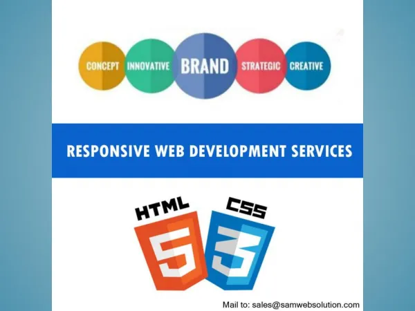
Responsive web application development
Create digital solutions that adapt to any device with responsive web application development. Our expert team ensures your applications look stunning and perform flawlessly on all screens. Boost user engagement and satisfaction with designs that offer flexibility and accessibility. Trust us to deliver applications that move with the pace of your business.


Responsive web application development
E N D
Presentation Transcript
WEDEVLOPE Responsive Web Application Development
What is Responsive Web Application Development? Definition: Responsive web application development refers to the approach of designing and building web applications that provide optimal user experience across a wide range of devices and screen sizes. Importance: Ensures usability and accessibility on smartphones, tablets, desktops, and other devices.
Key Features of Responsive Web Applications Adaptive Layouts: Design adjusts dynamically based on screen size and orientation. Flexible Images and Media: Images and media scale appropriately to fit different screens. Fluid Grids: Grid systems adjust proportionally to maintain consistency. Device-agnostic: Works seamlessly across various devices without compromising functionality.
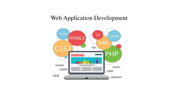
Technologies Used in Responsive Web Development HTML5: Markup language for structuring and presenting content on the web. CSS3: Stylesheet language for describing the presentation of a document written in HTML. JavaScript Frameworks: Libraries like React, Angular, or Vue.js for building interactive user interfaces. Media Queries: CSS3 module that allows content rendering to adapt to conditions such as screen resolution.
Benefits of Responsive Web Application Development Improved User Experience: Consistent experience across devices enhances user satisfaction. Higher Engagement: Accessible content encourages longer user sessions and increased interactions. Cost-Effectiveness: Develop one application that works everywhere rather than multiple versions for different platforms. SEO-Friendly: Google prefers responsive design, which can positively impact search engine rankings.
Challenges in Responsive Web Development Performance Optimization: Ensuring fast loading times across devices. Complexity in Design: Balancing aesthetics with functionality on various screens. Browser Compatibility: Ensuring consistent performance across different web browsers. Maintenance: Regular updates to keep up with evolving device standards and technologies.
Best Practices for Responsive Web Application Development Mobile-First Approach: Design for mobile devices first, then scale up for larger screens. Prioritize Content: Focus on essential content to optimize for smaller screens. Test Across Devices: Ensure functionality and aesthetics on different devices and browsers. Performance Testing: Monitor loading times and optimize performance for all users.
Case Studies of Successful Responsive Web Applications Example 1: Airbnb - Optimized for mobile and desktop, providing a seamless booking experience. Example 2: Slack - Adaptive interface across devices, enhancing productivity and collaboration. Example 3: The Washington Post - Responsive design improving readability and user engagement.
Future Trends in Responsive Web Application Development AI and Machine Learning: Personalized user experiences based on user behavior and preferences. Progressive Web Apps (PWAs): Blurring lines between web and native mobile applications. IoT Integration: Responsive applications that interact with Internet of Things devices. Voice User Interface (VUI): Voice-controlled interactions for enhanced accessibility.
Conclusion Recap of key points: Responsive web application development is crucial for delivering consistent user experiences across devices. Importance of staying updated with trends and technologies in the field.
Q&A Open floor for questions and discussions. https://www.wedevlope.com/