Download
1 / 2
0 likes | 18 Views
Get ready to learn how to create a dynamic and adaptable tailwind sidebar layout using the powerful combination of Tailwind CSS and React JS.

E N D
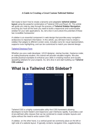
A Guide to Creating a Great Custom Tailwind Sidebar Get ready to learn how to create a dynamic and adaptable tailwind sidebar layout using the powerful combination of Tailwind CSS and React JS. This article will guide you step by step through the process of Tailwind Sidebar Navigation, ensuring you have all the tools you need to build a responsive and customizable sidebar for your web applications. So, let’s dive in and unlock the potential of these two incredible frameworks! A sidebar is an essential component in web design that provides easy navigation andaccess to important information. In this article, you will learn how to create a sidebar that adapts to different screen sizes, includes icons for visual representation, supports route highlighting, and can be customized to match your desired design. Tailwind Checkout Form Whether you are a web developer, UI/UX designer, startup founder, freelance coder, or coding bootcamp student, this tutorial will provide valuable insights. We also provide practical examples to enhance your skills in creating intuitive and visually appealing sidebars for your projects. So, let’s dive in and start building ourTailwind CSS sidebar! What is a Tailwind CSS Sidebar? Tailwind CSS is a highly customizable utility-first CSS framework allowing developers to build modern and responsive user interfaces rapidly. It provides a set of pre-defined utility classes that can be combined to create complex layouts and styles without the need to write custom CSS. A sidebar, on the other hand, is a vertical panel we commonly place on the left or right side of a website layout. It typically contains navigation links, supplementary
information, or additional controls. Sidebars in web design improve user experience by providing easy access to important sections of a website or application. When combined with Tailwind CSS, creating a responsive sidebar becomes even easier. With its extensive set of utility classes and responsive design capabilities, Tailwind CSS allows us to build sidebars that adapt to different screen sizes, ensuring a seamless experience for users across devices. Setting up the Project To start creating a Tailwind CSS sidebar with React JS, we first need to set up our project structure. We will use React JS, a framework that provides server-side rendering and other useful features for building React applications. In this project, we will be using React Icons to add different icons to our sidebar to improve the visuals of our design. First, create a new React JS project and a Components folder by running the following commands in the terminal: npx create-react-app my-sidebar-project cd my-sidebar-project mkdir components mkdir components/Layout Also, we need react-icons installed: npm install react-icons --save That’s it; you have successfully set up the project structure for ourTailwind Sidebar Layout. Now, let’s move on to creating the sidebar component itself.