Responsive Web Design
Responsive web design ensures your website looks great and functions seamlessly across all devices, from desktops to smartphones. Our expert team specializes in creating responsive websites that adapt to any screen size, providing users with an optimal viewing experience. With a mobile-friendly design, you can reach and engage with your audience effectively, no matter how they access your site.
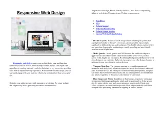

Responsive Web Design
E N D
Presentation Transcript
Responsive web design, Mobile-friendly websites, Cross-device compatibility, Adaptive web design, User experience, Website responsiveness. Responsive Web Design WordPress SEO Website Support Social media marketing Website Design Services Custom Website Design Solution Flexible Layouts: Responsive web design utilizes flexible grid systems that adjust proportionally to the user's screen size, ensuring that the layout adapts seamlessly to different devices and resolutions. This fluidity allows content to flow and reposition dynamically, maintaining a visually appealing and user-friendly interface across all platforms. Media Queries: Media queries are CSS3 features that enable developers to apply specific styles based on the characteristics of the user's device, such as screen width, height, and orientation. By defining breakpoints at different viewport sizes, designers can customize the layout, typography, and other design elements to optimize the user experience for various devices. Responsive web design ensures your website looks great and functions seamlessly across all devices, from desktops to smart phones. Our expert team specializes in creating responsive websites that adapt to any screen size, providing users with an optimal viewing experience. With a mobile-friendly design, you can reach and engage with your audience effectively, no matter how they access your site. Viewport Meta Tag: The viewport meta tag is a crucial component of responsive web design, as it allows developers to control the viewport's width and scale on mobile devices. By setting the viewport meta tag appropriately, designers can ensure that websites render correctly and are fully responsive on smartphones and tablets, regardless of the device's pixel density or screen size. Fluid Images and Media: In addition to fluid layouts, responsive web design incorporates fluid images and media, which scale proportionally to fit the screen size. By using relative units such as percentages or ems instead of fixed pixel values, designers can ensure that images and videos adapt seamlessly to different viewport sizes, preventing distortion or cropping on smaller screens. Optimize your online presence with responsive web design. We create websites that adapt to any device, providing a seamless user experience.