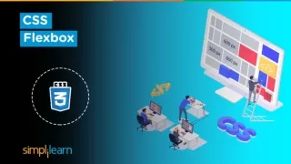
CSS Flexbox Tutorial | Learn Flexbox | Flexbox Tutorial | CSS Tutorial For Beginners | Simplilearn
In this presentation, we will learn about the flexbox and how you can use the flexbox to make flexible layout models in your web page. We will also work with some of the important properties that will give the understanding of flexbox model.<br><br>Post Graduate Program in Full Stack Web Development:<br>A Global Online Coding Bootcamp With Caltech CTME<br>Accelerate your career as a software developer through this Post Graduate Program in Full Stack Web Development course in collaboration with Caltech CTME. In just a few months, you'll learn modern coding techniques with bootcamp-level intensity and gain all you need to be a full-stack technologist. This Post Graduate Program will help you master both front-end and back-end Java technologies, starting with the basics and progressing to the advanced aspects of Full Stack Web Development. In this web development certification course, you will learn Angular, Spring Boot, Hibernate, JSPs, and MVC to help you launch your career as a full stack developer.<br><br>Key Features:<br>u2705 Caltech CTME Post Graduate Certification<br>u2705 Masterclasses from Caltech CTME faculty<br>u2705 Online Convocation by Caltech CTME Program Director<br>u2705 Get noticed by the top hiring companies<br>u2705 Receive 25 CEUs from Caltech CTME<br>u2705 Access to Caltech CTME Circle Membership<br>u2705 Physical Certificate from Caltech CTME (on request)<br>u2705 250 Hours of Applied Learning<br>u2705 30 in-demand tools and skills<br>u2705 Capstone Project in 4 domains<br>u2705 20 lesson-end and five phase-end projects<br>u2705 Build your own portfolio on GitHub<br><br>Learn more at https://www.simplilearn.com/pgp-full-stack-web-development-certification-training-course

CSS Flexbox Tutorial | Learn Flexbox | Flexbox Tutorial | CSS Tutorial For Beginners | Simplilearn
E N D
Presentation Transcript
What’s in it for you? • CSS Flexbox Basics • Flexbox model concept • Hands-on demo
CSS Flexbox CSS flexbox layout allows you to easily format HTML. You can create flexible responsive structure without using float or positioning You can easily create layouts for complex application and web pages using flexbox
Flexbox Model Concept The ability to alter item width and height to best fit in its containers available free space Flexbox is direction-agnostic Built-for small scale layouts while the upcoming “Grid” specification is for more large scale
Flexbox Model Concept display: flex | inline-flex; align-content: flex-start | flex-end | center flex-direction: row | column flex-grow: <number>; flex-wrap: wrap | nowrap | wrapreverse flex-shrink: <number>; flex-basis: <length> flex: <integer>; justify-content: flex-start | flex-end | center order: <integer>; align-self: flex-start | flex-end | center
Join us to learn more! simplilearn.com UNITED STATES Simplilearn Solutions Pvt. Limited 201 Spear Street, Suite 1100 San Francisco, CA 94105 Phone: (415) 741-3319 INDIA Simplilearn Solutions Pvt. Limited #53/1C, 24th Main, 2nd Sector HSR Layout, Bangalore 560102 Phone: +91 8069999471 UNITED STATES Simplilearn Solutions Pvt. Limited 801 Corporate Center Drive, Suite 138 Raleigh, NC 27607 Phone: (919) 205-5565