Download
1 / 12
130 likes | 242 Views
The purpose of responsive web design is to have one site, but with different elements that respond differently when viewed on devices of different sizes.

E N D
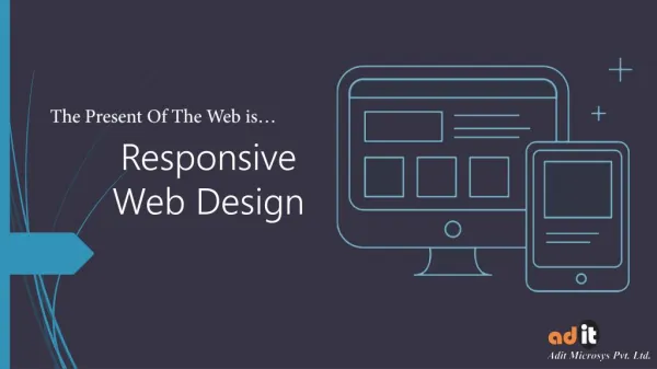
Responsive Web Design The Present Of The Web is…
Basic Parts In Design • Fluid Grids : In this grid, each and every unit resize itself according to screen size. • Flexible Images : No need to give specific width. It will scale & move with the flexible grid. • CSS Media Queries : It serves stylesheets based on browser window’s size, color, & orientation. • Screen resolution : Maintain landscape & portrait widths of different devices.
Fluid Grids • It allow the elements of the layout to resize based on the size of the user’s screen. • All elements are designed in terms of proportion instead of traditional layout. • All information fits well onto the screen.
Flexible Images • Image’s dimensions are flexible, so they can be resized properly. • Images on the web page must be sized in flexible units. • So they do not go outside of the dedicated viewing area
Media Queries • Media queries are the coding part of the website which enable the web designer to create the visual look. • CSS used to separate the content on a webpage from it actual view in the form of layout, color & fonts. ?
Do You Know This ? • Adaptive Design : It has multiple but fixed width layouts. • Responsive Web Design : It has multiple, but fluid grid layout (as said in previous slide)
Google Recommendation • As we all know Google is the largest and most usable search engine world wide. • So if you want to rank your website on Google SE, then you must follow the webmasters recommendations. • They prefer same HTML for all devices and use CSS media queries to render webpage on device.
Consumer’s Preference • 75% consumer’s prefer to use mobile friendly website. • 25% may not use smart phone or may not much aware with this technology upgrade.
Internet Users 2016 2016 90% 62% 2009 2009 Desktop Users Mobile Users
Benefits • One website is required for all different size devices • The overall development cycle is shorter than previous • Google prefer this structure to index webpages for its search engine • It gives choice to the viewers for device used to access website
Benefits • Users like look and aesthetics of a responsive site. • Website content loads quickly as there are not hundreds of pages of content. • It is easier for Google to crawl and index one URL for every device, rather than two different URLs.
Connect with us Check out our portfolio on responsive web design & development. Contact us, if you have any query for app development here : sales@aditmicrosys.com.au Twitter : twitter.com/aditmicrosysau Facebook : facebook.com/Adit-Microsys-887908624668076/ LinkedIn : linkedin.com/in/aditmicrosys-australia Google+ : plus.google.com/+AditmicrosysAu