Transform Your Data with Interactive Visualization in Power BI
Explore Power BI interactive data visualization techniques that help you create engaging, user-friendly reports and uncover insights quicker.

Transform Your Data with Interactive Visualization in Power BI
E N D
Presentation Transcript
Interactive Data Visualization with Power BI In today’s data-driven world, simply having information is not enough. The challenge lies in understanding that information and turning it into insights that people can act on. This is where interactive data visualization becomes a vital part of any organization’s analytics strategy. With tools like Power BI, it is possible to go far beyond static charts and create dashboards that respond to user input, reveal hidden patterns, and tell a story with clarity. Website:https://blogs.knowledgeexcel.com/data-visualization/interactive-data-visualization-power- bi Email: info@knowledgeexcel.com
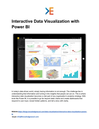
What Is Interactive Data Visualization? Interactive data visualization refers to visual displays that allow users to explore and interact with data. Instead of just looking at a static graphic or a simple table, users can filter, drill down, zoom in, or highlight specific segments to discover more detailed insights. This type of visualization invites exploration, encourages engagement, and makes complex data easier to digest. While traditional reports might show basic figures, interactive visuals allow users to ask questions and receive instant visual feedback. They can compare results, track trends, or identify outliers with just a few clicks. This makes data far more useful to individuals across departments, from analysts and managers to executives. Why Power BI for Interactive Visualization? Power BI is a widely used analytics platform that makes it easier to build, share, and explore interactive visuals. It connects to many data sources, organizes data into meaningful tables, and transforms raw numbers into visual elements like charts, gauges, and maps. Users can combine multiple visuals into a single dashboard that tells a complete story at a glance. One of Power BI’s biggest strengths is its ability to handle large datasets while keeping visuals responsive and easy to interact with. Whether it’s a finance dashboard or customer analytics report, Power BI allows users to design visuals that suit their unique business needs. Benefits of Interactive Visualization in Power BI 1. Improved User Engagement Interactive visuals are more engaging than static reports. When users can explore data on their own, they become active participants in the analysis process. This leads to deeper understanding and better retention of key information. Instead of reading rows of numbers, users can spot patterns, trends, or anomalies through interactive charts. They can select specific regions, filter by time period, or compare metrics side by side — all within a single dashboard. 2. Faster Decision-Making Website:https://blogs.knowledgeexcel.com/data-visualization/interactive-data-visualization-power- bi Email: info@knowledgeexcel.com
When data is presented visually and interactively, decision makers can respond more quickly. For example, a manager reviewing sales performance can instantly see which products are underperforming or which regions are driving growth. This real-time insight supports timely decisions without waiting for lengthy reports. 3. Simplified Complexity Large datasets can be overwhelming. Interactive visualization breaks down complex information into visual components that are easier to interpret. Users don’t need advanced technical skills to uncover insights — the visuals guide them through the data. 4. Personalized Views Different users have different needs. Interactive dashboards allow each user to explore the data from their own perspective. A salesperson may focus on monthly sales figures, while a financial analyst can zero in on cost trends — all using the same dashboard. How Interactive Visuals Work in Power BI Power BI allows you to build visuals using simple drag-and-drop actions. You begin by importing your dataset — whether from a spreadsheet, database, or cloud service. Once the data is loaded, you organize it into meaningful categories, such as dates, customer segments, products, or regions. Then you select the type of visual you want — bar chart, line chart, pie chart, map, or table. Each visual represents a specific aspect of your data. When multiple visuals are placed on a single canvas, they form a dashboard that provides a comprehensive view of your business metrics. Interactivity comes from built-in features such as: ● Filters – allow users to show only relevant data ● Slicers – provide quick selection options for specific values ● Drill-downs – let users explore deeper levels of data ● Tooltips – show detailed information when hovering over visuals With these tools, users can move through data effortlessly and gain deeper insight at each step. Website:https://blogs.knowledgeexcel.com/data-visualization/interactive-data-visualization-power- bi Email: info@knowledgeexcel.com
Real-World Uses of Interactive Visualization Interactive data visualization can be applied across many business functions: ● Sales and Marketing – visualize campaign performance, track leads, and monitor customer behavior ● Finance – compare budget versus actual spending, analyze profitability trends, and track financial growth ● Operations – monitor production efficiency, inventory levels, and delivery performance ● Customer Service – review support ticket trends and customer satisfaction levels ● Human Resources – analyze workforce trends, training performance, and engagement levels The flexibility of interactive dashboards makes them useful in nearly every department of an organization. Building a Culture of Data Awareness Interactive data visualization does more than just display data — it fosters a culture where employees feel empowered to explore information and draw insights. When team members at all levels have access to clear visuals, data becomes part of everyday decision-making rather than something only analysts review in isolation. A shared understanding of data encourages collaboration, aligns goals across teams, and supports a more responsive way of working. Users begin asking better questions, investigating trends more confidently, and relying on facts rather than intuition alone. Conclusion Interactive data visualization using Power BI transforms how organizations view and use their data. It turns static reports into engaging dashboards, invites users to explore data freely, and provides deeper insights that support smarter decisions. By combining strong visuals with intuitive interaction, Power BI makes it easier to uncover patterns, recognize trends, and respond quickly to changing business needs. Whether you are a business leader, an analyst, or a team member eager to understand performance, interactive visualization makes data approachable and meaningful. It bridges the Website:https://blogs.knowledgeexcel.com/data-visualization/interactive-data-visualization-power- bi Email: info@knowledgeexcel.com
gap between raw information and actionable insight — helping organizations act with confidence and clarity. Website:https://blogs.knowledgeexcel.com/data-visualization/interactive-data-visualization-power- bi Email: info@knowledgeexcel.com


![Neelkanth_Ayurveda[1] pdf](https://cdn7.slideserve.com/12544235/welcome-to-dt.jpg)