Download

1 / 4
0 likes | 3 Views
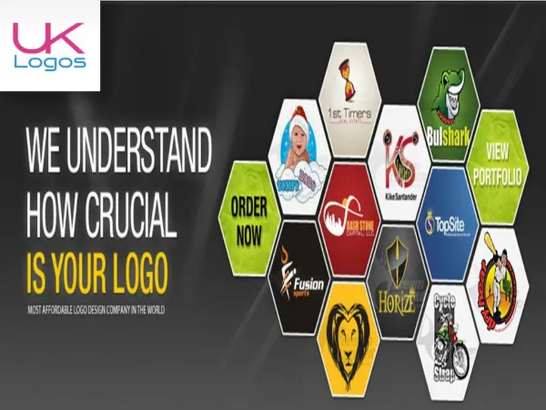
Minimal logo design is based on the principle of simplicity. It uses clean lines, limited colors, and clear typography to represent a brand. Instead of adding too many shapes, gradients, or details, it focuses on delivering the message in the most straightforward way possible.<br>

E N D