Download
1 / 4
40 likes | 55 Views
PrintSouq makes the production and delivery of custom print products simple, convenient and efficient. We fulfill, print and process customized print collateral. Visit us https://printsouq.ae/

E N D
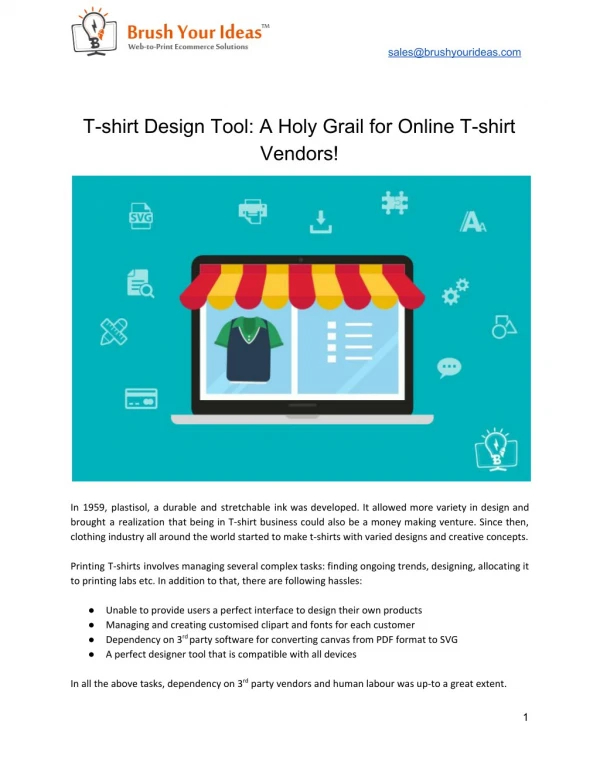
10 T-Shirt Design Tips for Better Results Everyone loves a great T-shirt design. But what makes for an impressive design that people want to repeatedly wear? Although some of the greatest designs look simply, even the simplest designs need to avoid the most common mistakes to achieve that greatness. Here are my ten T-shirt design tips, based on 25 years of experience in the custom printing business. 1. Set a modest print size There may be things in life where size doesn’t matter, but a t-shirt design is not one of them. A common mistake is people set their design to standard size. But standard is close to the maximum, which can be too large for most designs. The size of a design should be based on the purpose of the shirt, the properties of the garment, and the characteristics of the design itself. Keep in mind that certain shapes, like circles and squares, look better when sized smaller than standard. Consider the total surface area of the print, not just the width and height. Additional sizing considerations: One size doesn’t fit all. For larger orders with a variety of T-shirt sizes, consider reducing the print size on the smaller garments. Example: An 8″ wide chest print on youth tees and smalls, and a 10″ wide print on the rest. Certain styles have limited print areas. Set your print size to meet style-specific requirements. Examples: hoodies with front pockets have a max height of 10″ and stank tops have a much smaller print area than T-shirts. Consider comfort. A large print can affect breathability and weigh down a T-shirt, especially on lightweight shirts. Example: If you’re making T-shirts for a 5K run, a giant print becomes an uncomfortable “sweat patch”. Don’t make people into billboards. Even the most die-hard fans of your brand might be reluctant to wear a T-shirt that makes them look like a walking ad. Keep the print size modest and people will be more likely to wear it.
2. Get the placement right Print placement differs from print location. It’s the exact measurement of where to print the design within the location. If you’re choosing unique print placement, make sure you have a good reason. Many people new to T-shirt design don’t know that a standard full front placement isn’t halfway between the shirt’s top and bottom. It’s actually around 4″ from the collar. So a common mistake is the belly print, and it’s never flattering. 3. Focus on fonts and typography Typography, in its most basic form, is the visual arrangement of words (not to be confused with the font, which is the style of the text). Anytime text gets printed or displayed, good or bad, there is typography involved. In graphic design, typography is the art of typesetting: arranging type in a way that makes sense, along with choosing appropriate typefaces (fonts), making sure the letter spacing and line spacing is correct, and designing the way the words interact with the graphic elements to be aesthetically pleasing. But you don’t need to be a trained artist to get the typography right. You just need to follow some basic rules. 4. Take care with composition Composition is something you may remember from your high school art class. Every design has elements arranged in relation to each other, which makes up the overall composition. Good design is all about composition. Typical mistakes include elements that are too spaced apart or bunched up together. Sometimes the entire design can be off-balance, drawing the eye to the wrong place. Or if you’re especially careless, the type reads in the wrong order and ruins the message.
5. Ensure image quality One of the most common problems with customer-submitted art files is that images are “low resolution”. What that means is they don’t have enough pixel information to give us the quality and details that make for good print quality. Ideally, images should be 200 dpi or higher at full size. Up to 300 dpi is best. Images from the web are typically 72 dpi, and not at the size to be printed. Another problem with low-res images is visible artifacts from compression. Keep in mind, the print will only be as clear as the image we’re starting with– so starting with a high-quality image is key. 6. Be careful with colors Color choice is one of the most important decisions. Not only for design reasons but if you want screen printing, to make sure the job fits your budget. More colors equal more cost per item. Typically, screen printing is better suited for solid colors and a limited color palette. 7. Consider the contrast Contrast is a part of color choice, but it’s a specific and important part to consider. What exactly is contrast? Its the degree of visual difference between the darker and lighter parts of an image, or the way shades of colors correspond to each other. High-contrast designs are easier to read and more in-your-face, while low-contrast designs are more subtle. The strongest contrast is always going to be black-on-white or vice versa. Bright colors on a dark background are going to be high contrast. The design itself can dictate the overall contrast, as far as the content and what colors have the most surface area or are the most dominant. A crazy, eye-catching image along with saturated colors will greatly increase the contrast against a neutral background. 8. Invert negative images Inversion is a fairly common step that must be done, usually when printing light ink on black garments. Unless there is a specific reason, you probably don’t want your photo to look like an x-ray.
9. Avoid over-complexity Everyone knows the adage K.I.S.S. (Keep It Simple, Stupid), which applies to T-shirt design as much as anything else. “Stupid” was probably added just to complete the acronym. It’s rude, but good advice. The human eye can only process a certain amount of information at once, graphics or otherwise. And with a T-shirt design you not only have limited viewing time, but you’re usually a moving target. So keep it simple. 10. Add borders, masks, and edges Many designs that we print feature photographs. A photo just sitting on a shirt with plain edges can look boring or even cheap and unprofessional. A straightforward solution is to put a border on it. There are lots of options for borders and edges. The most simple is a thin white or black border, which can instantly improve the appearance. But maybe you don’t want it to be square. In that case, you can use the “mask” feature in our Design Studio, which gives you a variety of shapes to choose from. Printsouq has variety of printings in Hoodies, Polo T-Shirts, Round Neck T-Shirts, and Sweat Shirts. Visit their site to know more: https://www.printsouq.ae/