Data Visualization Service By Opin Analytics
Opin Analytics is a data analytics, BI, and data visualization service provider. At Opin Analytics, we realize how important is to set up the right strategy and collect the right data in order to drive your online business. We combine our knowledge of technology and business to deliver insights that help you succeed online. For more information visit our website. Contact Details - <br>Website - https://opinanalytics.com/ <br>Whatsapp - 7060448080

Data Visualization Service By Opin Analytics
E N D
Presentation Transcript
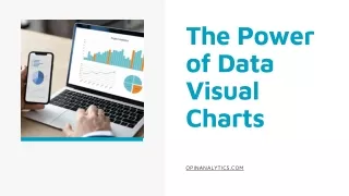
The Power of Data Visual Charts OPINANALYTICS.COM
About Opin Analytics is a marketing company that offers data analytics, BI, and data visualization service globally. We aim to drive the right data for online businesses and consult the strategy for more leads. First, we collect the data and then visualize it. Because it is easy to understand.
STATISTICS ON APP USAGE TIME IN THE DAY WHERE APP USAGE IS HIGH Use apps for business and personal use 75% pie chart featuring male and female distribution Female 50% Male 50% Use apps purely for personal use 20% 40 30 APP USE BASED ON GENDER line chart featuring days of the week 20 10 5% Use apps only for games 0 S M T W TH F SA
STATISTICS ON WEBSITE USAGE 75% 5% 20% Usewebsite for business and personal use Regularly website usage Use website purely for personal use 40 TIME IN THE DAY WHERE WEBSITE USAGE IS HIGH 30 WEBSITE USE BASED ON GENDER Female 50% Male 50% 20 pie chart featuring male and female distribution line chart featuring days of the week 10 0 S M T W TH F SA
Advantages of Visual Charts Convey a great number of information in an effective manner SIMPLIFIES STATISTICS EASY TO UNDERSTAND ADDS MAKES AN IMPACT CREDIBILITY .
CONTACT Website - opinanalytics.com Whatsapp - 7060448080