Creating A Responsive Website Is Easy With Monsoonfish
80 likes | 89 Views
More users search for products and services on their phones than on computers. A mobile-friendly website is critical to your business success. Get the best mobile friendly website design services at Monsoonfish at an affordable cost. Visit us: https://monsoonfish.com/responding-correctly-to-responsive-web-design/

Creating A Responsive Website Is Easy With Monsoonfish
E N D
Presentation Transcript
https://monsoonfish.com/responding-correctly-to-responsive-web-design/https://monsoonfish.com/responding-correctly-to-responsive-web-design/ CREATING A RESPONSIVE WEBSITE
https://monsoonfish.com/responding-correctly-to-responsive-web-design/https://monsoonfish.com/responding-correctly-to-responsive-web-design/ CREATING A RESPONSIVE WEBSITE ABOUT US We are committed to work with you over a range of services. Our team brings to the table a diverse set of experience which help us craft experiences that really matter to the users we design for. Be it consulting or pixel perfect design, our services will add value to your business and customers.
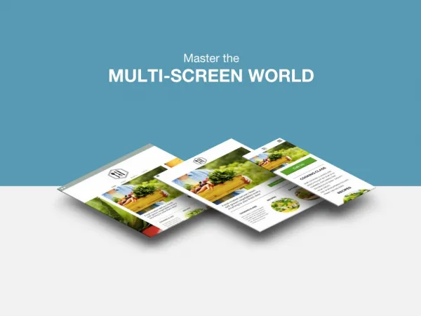
https://monsoonfish.com/responding-correctly-to-responsive-web-design/https://monsoonfish.com/responding-correctly-to-responsive-web-design/ CREATING A RESPONSIVE WEBSITE Consider this scenario – Dave is planning a trip in the summer. Since it’s going to be sunny, he browses some sunglasses on his desktop at work. At home, while binge watching Netflix on iPad, he browses some more sunglasses and shortlists a few. Finally, while going to sleep, he selects and orders a pair from Amazon on his smartphone.
https://monsoonfish.com/responding-correctly-to-responsive-web-design/https://monsoonfish.com/responding-correctly-to-responsive-web-design/ CREATING A RESPONSIVE WEBSITE For the same purpose, Dave has used a desktop, an iPad and a smartphone. Three different screens. And this scenario is getting more and more common as we speak. This infographic does a nice job of capturing the multi-screen human behaviour in the modern era. Add to this the rise of different devices people are using now – phablets, tablets, laptops, 2-in-1s, consoles, wearables, phones with notches, and so on.
https://monsoonfish.com/responding-correctly-to-responsive-web-design/https://monsoonfish.com/responding-correctly-to-responsive-web-design/ CREATING A RESPONSIVE WEBSITE This brings us to the concept of Responsive Web Design (RWD), which was originally defined by Ethan Marcotte in A List Apart, in… 2010. At the time, it focussed on making print-friendly designs work accurately in the web medium. But today, the concept still applies, although, across multiple devices, in different forms. It is not just making the website mobile-friendly, anymore. It is very simple to define RWD in one word. Water. It is equally hard to ascribe the properties of water, to the design you are building for users to watch on their screens.
https://monsoonfish.com/responding-correctly-to-responsive-web-design/https://monsoonfish.com/responding-correctly-to-responsive-web-design/ CREATING A RESPONSIVE WEBSITE Follow Us https://www.facebook.com/monsoonfish https://www.instagram.com/monsoonfish/ https://www.twitter.com/monsoonfish https://www.linkedin.com/company/monsoonfish
https://monsoonfish.com/responding-correctly-to-responsive-web-design/https://monsoonfish.com/responding-correctly-to-responsive-web-design/ CREATING A RESPONSIVE WEBSITE Contact Us +91 9890388405
https://monsoonfish.com/responding-correctly-to-responsive-web-design/https://monsoonfish.com/responding-correctly-to-responsive-web-design/ THANK YOU