Download
1 / 12
0 likes | 27 Views
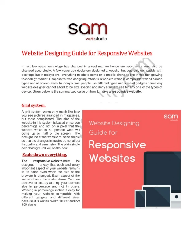
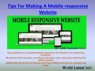
Welcome To<br> <br>Next-Level Mobile Responsive Website Designing<br><br>Having a mobile-responsive website is not just a nice idea in the current digital era; it is a need. An increasing number of consumers are accessing websites via mobile devices due to the explosive expansion of smartphones and tablets. In order to provide a fluid and user-friendly experience across a variety of screen sizes and devices, web designers and developers are pushed to build websites.<br>Contents<br>u2022tWhat is a website that is mobile-responsive?<br>u2022tWhy Is Responsive Design for Mobile Important?<br>u2022tHow to Create a Mobile Responsive

E N D
Welcome To Next-Level Mobile Responsive Website Designing Having a mobile-responsive website is not just a nice idea in the current digital era; it is a need. An increasing number of consumers are accessing websites via mobile devices due to the explosive expansion of smartphones and tablets. In order to provide a fluid and user-friendly experience across a variety of screen sizes and devices, web designers and developers are pushed to build websites. Contents What is a website that is mobile-responsive? Why Is Responsive Design for Mobile Important? How to Create a Mobile Responsive Website Four Crucial Elements of a Mobile Responsive Website A mobile responsiveness test best practices for responsive design for mobile What is a website that is mobile-responsive? A website that can adjust its content according to the device it is being viewed on is said to be mobile responsive. A website's layout and design are often made with desktop users in mind. However, as more users choose to browse on a tablet or Mobile Responsive Website Designing 2 smartphone, it is crucial for web design to adapt in order to guarantee that all users have an excellent experience.By October 2022, the market share for mobile devices had surpassed that of tablets and desktops combined. Since mobile devices are used by more than 58% of consumers, it's crucial to maintain a consistent user experience across all platforms. Because of this, responsive design is crucial in today's world. Responsive
website design requires creating a web application that offers a positive user experience on a variety of devices. Mobile responsive design involves reformatting the contents of the website to be more user- friendly as the screen size is lowered and resizing the page components and content of the website according to the screen size of the device. Why Is Responsive Design for Mobile Important? Web apps are developed in response to consumer demand. In order to effectively retain customers, it is crucial to comprehend the needs of the market before developing a product that meets those needs. As Of October 2022, the mobile market share was 58%, according to figures collected worldwide. Over 60% of the market share is held by non-desktop devices when the market share for tablets is included. A product will go extinct and be replaced by others that can better match consumer needs if it is unable to change and evolve. On the same vein, a poorly designed web application will turn off a sizeable chunk of its potential customer base if it cannot work properly and look attractive on mobile and tablet devices. Fragmentation of devices is another issue. In addition to the various screen sizes of tablets and mobile devices, there are numerous device configurations with various browsers and operating systems. To ensure that every user, regardless of the device they are browsing on, has a great experience, all of these elements must be taken into consideration. Four Crucial Components of a Mobile-Friendly Website Here are four elements to think about for a mobile-responsive design: Readability Instead of building a website that is really responsive, developers frequently just shrink the size of the webpage to match the mobile or tablet screen. This results in a very frustrating user experience because the text is frequently quite small and disjointed, forcing the user to zoom in and out in order to understand the website's contents. When necessary, text should be enlarged, and material should be formatted to look good while still fitting the lower screen size. Button and Image Formatting Similar to other website material, it's crucial to make sure that buttons are clear and easy to use. A mobile responsiveness test When a website is being designed, it would be prudent to make sure that it functions as intended across a number of devices. It can be quite useful to use tools like Browserstack's Responsive Tool, which
evaluates mobile responsiveness across a range of device/browser combinations. Free Responsiveness Test on Common Resolutions Try testing the responsiveness of your website on actual devices. Browserstack Interactive testing is possible on more than 3000 real devices and browsers thanks to a tool called Responsive Checker. Users may essentially test responsive web design with the aid of a responsive checker tool. The user can use the application to check that a website is shown correctly on multiple platforms. This requires considering various screen sizes, device configurations, and other elements. Prior to deployment, it is crucial. Although testing the application across a range of devices is crucial, testing it across 3000+ device/browser combinations could be overly laborious for some applications. By testing on the appropriate devices, developers may increase the effectiveness of testing for mobile responsiveness. How therefore do we recognize the appropriate mobile devices? The devices on which the application is most frequently used can be discovered if the application has already been made available to the general public and data regarding user devices has been collected. However, if this approach is adopted, survivorship bias might develop. A reference application can be used to assess the demographics of the target market for unreleased applications. Unfortunately, obtaining such information can be challenging, and there are frequently not Many apps that can be used as a reference. Using market data is the best way to guarantee that a web application has adequate device coverage. Numerous resources, like statista.com and offer detailed information on the popularity of devices, browsers, and other pertinent statistics. Market information is objective, and there is frequently a sizable amount of it available. Additionally, the data is often updated and offers a perspective that is nearly instantaneous. Due to this, market data is among the most pertinent sources of information when trying to test an idea. Best practices for responsive design for mobile
Make sure the writing is readable. The user shouldn't have to squint to see and comprehend the text because of the font or size. Make the design simple and give the user-attracting content top priority. Design the page keeping in mind the small screen size and making it suitable for a little touch screen. The consumer is frequently irritated by buttons that are challenging to click. Design the page with well-spaced, clickable buttons as a result. Make it simple to access the interactive parts. When engaging with webpages on their phones, people use their thumbs. This must be borne in mind while you sketch up the web application's layout. Adjust the size of the photos and make them responsive. Learning about Mobile Responsive Design The goal of mobile responsive design is to give users the best viewing experience possible across a range of devices, including desktop computers and smartphones. With this strategy, readability, usability, and navigation are all maintained as the content and layout of a website adapt to the screen size. The Importance of Mobile Responsiveness Neglecting mobile responsiveness might result in a huge loss of potential visitors and customers given the increasing usage of mobile devices. Mobile-friendly websites are also given priority by Google's search algorithms, which affects search engine rankings. Therefore, having a mobile-friendly website is essential for both SEO and customer delight. Mobile Responsive Design Using fluid grid layouts is one of the guiding principles of responsive design. Layouts must be created using relative units, such as percentages, as opposed to fixed ones, such as pixels. By enabling content to do this, a flexible and dynamic design may be created, according to the available screen width. Flexible Media and Images
Additionally, media assets like images must be adaptable. When images and videos are resized according to the screen size using the CSS property max-width: 100%, the layout is preserved and no overflowing or layout-breaking issues occur. Media queries are CSS guidelines that let designers use various styles and layouts according to screen size or device specifications. Mobile Responsive Design's Importance The way individuals access the internet has been radically changed by mobile devices like smartphones and tablets. Users favor mobile devices more and more due to the ease of mobile information and service access. Web design must adapt to this change in user behavior. Improved User Experience Delivering a seamless and delightful user experience is what mobile responsiveness is all about. It's not simply about changing your website to fit multiple screen sizes. No matter the device, users will be able to easily navigate, read, and interact with your information on a well-designed mobile-responsive site. SEO and search rankings Google and other search engines have acknowledged the importance of the mobile user experience. Google made mobile friendliness a ranking factor in 2015. How does responsive web design work? Web development has come under a lot of pressure to adapt to the growing popularity of mobile browsing on laptops, tablets, and smartphones. The best option first appeared to be to create multiple stylesheets for various screen widths. With responsive design, a site may now be used on several devices with just one stylesheet. less code to maintain. Although responsive design does away with the requirement to serve up a different stylesheet for every device, it nevertheless follows the accepted procedure of identifying the user's device first. With responsive web design, a designer builds a website
that automatically adjusts to the size of the device being used to see it. This approach bases development and design decisions. How should responsive web design be done? The goal of responsive design is to create one site with many elements that behave differently when seen on screens of various sizes. Take a look at a standard fixed website. When seen on a smaller tablet, it may force you to scroll horizontally, certain sections may be obscured or appear deformed, all of which are undesirable user experiences. Since many tablets can be used in either landscape or portrait position, the effect is further compounded. On a small smartphone screen, websites can be much more Difficult to navigate. Sites with a lot of graphics may take a while to load, and large images may interfere with the layout on mobile devices. Why should mobile responsiveness be improved? Nowadays, with users shifting their attention more toward mobile devices, having a mobile website has become crucial for websites and enterprises. Millions of visitors and potential consumers tend to leave your website without a mobile-responsive design. Mainly Making your website mobile-friendly is crucial whether you operate an e-commerce or service-based business because the majority of e-commerce and service-based websites are accessed from mobile devices. To raise awareness of your business and product, you might provide a variety of instructive and problem-solving content. As a result, if any of your potential consumers need assistance or want to seek for a product to purchase, they head to the closest desktop instead of using their preferred mobile device to search. If your website is not mobile-friendly, you are only making 50% of what you could if your mobile device was completely optimized. The creation of a mobile-friendly website for businesses is very popular right now because of this. Mobile devices are pushing customers to conduct their final research and buy through mobile apps or mobile browsers. Because of this, it is now crucial for businesses to have a mobile-responsive design. How can I create a mobile website?
When the number of mobile and tablet users overtook that of desktop users in 2016, websites that were not mobile-friendly started to face problems. Since then, the number of mobile users and the traffic coming from mobile devices has been steadily increasing, and it is predicted to reach billions. Therefore, it is crucial to figure out how to create a mobile website for their company. Let's look at three distinct processes that can result in the development of a mobile website for your company: Choose the appropriate web design strategy for your website. There are many methods you can employ to develop a mobile website, but you must first choose your website's design strategy. You must be knowledgeable with responsive design and adaptable design if you are already familiar with the web design industry. Depending on your needs, advantages, costs, and other factors, you can select one of the two techniques when building a mobile website for your company. So let's begin by giving a quick overview of the two various web design methodologies. Designing a responsive website A responsive website design (RWD) does not have a set layout for any particular device. Instead, it employs a layout that can change based on the size of the screen and the device that users are using. Your website's web pages will look the same across all devices if you use responsive design. Regardless of whether a person is using a desktop, mobile, tablet, or other form of screen, the elements of your website will be visible to them whenever they type the URL for your website. The elements and material on your website will automatically adjust to the screen size if it has responsive website design. Flexible web design Because it employs a different layout for desktop, mobile, and tablet devices, adaptive web design is less preferred by the website. This implies that the page that best suits the user's device is served when they type in your website's address. You may provide the user various experiences based on the device. For
instance, a couple of the websites can decide to develop three distinct webpages for various devices. The user will have a different experience depending on the device even though the website may employ the same elements and design.No website or business today wants to sacrifice when it comes to user experience because. Selecting a website builder or content management system The platforms you will utilize to build your website are another crucial step after you have decided on the web design strategy you will outline for it. You can choose from a variety of options in this phase to develop your website, including a website builder, a CMS, and a website design firm. The platform you choose to construct your mobile website on will determine its performance, cost, and return on investment, regardless of the choice you make for your website. Therefore, let's examine each of them separately: Agency for Website Design Even though website builders have a number of drawbacks, you may always choose to work with a reputable and skilled WordPress web design company to help you develop an appealing, user-friendly, and most importantly, responsive website for your company. The main benefit of working with a website design company is that they can assist you in developing a research-based website that fulfills your needs and conveys the message your company wants to get over to the public. In addition, you have access to the knowledge and experience the web design company's developers can contribute to the creation of a highly functional and profitable website design for your company. Well, a website builder and a website design firm can be quite expensive.
Create a Mobile Website Once you've successfully chosen the platform for your website's construction. The structure of your website can then be created, and the designing portion can then begin. Whether you are developing a blog or a full-fledged e-commerce site, you must make sure that the website runs quickly and correctly on all devices. The next step after creating your design is to evaluate the website's mobile responsiveness. However, if you have decided to work with a website design agency, you won't need to worry about the design, testing, or mobile adaptability. Considering that a trustworthy and knowledgeable WordPress web design company ensures that the website . Mobile-first You must be familiar with the term "mobile-first" if you are involved in the design industry. It is regarded as one of the most recent tendencies in the design industry. By choosing mobile-first, you build the website first for smartphones and tablets, then you add support for other devices like desktops and laptops. This indicates that the material you'll be producing is for mobile devices but may not perform as well on desktop. This strategy is especially beneficial for businesses where the majority of traffic comes from mobile devices. Cellular second You can infer from the name that this strategy is adopted by businesses and corporations who already have websites. Putting the content for the current website in order might be. Important things to take into account when creating a mobile-friendly website
You may already be familiar with the processes needed to build a visually appealing mobile website for your company. Next, we'll discuss some of the crucial elements you need to take into account when building a mobile-friendly website for your company. 1. Pick a template or theme that is mobile responsive. We want to emphasize choosing a mobile-friendly theme for your website as the first and most crucial component. Whether or whether the website you are constructing will be mobile-friendly will be greatly influenced by the theme and design you choose. No matter if you're using Squarespace, Wix, or WordPress, you need to be sure the theme or template you choose is optimized for. 2. remove undesirable content Finding the ideal and responsive theme is simply one of the steps you need follow to construct a mobile- friendly website, despite the fact that you could assume you're done after choosing an appealing and mobile-responsive theme or template for your website. Next on the list, we advise removing any undesirable information by checking your website's automated mobile view: In the mobile version, try to make your homepage's aim more precise. It's not a bad idea to draw attention to your aim, but adding too many things to the mobile version will make the user confused. You might be wondering at this point if emphasizing the objective will damage your reputation. In the desktop version, there is a possibility that it. 3. Make use of the concise and easy navigation menu If your website's navigation is difficult, users on desktop computers and mobile devices will both leave it and possibly never come back. Due to their small screens, mobile users constantly seek out websites with a straightforward and concise navigation bar. The mobile user may become confused if your website has too many pages and subpages because it would be challenging for them to find the correct web page. Additionally, it will be challenging for fingers to tap on the correct link if your website's mobile version has too many subpages. So using is always advised.
4. Improve your website's CSS and image quality Another crucial aspect that we advise taking into account when designing a mobile-friendly website is optimizing your website image and making your CSS as lightweight as possible. Large picture files frequently either take longer to load or fail to load at all. The same is true for CSS. Keep in mind that each element you add to your website creates a virtual version of it; the more elements you add, the slower your website will load. These components often consist of the video, pictures, and any special functions or designs that have bloated code. Therefore, since the code must load every time a website is clicked, having a large amount of CSS may prolong the time it takes for a website to open. 5. Adjust the button's size and placement A CTA button is included on every web page of the website, either to direct visitors to another page or to prompt them to submit a form. It is therefore reasonable to assume that your website may also include a button that is beneficial for websites in terms of lead creation, revenue, and other factors. But be aware that a great-looking button on a desktop computer can ruin the appearance of your website on a mobile device. You did read that right, Your website's appearance on a mobile device may be impacted if you arrange your button incorrectly. A tiny button on your website can. 6. Make use of a legible, large typeface. It's crucial for websites and organizations to pay special attention to the fonts on the website and web page when it comes to making your website mobile-friendly. In addition to design, the typeface you select on your website is quite important in getting visitors to interact with it and take the necessary action. Your font may be readable in the desktop view, but that is unimportant because it will be the same on mobile devices. It is crucial that websites examine the font size on mobile devices because of this. The user may abandon your website and never come back if the font is difficult to read. So ensure that the user. We advise hiring a reputable and skilled WordPress web design company to produce a mobile-responsive design for your organization if you don't want to get engaged in the technical tasks yourself.
Conclusion You ought to be aware by now of the significance of having a mobile-friendly website and how to build one for your company. It can be challenging to determine which device will generate more traffic in the technology-driven world of today. Yes, there are several analytical tools that may assist you figure out which device is bringing in the most visitors to your website. But having a mobile-responsive design for your company website is always advised. If you want to construct a highly responsive custom-coded. Contact US Website: https://www.seoexpartebd.com/ Email: info@seoexpartebd.com WhatsApp: +8801758300772 Address: Head Office Shajapur Kagji para, Majhira, Shajahanpur 5801, Bogura, Banlgladesh