Download
1 / 10
0 likes | 4 Views
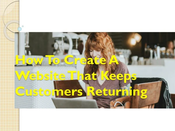
Like slipping into your favorite hoodie or sipping coffee in a sunlit cafu00e9. Thatu2019s the magic of a web design that feels like home.<br>

E N D
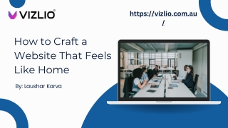
https://vizlio.com.au/ How to Craft a Website That Feels Like Home By: Laushar Karva
Introduction Let me start with a confession. I’ve abandoned websites faster than a sinking ship. You know the ones with cluttered layouts, aggressive pop-ups. The colors that scream “I’m here to sell, not to care.” But then there are those rare gems that make you linger. The kind where you think, “Huh, this feels… nice.” Like slipping into your favorite hoodie or sipping coffee in a sunlit café. That’s the magic of a web design that feels like home.
https://vizlio.com.au/ The Heartbeat of Emotional Design • I remember redesigning a local bookstore’s site a few years back. The owner told me, “I want it to smell like old paper, even through the screen.” We didn’t literally add scratch-and-sniff (though that’d be wild), but we used warm sepia tones, handwritten font accents, and a looping video of someone flipping through a weathered novel. Visitors started leaving comments like, “This feels like my grandma’s library.” Mission accomplished. • The lesson? Details matter. A web design button labeled “Get Started” feels transactional. But “Let’s Begin Your Journey”? That’s an open door.
Take navigation menus • Here’s the kicker https://vizlio.com.au/ • User-Centric Layouts: Less Maze, More Porch Swing • Ever walked into a cluttered room and immediately felt overwhelmed? Websites development work the same way. A user-centric layout isn’t just about where things go. It’s about how they make people feel. • Simplicity is kindness. A clean layout says, “I respect your time.” Use white space like a deep breath between sentences. Guide users with visual hierarchies, bigger fonts for headlines, subtle arrows pointing to CTAs. And for heaven’s sake, make sure your site works on mobile. Nothing yanks visitors out of the “home” vibe faster than zooming in sideways. • I once worked with a client who insisted on a 10-item dropdown menu. “But we offer SO much!” they argued. After a week of testing, we found users were bouncing faster than a dropped call. We trimmed it down to four intuitive categories and added a search bar with a friendly prompt: “What are you looking for today?” Traffic doubled.
The Secret Sauce: Microcopy That Talks Like a Friend • Micro Copying those tiny bits of text on buttons, error messages, or forms is where personality shines. Compare “Submit” versus “Send My Message.” One’s a robotic command; the other’s a conversation. • I’ll never forget a bakery site I revamped. Their 404 error page originally said, “Page Not Found.” We changed it to, “Oh crumbs! This page is still in the oven. Try our fresh menu instead!” with a link to their bestsellers. The owner later told me customers started calling to joke about the “burnt page.” That's the connection from web design.
Color and Texture Color psychology isn’t just for therapists. Warm earth tones (think terracotta, sage green) evoke calm. Bright pops of yellow or orange spark joy. But here’s the twist: it’s not about picking “pretty” colors, it's about choosing ones that mean something from web design. A client once asked me to design a site for a pet adoption nonprofit. We used soft pastels and added subtle animations of floating paw prints. One adopter emailed, “I clicked ‘Apply’ because the site made me feel like I was already holding my new dog.” That’s the power of intentional design. Textures add depth, too. A background with a faint paper grain or a button that looks like woven fabric can subconsciously signal “handcrafted” or “authentic.” Just don’t go overboard; nobody wants a site that feels like a ’90s Geocities page.
https://vizlio.com.au/ I learned this the hard way when my aunt, who uses a screen reader, tried navigating a site I’d built. “It’s like listening to a scrambled radio,” she said. Gutted, I overhauled everything: alt text for images, keyboard-friendly menus, captions for videos. She later told me, “Now it’s like you’re reading me a story.” Speed is empathy. Compress images. Ditch bloated plugins. Use tools like Lighthouse to audit performance. And accessibility? It’s not a checklist. It’s a promise that everyone’s welcome. • Speed and Accessibility A slow website design is like a host who keeps you waiting at the door. And inaccessible design? That’s locking the door entirely.
https://vizlio.com.au/ • The Final Touch: Invite Them Back A home isn’t a home without return visits. End every page with a gentle nudge: “Bookmark us!” “Sign up for cozy updates.” Add a blog with personal stories not just “5 Tips for X,” but “Why I Almost Quit Design (And What Changed My Mind).” One of my favorite projects was for a yoga studio. We added a “Zen Corner” blog with posts like “How I Survived My Worst Class Ever.” Students started commenting, sharing their own stories. The site became a community, not a brochure.
YOUR TURN TO BUILD • Crafting a website that feels like home. It isn’t about chasing trends or cramming in features. It’s about listening, empathizing, and daring to be human. So ask yourself: If my site were a physical space, would people kick off their shoes and stay awhile? • Start small. Swap one cold button label for something warmer. Test a color palette that mirrors your brand’s heartbeat. And remember every pixel, every word, every loading screen is a chance to say, “Come on in. We’ve been waiting for you.” Vizilo can help you with great designs.
THANK YOU! • Laushar Karva • 0482 388 848 • https://vizlio.com.au/ • 81-83 Campbell Street, Surrey Hills 2010 NSW