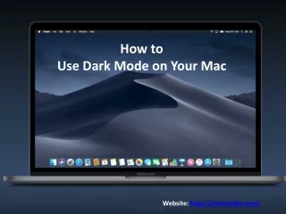
Does Dark Mode Help
Does your website/app do Dark Mode right? <br>Bad contrast, eye strain, and poor readabilityu2014dark mode can go wrong fast. A sleek look shouldnu2019t come at the cost of usability.<br> <br>Build a better, more sustainable web experience with Kytz Labs: www.kytzlabs.com<br> <br>#darkmode #webdesign #sustainabledevelopment #userexperience<br>


Does Dark Mode Help
E N D
Presentation Transcript
Let’s debunk a myth! (Because the truth comes in many shades) www.yourwebsite.com are Black & White Really Key to Sustainable Websites? www.kytzlabs.com
Myth 1 White Is Clean and Efficient White is often considered to make designs clean and sleek. But here’s the catch: ? White pixels = Maximum brightness and power consumption ? Bright white drains energy on both OLED and LCD screens #FFFFFF
Myth 2 Jet Black Is the Most Energy-Efficient Typically, black pixels use less to no power. Sounds great, right? But here’s the catch: ? Pure black can strain your eyes ? It’s harder to read in low light #000000
So, What’s the Alternative? Balanced dark themes work better #121212 #000080 #36013F Dark gray Reduces fatigue Navy blues Lower eye strain Deep purples Offer great contrast It’s about balance, not extremes.
Dark mode can save battery (up to 4%) ...But ? Users spend 20% longer browsing ? More scrolling = More energy use Sustainability isn’t just about colors; it’s about total impact.
The Real Goal of Sustainable Design Sustainable websites should Keep functionality intact Enhance user experience Save energy intelligently It’s about balance—not just black or white. www.kytzlabs.com