5 Tips On Responsive Web Design by Ethan Marcotte
60 likes | 142 Views
Ethan Marcotte has come up with an exclusively incredible technique that makes your website an award winning website with 100% responsiveness for your viewers.

5 Tips On Responsive Web Design by Ethan Marcotte
E N D
Presentation Transcript
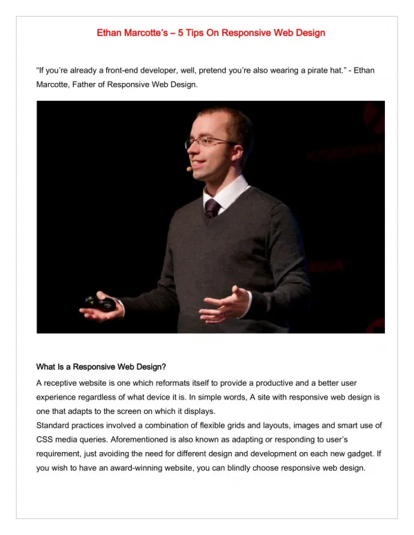
Ethan Ethan Marcotte Marcotte’ ’s s – – 5 5 Tips Tips On On Responsive Responsive Web Web Design Design “If you’re already a front-end developer, well, pretend you’re also wearing a pirate hat.” - Ethan Marcotte, Father of Responsive Web Design. What What Is Is a a Responsive Responsive Web Web Design? Design? A receptive website is one which reformats itself to provide a productive and a better user experience regardless of what device it is. In simple words, A site with responsive web design is one that adapts to the screen on which it displays. Standard practices involved a combination of flexible grids and layouts, images and smart use of CSS media queries. Aforementioned is also known as adapting or responding to user’s requirement, just avoiding the need for different design and development on each new gadget. If you wish to have an award-winning website, you can blindly choose responsive web design.
Responsive Responsive Web Web Design Design In In Its Its Reality: Reality: There is no necessity to create a design that needs a change every time you switch among devices. For example, we do not afford to build a house depending on every single personality’s requirement of our family. Likewise, it is not necessary to create a custom design for individual users. Implementing this technique on a web design can come up with a new idea. The web design design is not only about custom screen resolutions or resizability of images rather it is a different perspective on design. Here is where the responsive website could help you. web Custom Custom Web Web Design Design Vs Vs Responsive Responsive Web Web Design: Design: Custom Custom Web Web Design: Design: A custom web design cannot be a solution for all businesses. There are numerous programming codes involved. On choosing templates of these custom design, your website looks like the other sites. Responsive Responsive Web Web Design: Design: Whereas, today’s generation have improved a lot with advancement, for which they prefer tablets and mobile devices. Here is where the importance of responsive websites is understood. Responsive websites were able to provide excellent user experience. No matter how much work it indulges, responsive websites were always profitable. World’s no:1 search engine also recommends responsive websites. Managing or handling this site is always easy. Thus all of these advantages in comparison with custom web design has made responsive web design more accessible. What What Does Does Ethan Ethan Marcotte Marcotte Say Say About About Responsive Responsive Web Web Design? Design? K2B Solutions, No.5, Lakshmi Ammal Street, Ayyavoo Colony, Aminjikarai, Chennai-600029. Contact No: +1 (860) 7303280, 9600007006.
A responsive web representation is the frameset of your website. For example, the foundation of a building can define its frame and shape for decades. Likewise, the design of the site could define its worth. Ethan Marcotte has come up with great ideas in his second edition of responsive web design. He has sculptured it as, “an outcome of the responsive web design is intense.” He has concluded that the following principles could help much more about the Internet model, Responsive web Flexible network Flexible images Media queries Becoming responsive He also believes that these 5 techniques could mean a lot in building up an exclusive flexible web representation. Now let us see in brief, “ “how how these these techniques techniques work work with with flexible flexible web web design design ? ?” ”. Responsive Responsive Web: Web: K2B Solutions, No.5, Lakshmi Ammal Street, Ayyavoo Colony, Aminjikarai, Chennai-600029. Contact No: +1 (860) 7303280, 9600007006.
Recent experiments involved art installations and wall structures that make websites more flexible and expands when the viewers approach them. People likely prefer systems that are interactive. It is highly preferable in comparison with disconnected designs for each developing web devices. Rather could be recommended to use them as features for a similar experience. It is possible for an optimal design but embeds standard-based technologies into designs, not only turning them flexible but adaptive that fits all media. The only solution is responsive web design. Flexible Flexible Grid: Grid: The first and foremost step is the flexibility of the website. The technique is through obtaining pixel variation based on the width with percentage-based widths. Initially, margin later they begin with em em. Finally, they are concluded to use as font-size that it helps the grid stay flexible. margin and padding padding use px px; Flexible Flexible Images: Images: One of the major concentration on developing a responsive web design is by using flexible models. Re-sizing images are proportional, and most of it were easy. Until the width based images overruled the images loaded in its original format. Later, the idea behind the fluid images with the help of CSS proved that no matter whatever size you upload an image, the browser can resize the picture according to the requirement. The idea was considered to be an excellent technique for resizing images. Picture determination and download times ought to be the essential contemplations. While resizing an image for cell phones can be extremely basic, if the first picture size is applicable for substantial gadgets, it could fundamentally moderate download times and consume up room superfluously. Media Media Queries: Queries: K2B Solutions, No.5, Lakshmi Ammal Street, Ayyavoo Colony, Aminjikarai, Chennai-600029. Contact No: +1 (860) 7303280, 9600007006.
The media queries that Ethan example, if the browser displays an image on the screen and if the width of the screen is comparatively less then it loads as shetland.css shetland.css There are chances to create multiple style sheets, at the same time necessary layout modifications defined to fit ranges of the widths. You can find more examples on Ethan’s article. There is a brief information that could explain on the flexibility of images that best tried with CSS 3 and Java Scripts. Ethan Marcotte Marcotte has mentioned in his article are self-explanatory. For Becoming Becoming Responsive: Responsive: A recent practice involved the “responsive architecture.” Still, technicians were experimenting with art installations and wall structures which can bend and expand as when viewers approach them. Michael fox and Miles Kemp have explained about the adaptive concept as the multiple-loop system that interacts with the conversation. With the combination of embedded robotics and tensile material, technicians are experimenting with art installations and wall structures that are flexible. Why do you wait still? You can put them all into action. Ethan’s article would speak briefer on all the above. Implement all of these principles to make your website an award winning website and turn it to be responsive than ever. Source: https://www.k2bindia.com/5-tips-on-responsive-web-design/ K2B Solutions, No.5, Lakshmi Ammal Street, Ayyavoo Colony, Aminjikarai, Chennai-600029. Contact No: +1 (860) 7303280, 9600007006.