Python Data Visualization Libraries: Our best picks
As a highly comprehensive programming language, Pythonu2019s market advantage relies on its range of Data Visualization Tools. Packed with powerful features, such tools for data visualization are suitable for varying purposes depending on the kind of available data.

Python Data Visualization Libraries: Our best picks
E N D
Presentation Transcript
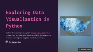
Exploring Data Visualization in Python Python offers a vibrant ecosystem for data visualization. This presentation will explore six powerful libraries that enable you to create stunning and insightful visuals for your data. by Johan Doc
Matplotlib: The Backbone of Python Visualization Matplotlib is a foundational library for creating a wide range of static, interactive, and animated visualizations in Python. It provides a flexible and customizable framework for plotting various data types, including line plots, scatter plots, histograms, and bar charts. Versatility Customization 1 2 Matplotlib can generate a wide range of visualizations, making it suitable for different data analysis tasks. It offers extensive options for controlling the appearance of plots, including colors, labels, and styles. Community Support Foundation 3 4 Matplotlib benefits from a large and active community, ensuring ample resources and support. Many other visualization libraries build upon the foundation provided by Matplotlib, making it a valuable starting point.
Seaborn: Beautiful and Informative Statistical Graphics Seaborn is a high-level library built on Matplotlib that provides a more visually appealing and statistically oriented approach to data visualization. It simplifies the creation of informative and aesthetically pleasing plots that are well-suited for exploratory data analysis and communication. Statistical Focus Aesthetic Appeal Seaborn's Strengths Seaborn excels at creating visualizations that highlight relationships between variables and distributions, facilitating data understanding. It automatically applies default styles and color palettes, resulting in visually appealing plots that enhance data storytelling. Seaborn simplifies the process of creating complex statistical visualizations, such as heatmaps, pair plots, and joint plots.
Plotly: Interactive and Web-Based Visualizations Plotly is a powerful library for creating interactive and web-based visualizations. It allows users to create dynamic charts and dashboards that can be easily shared and explored online. Web-Based Plotly visualizations are rendered in web browsers, enabling seamless sharing and collaboration. Interactivity Users can zoom, pan, and hover over data points, gaining deeper insights through exploration. Customization Plotly provides extensive options for customization, enabling users to tailor visualizations to specific needs.
Bokeh: Highly Interactive Plots for the Web Bokeh is a Python library specifically designed for creating interactive web-based visualizations. It enables the creation of highly customizable plots that are ideal for exploring large and complex datasets. Feature Description Interactive Bokeh visualizations are designed to be interactive, allowing users to zoom, pan, and filter data. Scalability Bokeh can handle large datasets and complex visualizations, making it suitable for data exploration and analysis. Customization Bokeh provides extensive options for customizing the appearance and functionality of visualizations.
Altair: Declarative Statistical Visualization Altair is a declarative statistical visualization library that focuses on creating concise and expressive visualizations. It leverages a grammar of graphics approach, allowing users to define visualizations using a high-level syntax. Declarative Syntax 1 Altair allows users to express their visualization intent in a clear and concise manner, focusing on data relationships rather than implementation details. Interactive Exploration 2 Altair's visualizations can be interactive, allowing users to explore data relationships dynamically. Grammar of Graphics 3 Altair follows the grammar of graphics paradigm, providing a consistent and flexible framework for creating visualizations.
Folium: Mapping and Geospatial Visualization Folium is a powerful Python library for creating interactive Leaflet maps. It provides a simple and intuitive interface for visualizing geospatial data and creating interactive maps that can be easily shared and explored online. Leaflet Integration Geospatial Data Customization Web-Based Folium leverages the popular Leaflet JavaScript library, enabling the creation of interactive maps with a wide range of features. Folium is designed to work seamlessly with geospatial data, including geographic coordinates, shapefiles, and GeoJSON data. Folium provides extensive options for customizing the appearance of maps, including markers, popups, and layers. Folium maps are rendered in web browsers, enabling easy sharing and collaboration.
Conclusion and Key Takeaways Python offers a rich and versatile ecosystem for data visualization. Each library provides unique strengths, catering to various needs and preferences. Matplotlib Seaborn Plotly, Bokeh Foundation, wide range of plot types, extensive customization. Statistical focus, aesthetic appeal, simplifies complex plots. Interactive and web-based visualizations, ideal for data exploration and sharing. Altair Folium Declarative syntax, concise visualizations, grammar of graphics approach. Mapping and geospatial data visualization, Leaflet integration, interactive maps.