Four Simple, Quick Website Design Tips for Better Website Navigation
30 likes | 61 Views
When revamping your website design in Oklahoma City, do not neglect site navigation. Here are tips to make site navigation a lot easier for users.

Four Simple, Quick Website Design Tips for Better Website Navigation
E N D
Presentation Transcript
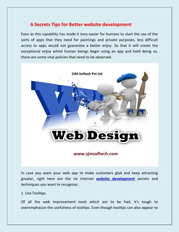
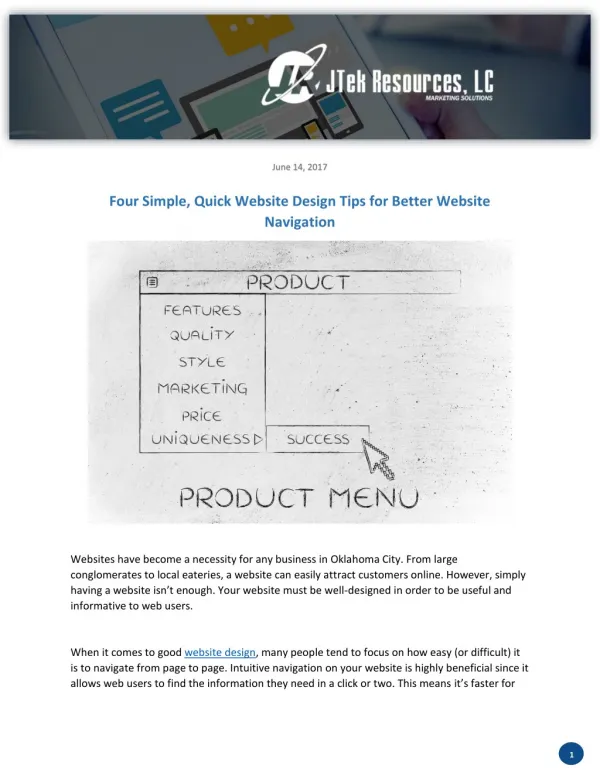
June 14, 2017 Four Simple, Quick Website Design Tips for Better Website Navigation Websites have become a necessity for any business in Oklahoma City. From large conglomerates to local eateries, a website can easily attract customers online. However, simply having a website isn’t enough. Your website must be well-designed in order to be useful and informative to web users. When it comes to good website design, many people tend to focus on how easy (or difficult) it is to navigate from page to page. Intuitive navigation on your website is highly beneficial since it allows web users to find the information they need in a click or two. This means it’s faster for 1
them to transition from “browsing” to “buying”. Furthermore, websites that are easy to navigate for users also tend to be easier for search engines to crawl through, which can only help your website’s search ranking. Web design is both a science and an art form. As such, it is in your best interest to work with respected website design companies like JTek Resources, LC. Website design professionals can easily help you with all your design and maintenance needs. When working with your web design company, be sure that everyone is on the same page with these navigation and web design elements: Create a Navigation Bar Navigation bars are a website visitor’s best friend, especially if this is the first time they are visiting your website. In fact, these handy navigation tools are so useful that most users see navigation bars as a standard for modern website design. If you already have a navigation bar on your site, it’s best to make sure that the bar “floats” at the top as the user scrolls down and reads your content. This provides easy access to the navigation bar since users do not have to scroll up to the very top of your page. Smarter URLs When creating links in your content, be sure that the anchor text you use is appropriate for the page it will be linked. For example, there’s no point in linking the anchor text “bathroom remodels” to your “bathroom fixture installation” page. After all, users who click on “bathroom remodels” are clicking it with the expectation of seeing your “bathroom remodels” page. It may seem like a no-brainer, but you’d be surprised by how many websites make this mistake for the sake of “keyword optimization”. 2
Check Your URL Redirects If you have recently made changes to your URL strings, make sure that the old URL will redirect users to the new URL. The last thing a website user wants to see when clicking on a link is to receive a 404 error. However, be careful with your use of URL redirects. You should try to keep your redirects as short as possible. In other words, don’t have a page that will redirect to page two, only to be redirected to page three and so on and so forth. Keep Mobile in Mind at All Times Mobile devices are slowly becoming the preferred Internet access device in the United States. As such, make sure all the changes you make to your site’s navigation works well on mobile devices. This is especially true if your website doubles as your online store. Drop down menus via the “hamburger icon” are a great way to create a navigation bar that does not obstruct the smaller screens of a smartphone or tablet. Sources: Five Rules of Effective Website Navigation, ThroughtCo.com 4 Secrets to Website Navigation Design with SEO Power, Business2Community.com 3