Download
1 / 8

E N D
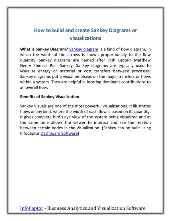
How to build and create Sankey Diagrams or visualizations What is Sankey Diagram? Sankey diagram is a kind of flow diagram, in which the width of the arrows is shown proportionally to the flow quantity. Sankey diagrams are named after Irish Captain Matthew Henry Phineas Riall Sankey. Sankey diagrams are typically used to visualize energy or material or cost transfers between processes. Sankey diagrams put a visual emphasis on the major transfers or flows within a system. They are helpful in locating dominant contributions to an overall flow. Benefits of Sankey Visualization Sankey Visuals are one of the most powerful visualizations. It illustrates flows of any kind, where the width of each flow is based on its quantity. It gives complete bird's eye view of the system being visualized and at the same time allows the viewer to interact and see the relation between certain nodes in the visualization. [Sankey can be built using InfoCaptor Dashboard Software] InfoCaptor - Business Analytics and Visualization Software
Consider the following pivot table The pivot table does a good job of showing how the salary is distributed between various departments and locations. The same table when represented as Sankey shows up like below InfoCaptor - Business Analytics and Visualization Software
The above sankey now forces you to view the left hand side as the Source and the right hand side as the destination. We will see that Sankey Diagrams add tremendous "Expressive Power" and your normal "boring" pivot tables become quite interesting. Problems with Sankey Sankey diagrams can be difficult, frustrating and time-consuming produce by hand. Until now, it was super frustrating to build sankey diagrams and various flows using flow charting or other specialized software. Just like other complicated hierarchical charts like Circle Pack, Sunburst, Tree Cluster/Dendograms, InfoCaptor has incorporated Sankey as part of the visualization library. What this means is, any user can produce Sankey diagrams by simple drag and drop operations. The other problem with automated Sankey diagram software, you need to provide data in a special format, you need to clearly mark your from and to nodes. This is greatly simplified within InfoCaptor, all you need to do is provide atleast one dimension and you can generate a Sankey diagram. InfoCaptor will automatically detect any parent child relationship and incorporate them into the visualization. Not only that, if there was some problem with data, like Circular loops or Circular references where one child node points back to the parent, InfoCaptor will automatically detect those loops and mark them appropriately in the visualizations. When to use Sankey It is pre-dominantly used in visualizing Energy flow systems but you can use it to show budget data, Balance sheet visualization, Profit and Loss and most importantly within InfoCaptor you can add multiple dimensions to build a Sankey that resembles the Parallel coordinates diagram. With this much visualization power, there is no reason for InfoCaptor - Business Analytics and Visualization Software
Sankeys to be limitted just few niches like Energy and budget flow visuals. Energy input/output/losses Visualization Budget flow, how money flows from one department, through various fund categories, programs etc Visualize the boring Balance sheet/Profit loss statements Visualize GDP of a country Thermodynamics [Exergy] How to build Sankey Diagrams Other related visualizations | names Alluvial Diagram Grassmann diagram When there are only two levels in Sankey diagram, then it is very similar to the Chord Diagram Click Here to view the Sankey diagram examples Click Here to Download Dashboard and Visualization Software InfoCaptor - Business Analytics and Visualization Software
Energy Flow Sankey InfoCaptor - Business Analytics and Visualization Software
Presidents of USA - Their birth signs InfoCaptor - Business Analytics and Visualization Software
Data Breaches -Hacking InfoCaptor - Business Analytics and Visualization Software
Click Here to Download Dashboard and Visualization Software InfoCaptor - Business Analytics and Visualization Software