Download
1 / 10
200 likes | 1.07k Views
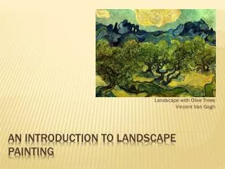
A Landscape Painting. My Notes on Color Painting By Iskandar Syed PHY214. “The painter is not dealing with light but with paints”. Paints are subtractive when they are mixed because they deal with pigments and not colored light

E N D
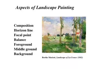
A Landscape Painting My Notes on Color Painting By IskandarSyed PHY214
“The painter is not dealing with light but with paints” • Paints are subtractive when they are mixed because they deal with pigments and not colored light • Each color has different physical and psychological properties that through a composition can be exposed brilliantly • The three main physical properties are: • Opaque • Translucent • Transparency
Hue, Saturation and Brightness • The Ostwald color system uses three different focuses in distinguishing its color system • Dominant wavelength: The highest visible wavelength frequency in the spectrum is the dominant • Purity: is also commonly referred to as saturation but in the OCS is primarily dealing with isolating the color as an individual hue unsaturated • Luminosity: can also be brightness however luminosity is directly referring to the sensitivities of colors reflective properties
Mixing Colors In this painting, I used five individual hues including Titanium white. Those pigments are: • Cadmium Yellow Extra-Deep • Cobalt Green Deep • Carmin Lake Extra • Cobalt blue turquoise • Titanium White All of these pigments are opaque however manipulated properly these pigments can act as either translucent or transparent.
The painting’s underpainting Blue Turquoise Blue Red Blue Green Green Yellow green Dark Blue Green Green Black Magenta Carmin Lake / Red Yellow Brown Yellow
Technique and Process These three general steps are taken to correspond between the process of laying down colors and in composing the painting, in terms of a background, middle ground and foreground. • In order to retain pure colors I had to systematically choose which colors were painted down initially in the composition as opaque colors • After the initial opaque colors were set, the next step was to lay a secondary color manipulating its translucent properties • The third and final step is to glaze over the painting using made greys, made blacks and greens.
Color Mixes • A list of saturated colors that I have mixed for this painting are: • Magenta = 1:Carmin Lake + 2:Cobalt Blue Turquoise • Yellow Green = ½:Cadmium Yellow + 1:Cobalt Green • Yellow Brown = 2:Cadmium Yellow + ½:Carmin Lake + 1Cobalt Green • Brown Dull = 1:Magenta + 1:Cadmium Yellow • Dark Blue Green = ½:Magenta + 1:Cobalt Green • Brown Black = 1:Magenta + ½:Cadmium Yellow + ½:Green • A list of unsaturated mixes are: • Grey Green = ½:Titanium White + ½:Brown Dull • Grey Blue = ½:Titanium White + ½:Cobalt Blue Turquoise + ¼:Cobalt Green • Grey Magenta = ½:Titanium White + ½:Magenta + ¼:Cadmium Yellow
The painting in four quadrants This portion of the painting is a play on saturation and unsaturated pigments. The effect this makes can be seen in the lower bricks and upper bricks where “light” is hitting it. Unsaturated This sky consists of an under painting of Blue Turquoise, Titanium white and in the north west area some Carmin Lake. The atmosphere was glazed on with green which reflect the trees. The tips of the crumbling wall is highlighted with made greys. Saturated
The physics behind the colors of the bricks goes back to the Ostwald color system. The Red in the bricks are a dominant wavelength, which weighs down the painting. By using a neutralizer like a made grey, it created a kind of transparent filter over it which dulled the intense red – Magenta mix. The lower portions of the painting consists mainly of saturated colors. In order to balance this portion with the upper portion I used made greys. I used Magenta grey on the edge of the bricks and Green grey on the walkway.
Conclusion • Pure colors are saturated hues and when mixed the results are subtractive color mixing • Unsaturated colors are positive colors mixed with white • Dominant wavelengths correspond to the human’s eye sensitivity to color and this in return affects the viewer in a psychological and physical way • Made Grey’s are a useful color in blending portions of unsaturated and saturated areas of a painting • It is useful to note that when mixing pigments, try to only mix two colors at a time if not the result is a dull color.