Key Elements of Responsive Web Design
The responsive web design is a way of building a website that responds to the size of the browser accordingly. Rather than building a unique mobile version developers build a flexible design that changes dynamically to the actual width of the browser. Here you come to know the major key elements of responsive web design. https://www.geekinformatic.com/html5-websites/<br>

Key Elements of Responsive Web Design
E N D
Presentation Transcript
Responsive Web Design Elements
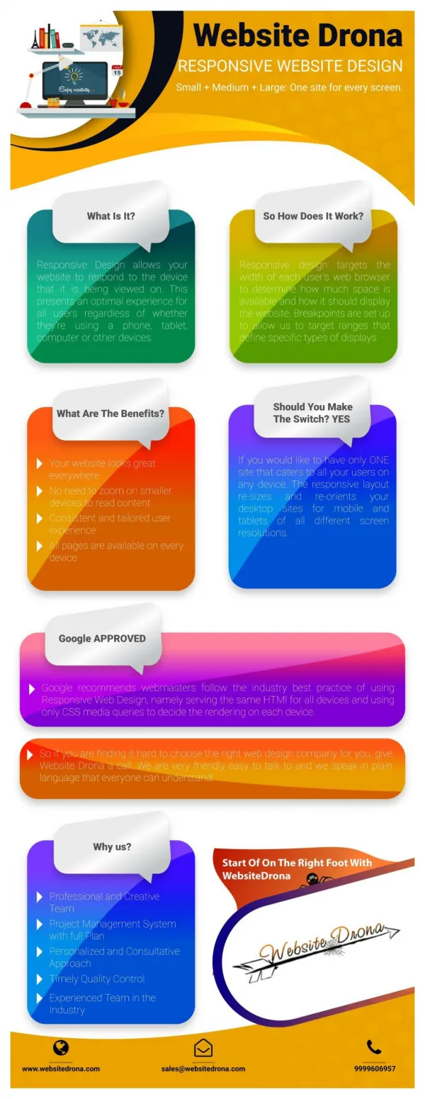
Responsive Web Design is a way of building a website that responds to the size of the browser. Rather than building a unique mobile version developers build a flexible design that changes dynamically to the actual width of the browser.
Element 1: Navigation The site navigation is laid out in different locations depending on the width of the browser. For mobile users the navigation is top and centered (for easy access) for other widths it is either top right corner or below the logo. Responsive design shouldn’t scale the navigation to huge proportions on a large screen device.
Element 2: Columns A responsive website will scale headlines, images, text and ads in the right proportions while maintaining the integrity of the design, both when the website is first served, and when the browser is re-sized.
Element 3: Calls to action Good responsive design considers the critical calls to action that should be displayed prominently regardless of the screen or browser size.
Element 4: Branding Simply scaling or moving elements around on a flexible grid, doesn’t address the issue of sites losing their unique branding when building a mobile version. Building a responsive design requires designing for three or four widths. A designer’s eye is important to make sure that the design reflects the brand at all sizes.
Element 5: Padding and White Space This ensures the items on the page have the appropriate information hierarchy. Nothing feels too crowded or misaligned.
Contact us... PHONE: +1 323 744 6678 EMAIL: INFO@GEEKINFORMATIC.COM WEBSITE: WWW.GEEKINFORMATIC.COM


