Download
1 / 3
30 likes | 43 Views
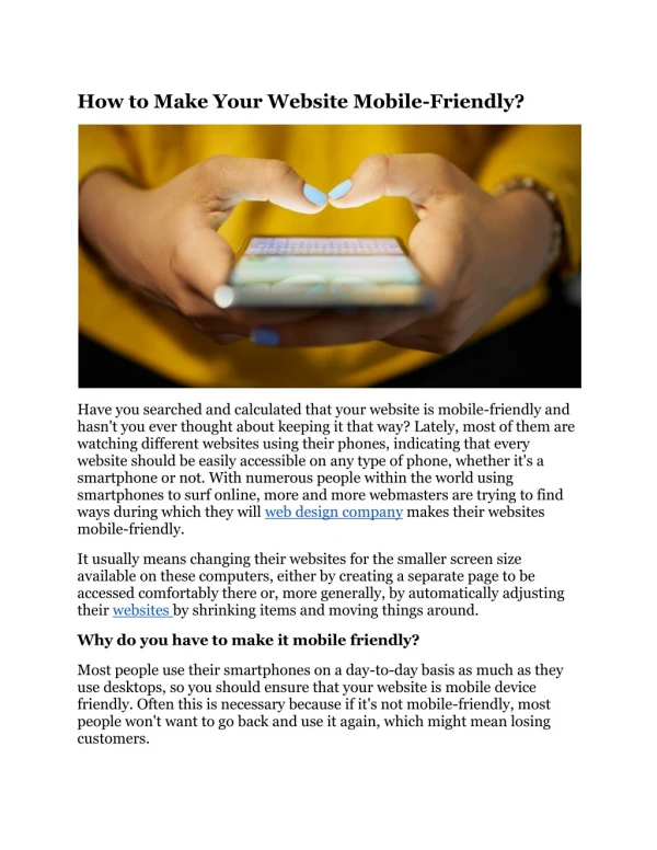
Want your website visible in Googleu2019s search engine ranking? Then connect with digital marketing agency for mobile-friendly website. Hire digital marketer for make critical part easy for you.

E N D
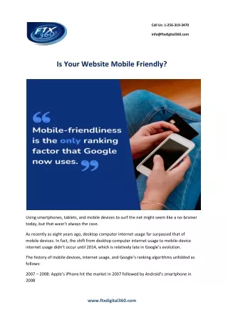
Call Us: 1-256-319-3470 info@ftxdigital360.com Is Your Website Mobile Friendly? Using smartphones, tablets, and mobile devices to surf the net might seem like a no-brainer today, but that wasn’t always the case. As recently as eight years ago, desktop computer internet usage far surpassed that of mobile devices. In fact, the shift from desktop computer internet usage to mobile-device internet usage didn’t occur until 2014, which is relatively late in Google’s evolution. The history of mobile devices, internet usage, and Google’s ranking algorithms unfolded as follows: 2007 –2008: Apple’s iPhone hit the market in 2007 followed by Android’s smartphone in 2008 www.ftxdigital360.com
Call Us: 1-256-319-3470 info@ftxdigital360.com 2009 – 2011: Google developed and distributed techniques and guidelines for web developers to help them build mobile-friendly sites that are discoverable. 2012 – 2014: Google introduced, adjusted, and refined its algorithms, updated its ranking factors, and provided webmasters with a new Mobile Usability Tool. 2015 – Present: Google shifted from only indexing desktop computer internet websites to evaluating website mobile friendliness as the sole ranking factor. Today, mobile friendliness is the only ranking factor that Google now uses. WHY SHOULD YOUR WEBSITE BE MOBILE FRIENDLY? As crucial as it is to please Google by adhering to their algorithmic changes, improving your SEO tactics, and following their guidelines so that Google bots crawl and promote your website, it’s far more important to please your website visitors. If the history of Google and mobile-friendliness that we laid out in the introduction of this article proved anything, it’s that today’s consumers prefer to use their mobile devices to surf the net, browse websites, and even buy products. Given the evolving consumer demand for mobile-friendly sites, over time Google developed web guidelines to accommodate mobile users, which culminated in a new mobile-only indexing system. A mobile-friendly website will not only get crawled, indexed, and ranked by Google, but it will also ensure that consumers can visit your site from their mobile devices, encounter an excellent user interface, and have a wonderful experience while navigating from one web page to the next. When visitors have a positive experience on your website using their mobile devices, they will be far more likely to become repeat visitors, first-time customers, social media followers, and even lifelong loyal customers. Put simply, offering a mobile-friendly website will help you gain the appreciation and loyalty of mobile device users who quickly convert into customers. Additionally, mobile-friendly websites also ensure: ● Higher page views per visit ● Lower bounce rates ● Increased customer loyalty ● Elevated search engine rankings www.ftxdigital360.com
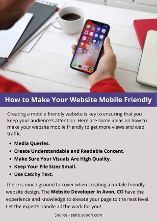
Call Us: 1-256-319-3470 info@ftxdigital360.com UNDERSTAND THE DIFFERENT DEVICES Not all handheld internet-accessible devices are created equal. In fact, Google categorizes devices differently depending on their size and uses. The primary reason for offering a mobile-friendly version of your website is to ensure that visitors are able to read your content and properly interact with your brand. Due to the fact that smartphone screens are remarkably smaller than desktop and laptop computer screens, redesigning your web content so that it displays correctly on mobile devices is imperative. You don’t want visitors “pinching” and “pulling” your web content whenever they view your website from their mobile device. Ideally, when a visitor lands on your website, they will encounter easy-to-read fonts, an accessible navigation toolbar, and a clean presentation overall. Here are the four main device types and the breakdown of how Google regards each of them. 1.Mobile Devices 2.Tablets 3.Multimedia Phones 4.Feature Phones CHECKLIST OF MOBILE-FRIENDLY FEATURES Creating a website that displays beautifully on all mobile devices might not seem easy, but it can be done. You will need to configure your website for multiple devices, which will help Google and other search engines understand your site, as well as ensure that mobile users properly experience your website. There are three configuration techniques you can use to ensure your website will be mobile friendly. 1.Responsive Web Design 2.Dynamic Serving 3.Separate URLs Read Full Blog: www.ftxdigital360.com