Complete Guide to Mobile-Responsive Magento Development Services
Unlock the power of mobile commerce with Magento development services! Learn how to make your Magento website responsive for seamless customer experiences.

Complete Guide to Mobile-Responsive Magento Development Services
E N D
Presentation Transcript
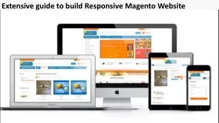
How to Make Your Magento Website Design Mobile Responsive? (Complete Guide) As of 2023, there are over 5.3 billion internet users worldwide. Out of which 69.13% of the total traffic is from mobile devices. Today, most buyers prefer online shopping using mobile phones. As a Magento website owner, you're losing a large percentage of your customer base if you're still not offering a mobile responsive design. Thus, making your Magento website mobile responsive becomes a necessity. This article is a complete guide on how you can make your Magento website design mobile responsive with Magento development services. So, without any delay, let's dive in! What Is A Responsive Design? In simple terms, a responsive design is a website layout or a special approach where websites are designed to craft an excellent viewing experience for mobile device owners. Responsive website design promotes easy navigation, hassle-free reading, browsing products, scrolling, and purchasing. Responsive web design, or RWD, includes coding and designing a Magento website to adapt quickly to desktop and mobile versions. Potential benefits of responsive website design in Magento are: ● Enhanced sales and better conversions ● The Adobe commerce website looks great on all devices ● No need to build a different website for various devices
● ● Promotes ease of shopping and satisfies customers Increase visitor time Steps To Create A Responsive Mobile Theme Here is the step-by-step process to create a Responsive Mobile Theme: 1. Start the process with a basic theme such as Luma or Magento Blank theme. 2. Personalize the theme so that it blends well with your brand and overall PWA for Magento 2 website design. 3. To make your theme responsive to various devices and screen sizes like mobiles, laptops, PCs and more, use JavaScript and CSS. 4. You can test the theme on devices like mobile phones, tablets, monitors and others to check if they work properly. 5. Make necessary adjustments to ensure all themes function and look as expected. 6. Optimize images and minimize codes for theme optimization for performance and overall speed. 7. Keep testing and updating your Hyva theme extensions so that they work correctly with Magento's latest version and all devices. Best Practices For Magento Responsive Design Some of the best practices for Magento responsive design include: ● Keep a mobile-first approach while taking Magento development services for your Magento website. You can later scale up to large screens like tablets and laptops. Set up breakpoints that control the elements on your Magento store, which are displayed on various devices. To improve the website's responsiveness, use different APIs and various services. Take the help of the Magento community and experienced developers. Adobe developer resources are vital to building a user-friendly and visually appealing online store. ● ● ● ● Wrapping Up Today, more than half of your potential customers love to visit your website using their mobile phones. Thus, relying on Magento development services from experts is important to meet your customers expectations and offer them an excellent experience. By following the step-by-step
process to make your Magento website design mobile responsive, you can enjoy hassle-free functioning. Contact Us Company Name: Elsner Technologies Pvt Ltd. Address: 3405 Pennsylvania Common, Fremont, CA 94536 USA Phone(s) : 16075244040 Email id: sales@elsner.com Website: https://store.elsner.com/