Download
1 / 42
420 likes | 892 Views
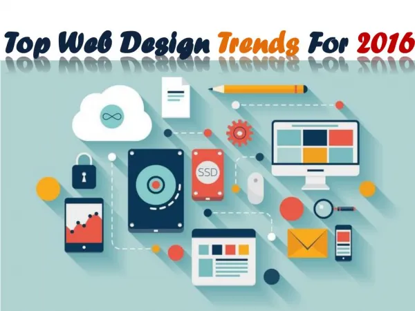
Parallax, responsive, card, and flat design are only a few modern Web Design trends that have taken the web by storm. I have listed 40 in this article, though I’m quite certain there’s more. So if you guys have spotted any modern trends that I’ve missed, just holla in the comments. View article

E N D
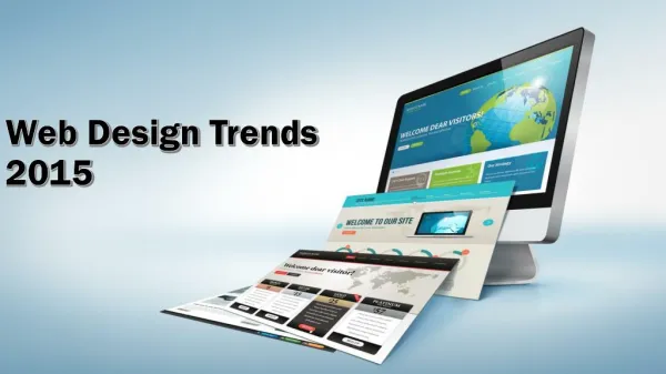
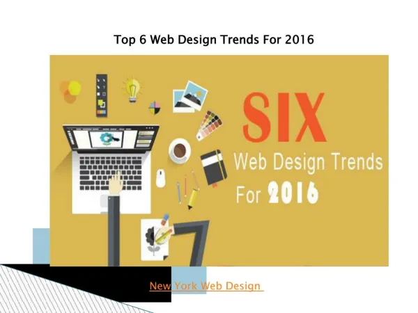
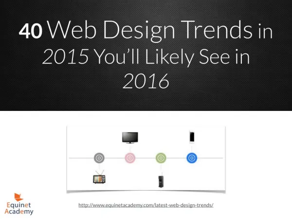
40Web Design Trends in 2015 You’ll Likely See in 2016 http://www.equinetacademy.com/latest-web-design-trends/
Flat Design In the world of tech, there seems to be a trend where thick bulky gadgets evolve into thin flat devices. I see the same trend happening in Web and Graphic Design. More and more sites are shifting away from box shadows, glossy buttons and adopting flat boxes and flat buttons. Even Microsoft has made this shift in Windows 8. http://www.equinetacademy.com/latest-web-design-trends/
Responsive Design (Mobile First) Users are increasingly viewing web pages on their mobile devices, and it doesn’t get more frustrating than when they have to zoom in to enlarge text and scroll both horizontally and vertically when browsing through a site. ? Responsive design solves these problems by making use of media queries, fluid grids, and fluid images. Basically the screen elements resize themselves depending on the screen resolution or browser size like the example below. http://www.equinetacademy.com/latest-web-design-trends/
Screen Estate Maximisation Another noticeable trend is wide or stretched layouts. Wide or stretched layouts make better use of screen estate compared to boxed layouts. http://www.equinetacademy.com/latest-web-design-trends/
Grid/Tiled Layouts Grid and tiled layouts can be applied to blogrolls, portfolios, and bulletin board sections. http://www.equinetacademy.com/latest-web-design-trends/
Cards Cards have been used as a means to quickly convey and disseminate information for centuries. Playing cards were invented in Imperial China tracing back to as early as the 9th century. Identity cards, credit cards, and membership cards have also become an integral part of our lives. ? There are countless reasons why cards will be the future of the web. Even social networking giants Facebook, Twitter, and Pinterest have well adapted card styles to their user interfaces. http://www.equinetacademy.com/latest-web-design-trends/
Borderless Borderless text boxes, like the example below, improves the reading flow and gives web pages a clean look. Too many borders and box sections on the other hand can make a web page look cluttered. http://www.equinetacademy.com/latest-web-design-trends/
Spaceless Here’s another trend in modern web design I’ve been observing. The complete absence of any padding or margin between web page elements. http://www.equinetacademy.com/latest-web-design-trends/
Storytelling Just as traditional billboard advertisements have evolved into creative attention-grabbing displays, websites have also evolved quickly over the past decade from merely online brochures to sophisticated storytelling visual experiences. http://www.equinetacademy.com/latest-web-design-trends/
Split Screen Layouts Another interesting modern web design trend are vertical split screen layouts, where the screen is split into two halves and displays separate content on both sides. http://www.equinetacademy.com/latest-web-design-trends/
The One-Pager The One-Pager design displays the entire site in one page instead of splitting content into multiple pages. It usually comes with a fixed navigational menu with its links taking users to different sections of the page instead of loading an entirely new page. http://www.equinetacademy.com/latest-web-design-trends/
Hover Effects Hover effects can improve user interactivity on desktops. However, hover works well on desktop versions but not on touch devices. Therefore there has to be clear visual cues that touching a web page element such as a button on a touch device will activate an effect or show/hide important details. http://www.equinetacademy.com/latest-web-design-trends/
GIF Animations No doubt GIF animations have been around for a very long time. Even in modern web design, a tiny touch of these animations can make your content more engaging. Just don’t go overboard. http://www.equinetacademy.com/latest-web-design-trends/
Parallax Design First what is parallax design? You know those 2D games like Pokemon where the background moves at a slower rate than the character? Apply this concept to Web Design and you get parallax design. ? Though parallax design may look cool and give your site the wow-factor, is it good or bad for SEO? Lindsay Kolowich explains this controversy on Hubspot. The conclusion is that the parallax design code itself doesn’t cause any SEO issues, but rather incorrect Web Design practices such as putting a ton of content on a single page. http://www.equinetacademy.com/latest-web-design-trends/
Animated Sliders Animated sliders give your site the wow-factor but the downside is that it may slow your site down. To decrease page loading time, save your images for web and optimise them further by removing junk metadata and unnecessary colour profiles with a software like ImageOptim. http://www.equinetacademy.com/latest-web-design-trends/
Page Preloading Effect These fancy page preloading effects appear on some sites while the user is waiting for a page to load. It’s a little something to entertain impatient users and reassure users who think their browser may have jammed that the page is still loading. http://www.equinetacademy.com/latest-web-design-trends/
Fade-In, Slide-In, & Pop-Up Content With Page Scrolling What better way to encourage visitors to scroll further down than to use fade-in, slide-in or zoom- out effects on content as they scroll down your page? ? I know I tend to want to scroll further down to see what more effects are in store. I can’t really explain the rationale behind this, but it’s like a subconscious thought that I’ve caused these effects as I scroll down my mouse wheel. http://www.equinetacademy.com/latest-web-design-trends/
Monochromatic Colours Monochromatic colours are all the colours (tints, tones, and shades) of a single hue. When you use only monochromatic colours on a web page, it shows you mean business as your written content comes into focus without all the distractions created by multiple hues. http://www.equinetacademy.com/latest-web-design-trends/
Multivariate Colours Some sites though, are more suited using 4 – 7 or more different colours. I’m referring to childcare centres, party supplies, and restaurant sites. http://www.equinetacademy.com/latest-web-design-trends/
Transparent & Translucent Web Page Elements Transparent buttons and translucent overlays coming together is the new contemporary look for modern websites. http://www.equinetacademy.com/latest-web-design-trends/
Compact Navigation Menus Give a user too many choices and he may make none. This may seem a little exaggerated but check out this study by kissmetrics. ? Not only does the above theory apply but limiting what you put on your main navigation menu can give the user a faster and clearer overview of what your site is all about. http://www.equinetacademy.com/latest-web-design-trends/
Mega Menus If you really have to display a dozen or more links on your navigation menu, one way to reduce clutter and maintain a cleaner look is by creating mega menus. Lynda.com and MarketingProfs does a great job on that. http://www.equinetacademy.com/latest-web-design-trends/
Hide-able & Expandable Navigation Menus Talk about decluttering your site and maximising screen estate, hide-able and expandable navigation menus do the job just fine. http://www.equinetacademy.com/latest-web-design-trends/
Right/Left Sidebar Main Navigation Menus I’ve seen this trend mainly on smaller sites such as personal blogs, photography-themed, and F&B- themed sites. http://www.equinetacademy.com/latest-web-design-trends/
Sticky/Fixed Navigation Menu One can argue that a sticky navigation menu can reduce screen estate and shrink the amount of space content can be displayed on screen. ? However fixed navigation menus can be rather useful in maintaining visitor duration on-site, especially on long pages where the user doesn’t have to scroll all the way up just to view the navigation menu. ? Then again, there are other web design tricks one can use like back-to-top buttons (in my next point) to take one back up to the top menu in an instant. http://www.equinetacademy.com/latest-web-design-trends/
Scroll-Down & Back-To-Top Arrows Back-to-top arrow buttons, usually located on the bottom right of the screen, are a convenient way for users to scroll back up to the top of the page. Just remember to make it a little more visible in case users might miss it. http://www.equinetacademy.com/latest-web-design-trends/
Scroll-Down & Back-To-Top Arrows A good time to use click-to-scroll-down arrow buttons is when your the first content section of your landing page takes up the whole screen, before scrolling down the page. We refer to the content section as “above the fold of the page”. ? Some users may not know that they can scroll down the page to view more content. So this button comes in handy. http://www.equinetacademy.com/latest-web-design-trends/
One-Page Scrolling The one-page scrolling navigation menu comes in handy for sites that include a whole lot of information on one page. The content on the page is split into different sections and clicking on the navigation menu links will take the user directly to the respective content sections. http://www.equinetacademy.com/latest-web-design-trends/
Infinite/Endless Scrolling This trend has been around for some time now, especially in the social sphere. Tumblr blogs, Pinterest, Your Facebook and Twitter news feed. http://www.equinetacademy.com/latest-web-design-trends/
Rich Media While websites have become more modern-looking, online ads have also become more creative and offer more ways to increase interaction between an audience and an ad. The digital advertising term for these creative interactive ads is known as rich media. ? There are several types of creative rich media including Expanding, Floating/Interstitial, In-page with floating, Multi-directional Expanding (MDE), Video, VPAID, and more listed and defined here. ? A modern-looking website filled with flashy GIF ad banners will kill the whole look, aesthetically speaking, whereas a rich media ad will blend well with a modern website. http://www.equinetacademy.com/latest-web-design-trends/
360-Degree Virtual Tours A cool interactive feature to include in real estate, e-commerce, and travel sites. http://www.equinetacademy.com/latest-web-design-trends/
Video/Motion Backgrounds No doubt video is becoming a more and more popular as a means of conveying information. See why video is the future of online marketing. http://www.equinetacademy.com/latest-web-design-trends/
Large High Quality Custom Photography Stock photography, especially those that are overly-used around the web, can make visitors lose trust in your site. ? Including your own high quality custom photography adds a personal touch to your brand and website, increasing trust and possibly conversions. http://www.equinetacademy.com/latest-web-design-trends/
Full-Width Imagery http://www.equinetacademy.com/latest-web-design-trends/
Box-Less Images Box-less or border-free images make your page look more simple and uncomplicated. http://www.equinetacademy.com/latest-web-design-trends/
Flat & Slender Icons Sometimes instead of using stock or custom photography, we can use icons to give a clean and simple look. http://www.equinetacademy.com/latest-web-design-trends/
Circled, Hexagon, and Irregular-Shaped Images Squarish images can cut it, but too much of it can get a little boring. How about spicing your images up with circled, hexagon and other irregular shapes using CSS? See this guide on how to make rounded images with CSS. http://www.equinetacademy.com/latest-web-design-trends/
Varied Typography Other than for aesthetic design purposes, Mix and Match or Varied Typography is an effective way to prompt readers to pay more attention to specific words in any given paragraph. ? http://www.equinetacademy.com/latest-web-design-trends/
Large Typography Large typography certainly draws the attention of the reader, conveying that the text is important and is worth the time to digest. http://www.equinetacademy.com/latest-web-design-trends/
Thin & Light Fonts Hairline fonts certainly give a cleaner look and feel. http://www.equinetacademy.com/latest-web-design-trends/
White Text on Dark Backgrounds White text on dark backgrounds not only looks more meticulous, but also forces the reader to focus more on the text instead of the background. http://www.equinetacademy.com/latest-web-design-trends/
Follow Us On: https://twitter.com/EquinetAcademy https://www.facebook.com/equinetacademysingapore https://www.linkedin.com/company/equinet-academy Learn Digital Marketing and Design at ? www.EquinetAcademy.com http://www.equinetacademy.com/latest-web-design-trends/