Download
1 / 4
40 likes | 61 Views
There is a distinctively fine line between a decent and terrible website. Terrible here is not used to mean ugly in appearance or comically incompetent pages from the 90s. This content talks about those business platforms that don't seem to have a problem when viewed in passing. However, their mistakes severely impair your chances of engaging customers and lead to decreased sales and user satisfaction. As a prominent web development company study indicates, it is a vital issue.

E N D
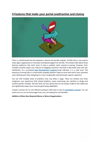
4 Features that make your portal unattractive and clumsy There is a distinctively fine line between a decent and terrible website. Terrible here is not used to mean ugly in appearance or comically incompetent pages from the 90s. This content talks about those business platforms that don't seem to have a problem when viewed in passing. However, their mistakes severely impair your chances of engaging customers and lead to decreased sales and user satisfaction. As a prominent web development company study indicates, it is a vital issue. The presence of wrong links or a technically incapable platform leads to more than half of your potential users ditching your links and going to a more recognisable and technically superior opponent. You can find multiple kinds of problems that may affect a page. These are divided into three categories: user experience (UX) related problems, issues concerning user interface or design and content-specific mistakes. We will check out four points that are not always visible to the naked eye but significantly impact your revenue-generating capabilities. Coweso is known for its cost-effective pricing to offer best-in-class IT consultancy services. You can reach out to us on our home page if you, too, are looking for such benefits. Addition of More than Required Menus or Menu Categorisations
It has been proved many times with the help of multiple studies and surveys from web development companies in Australia that the human brain doesn't like excessive options and tends to get confused & vulnerable while encountering numerous alternatives. In such a scenario, it becomes challenging. You surely do not want such confusion to happen while integrating the menu options on your website. A visitor can feel overwhelmed and feel unable to adjust to the more than-needed additions you have made on your menu page. Furthermore, your client may also get confused with too many drop-down options under each heading, making them dizzy and unable to check the information they need. Makes it Hard to Find Relevant Details Similar to the scenario where multiple alternatives for a single page become too distracting for the customer, a website also does not perform well when there are not enough options. In such a situation, conversions are hard to get since customers have to waste a huge chunk of their precious time finding relevant information. Every high-ranking website takes a limited and acceptable time to fetch your requests, increasing consumer expectations from every business page. However, if a
platform does not display menus, put content in locations no one bothers to find or allow the customer to get details after numerous clicks, all of this will create unanimous confusion and hatred among the masses. All these issues might lead the audience to stop visiting your site and instead go to your competitors' portal. For more help in this regard, contact Coweso - the top web development company in Brisbane. Not Showcasing a Clear Vision or Goal of your Website A consumer can clearly grasp your goal as an organisation while going to your platform and also guess the potential attributes you will provide. A standard web page adhering to SEO guidelines is rich with quality content, enticing photos and banners. However, the following are the features of a worthless or directionless portal: Lots of keywords, jargon or slogans that do not add any meaning to the portal Lack of a visible script or description results in an additional effort by a customer to find its whereabouts No logical disclaimer or further information on the enticing deals given by the website Multiple pieces of research conclude that 0.05 seconds (50 milliseconds) is the approximate time the audience takes to develop an initial impression of your site, which is then used to continue browsing or leave the page according to the situation. Therefore, it is an organisation's duty to catch the user's attention in those 0.05 seconds and provide something meaningful to them to stay on. We make our Mobile App Development Services stand apart by adding enough creativity to their design. For more queries, go to the Coweso webpage. Providing Service 'X' but Creating Impression of Service 'Y'
Many portals want to create a lasting impression of their services with the assistance of a web development company in Sydney. However, the said impression doesn't merge well with the original attributes of the website. The errors committed by these portals can be any of the following: Pushing the customer away and alienating them with a heavily technical and tough writing Writing content that sounds machine-generated without the input of an actual human Compiling a copy that puts the consumer down by humiliating or insulting them Writing text that is in a false tone and doesn't describe the topic properly Giving unfathomable or obsolete references no one would understand Glaring tonal inconsistencies in every related page and upload Lack of thematical harmony between promotions, social media channels, chatbots and websites. Like a customer or sales representative, your web page represents your venture. If your page can't offer and showcase its internal content adequately, it will significantly lose consumers.