Download
1 / 4
40 likes | 43 Views
For the best viewing experience on a variety of devices, responsive web design offers easy reading and navigation with the least amount of resizing, panning, and scrolling . RWD also makes content more easily accessible to technologies used for content crawling, which improves the efficacy of search engine optimization (SEO).

E N D
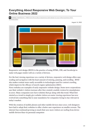
Everything About Responsive Web Design; To Your Online Business 2022 medium.com/@amrit_79682/everything-about-responsive-web-design-to-your-online-business-2022- 8a74e8e3280e August 14, 2022 Responsive web design (RWD) is the practice of using HTML, CSS, and JavaScript to make web pages render well on a variety of devices. For the best viewing experience on a variety of devices, responsive web design offers easy reading and navigation with the least amount of resizing, panning, and scrolling . RWD also makes content more easily accessible to technologies used for content crawling, which improves the efficacy of search engine optimization (SEO). News websites are examples of early responsive website design. Some news corporations saw their website’s visitors increase after they created a mobile version for smartphones in 2010. Many companies now have websites that go along with this trend. What first started as a trend to simply give website visitors an easier viewing experience has now evolved into something that is near-mandatory for companies trying to stay relevant in today’s market. With the creation of mobile phones and other mobile devices since 2010, web designers have had to adapt their websites to offer a better user experience on smaller screens. The internet has continued growing so much that now more visitors are surfing from device mobile devices than via personal computers 1/4
Until recently, many website designers included separate mobile sites for browsing from smartphones and other devices, but these websites rarely matched the look and feel of their desktop counterparts. Mobile browsers web designers created were limited compared to those designed for desktops and laptops. Hence, now many have started creating mobile responsive websites. What is Responsive Website Design? According to the responsive web design methodology, website design and development should adapt to user behavior and environment based on factors such as screen size, platform, and orientation. Three components make up the technique: a fluid grid, adaptable pictures, and media queries. The fluid grid creates a flexible layout that responds to the width of the browser window. The flexible images adjust to fit the size of the browser window without distorting their aspect ratio, while the media queries detect the resolution of the device and serve different styles accordingly. This allows for a single website that works well across all devices, from desktop computers to smartphones and tablets. Why is Responsive Web Design Important? With the growth of mobile devices, responsive web design has become increasingly important. A website that doesn’t respond to different screen sizes can be difficult to navigate on a small screen and can lead to a poor user experience. In addition, Google now uses mobile-friendliness as a ranking factor in its search results, so it’s important to have a responsive website if you want to rank high in search engine results pages. Principles of Responsive Web Design There are a few principles of making a responsive web design! Create Responsive and Not Adaptive There is big difference between both the designs. So focus on creating a responsive web design, since Adaptive web design takes more time to load. Use Vector Images Vector Images are different from other images. Using it in responsive websites will be beneficial. Since one can view the images easily on different screens with the same quality. Also, these types of images are lightweight. Keep The Website Minimalistic Having minimum elements on the website will be beneficial for the small screen users (mobile users). As the website is aligned in simple with appropriate whitespace. It helps to design easily for smaller screens. 2/4
Don’t Hide Contents When you build a website design, never hide the content under any element. It will affect the experience of mobile users. Since mobile responsive designs is built especially to give a quality experience to these users. Always Test Testing is important to know the performance of anything one has created. A/B testing is the best method to know the preview performance of the responsive website design. But for this, you need to have a backup design for the test. How Website Design Services are Helpful? Responsive website design has become mandatory and if your website lacks in this area, then remember, you are losing a big chunk of traffic and potential customers. However, if you are planning to build a responsive website, then you must hire an agency if you don’t have a strong and technically sound team for designing the website. There are various reasons to hire an agency as a website designing company in Delhi. The Complete Solution: The website designing agency provides the complete solution with a strong launch of the website. Which will set up your goal and objective as a priority with the website. Also, the functioning of the website will be smooth. You get other services as well. Removes Burden: Website is like a shop or office of the business, it will represent your company online. Hence it needs to be strong and impactful. However, an agency will remove this burden by creating a quality website for you. Cost Cutting: Managing the in-house team will be difficult and increases the budget over time. But an agency will bring you the cutting in the cost. The service you hire will be a whole, where everything will be involved, unlike the in-house team. These are the few benefits of hiring an agency as a website design company in Delhi. Types of Responsive Web Design There are three main types of responsive website design: fluid, modular, and responsive. Fluid Design 3/4
With the fluid design, the width and height of all elements on a web page are relative to the browser window’s width, making the layout flexible. This type of design is usually implemented with percentage-based widths and heights, which means that as the browser window changes size, the elements on the page will change size as well. Fluid design usually looks best when used on websites with a single-column layout. Modular Design Modular design is similar to fluid design in that it uses percentage-based widths and heights, but it takes things further by using modular units instead of relative sizes. This means that you can have different-sized modules on a page that will still be responsive to the browser window’s width. Modular design is usually best for websites with multiple column layouts. Responsive Design Responsive design is the most recent type of responsive web design, and it uses media queries and CSS3 to change the layout of a website based on the size of the browser window. Media queries are a feature of CSS3 that allows you to target different screen sizes and devices with specific style rules. This type of design is ideal for websites that need to look good on a variety of devices, including desktops, laptops, tablets, and smartphones. Conclusion Responsive website design is a complicated thing if not understood properly. So before moving forward about it, study and understand the responsive web designs properly. Check out the best examples to get an idea. Else, you can choose the website designing services, which will bring you the desired results. However, we hope that this blog has given you the solution you were looking for. Get the best to your audience through a responsive website. We hope this blog from a website designing company in Delhi has helped you to know the complete information on the importance of a mobile responsive website. 4/4