Responsive Design_ Creating Websites for Every Device
0 likes | 14 Views
Responsive design is a web design technique that ensures a website adapts its layout and functionality based on the device and screen size being used to view it. This means the website automatically adjusts its content, images, and structure to provide the best user experience regardless of whether someone is accessing it on a smartphone, tablet, laptop, or desktop.

Responsive Design_ Creating Websites for Every Device
E N D
Presentation Transcript
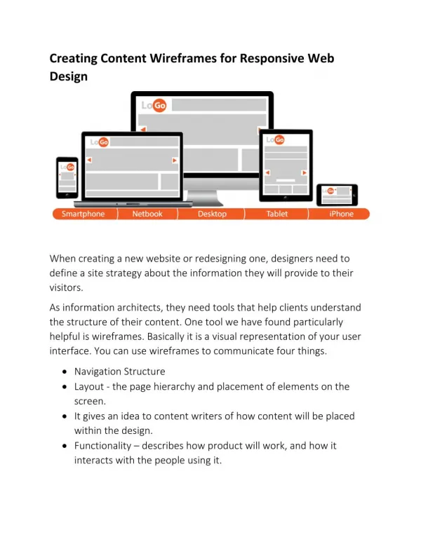
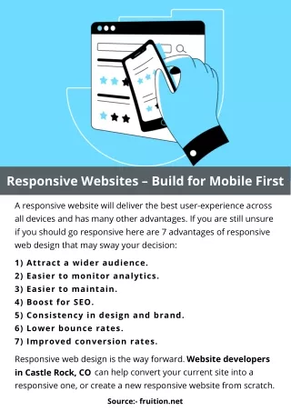
ResponsiveDesign:CreatingWebsitesforEveryDevice • Intoday'sdigitalage,wheresmartphones,tablets,laptops,anddesktopsareubiquitous,ensuringthatyourwebsitelooksgreatandfunctionswelloneverydeviceiscrucial.Thisiswhereresponsivewebdesigncomesintoplay—adesignapproachthatallowswebpagestorendercorrectlyonvariousscreensizesanddevices.Let'sdelveintowhatresponsivedesignis,whyit'sessential,andhowitcanbenefitbothusersandbusinesses. • WhatisResponsiveDesign? • Responsivedesignisawebdesigntechniquethatensuresawebsiteadaptsitslayoutandfunctionalitybasedonthedeviceandscreensizebeingusedtoviewit.Thismeansthewebsiteautomaticallyadjustsitscontent,images,andstructuretoprovidethebestuserexperienceregardlessofwhethersomeoneisaccessingitonasmartphone,tablet,laptop,ordesktop. • WhyisResponsiveDesignImportant? • EnhancedUserExperience:Usersexpectseamlessbrowsingexperiences,regardlessofthedevicetheyuse.Responsivedesignensuresthatyourwebsitelookspolishedandfunctionswellonanyscreensize,reducingbounceratesandkeepingvisitorsengaged. • SEOBenefits:SearchengineslikeGoogleprioritizemobile-friendlywebsitesintheirsearchresults.Havingaresponsivedesigncanimproveyourwebsite'sSEO • performanceandvisibility,leadingtoincreasedtrafficandconversions. • Cost-Effectiveness:Maintainingasingleresponsivewebsiteismorecost-effectivethan • managingseparatedesktopandmobileversions.Itreducesdevelopmenttimeandongoingmaintenanceefforts. • Future-Proofing:Asnewdeviceswithvaryingscreensizesandresolutionsemerge, • responsivedesignensuresyourwebsiteremainscompatibleandaccessiblewithoutneedingmajoroverhauls. • PrinciplesofResponsiveDesign • FluidGridLayouts:Designingusingrelativeunitslikepercentagesratherthanfixedunitslikepixelsallowselementstoresizeproportionallytothescreensize. • FlexibleImages:UsingCSStocontrolthesizeofimagesbasedontheviewportensuresimagesremainsharpandappropriatelysizedacrossdevices. • MediaQueries:Theseallowyoutoapplyspecificstylesbasedondevicecharacteristics • suchasscreenwidth,orientation,andresolution,enablingatailoreduserexperience. • BestPracticesforImplementingResponsiveDesign
Mobile-FirstApproach:Startdesigningforthesmallestscreensizeandgraduallyenhancethedesignforlargerscreens.Thisensuresafocuseduserexperienceonmobiledevices.Mobile-FirstApproach:Startdesigningforthesmallestscreensizeandgraduallyenhancethedesignforlargerscreens.Thisensuresafocuseduserexperienceonmobiledevices. PerformanceOptimization:Minimizefilesizes,useefficientcodingpractices,andoptimizeimagestoensurefastloadingtimesacrossalldevices. TestingAcrossDevices:Regularlytestyourwebsiteacrossvariousdevicesand browserstoidentifyandfixanycompatibilityissues. ContentPrioritization:Prioritizecontentbasedonimportanceanduserneeds.Ensure keyinformationiseasilyaccessibleonsmallerscreenswithoutoverwhelminguserswithexcessiveinformation. Conclusion Responsivedesignisn'tjustatrend;it'sanecessityintoday'sdigitallandscape.Byembracingresponsivedesignprinciples,businessescancreatewebsitesthatprovideconsistentandoptimaluserexperiencesacrossalldevices.ThisapproachnotonlymeetsuserexpectationsbutalsocontributestoimprovedSEOperformance,reducedbouncerates,andultimately,increasedconversions.Astechnologycontinuestoevolve,responsivedesignremainsacornerstoneofsuccessfulwebdevelopment,ensuringyourwebsiteisreadyforeverydeviceyouraudienceuses. Byprioritizingresponsivedesign,you'renotonlyfuture-proofingyourwebsitebutalsoensuringitstandsoutinacompetitiveonlineworldwhereuserexperiencereignssupreme.So,whetheryouraudienceisbrowsingonasmartphoneduringtheircommuteorusingadesktopattheiroffice,responsivedesignensurestheyhaveaseamlessandenjoyableexperienceinteractingwithyourbrandonline.