WHAT IS RESPONSIVE WEB DESIGN HOW TO TEST IT
40 likes | 90 Views
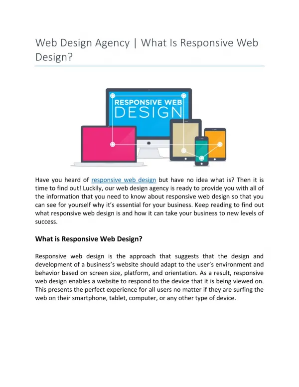
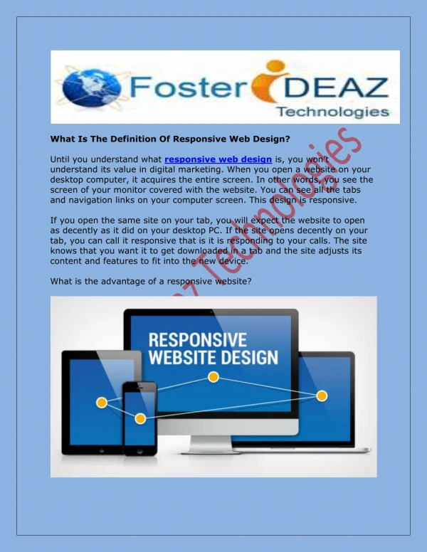
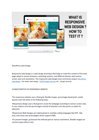
Responsive web design is a web design technique that helps to make the content of the web page adapt to various browsers, operating systems, and different devices with various screen sizes and resolutions.

WHAT IS RESPONSIVE WEB DESIGN HOW TO TEST IT
E N D
Presentation Transcript
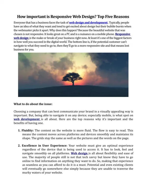
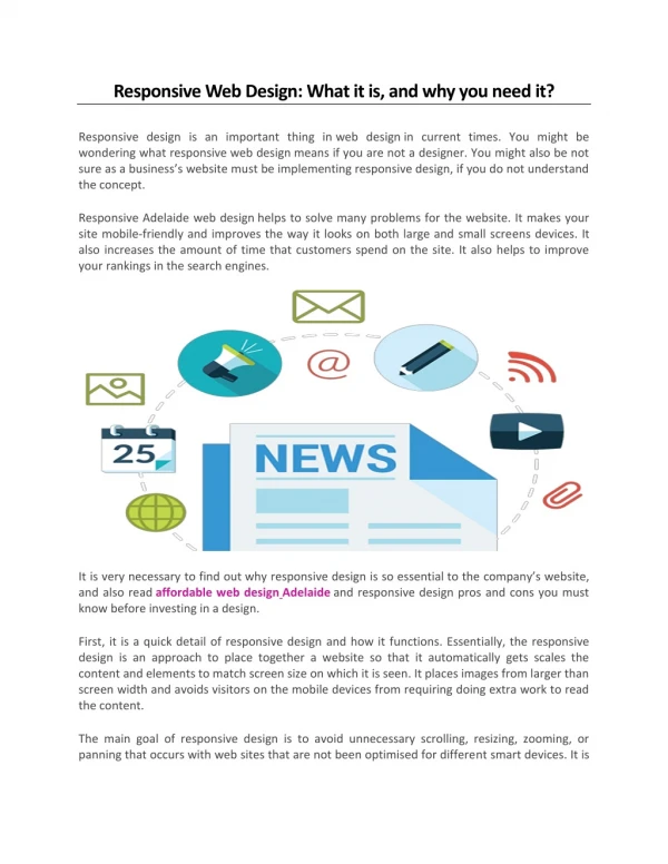
WordPress web Design Responsive web design is a web design technique that helps to make the content of the web page adapt to various browsers, operating systems, and different devices with various screen sizes and resolutions. The responsive web design most commonly using in WordPress web design , File maker web design, UI/UX design services, etc… design services. CHARACTERISTICS OF RESPONSIVE WEBSITE: The responsive website uses a fluid grid, flexible images, percentage-based grids, media queries with CSS styles in the following ways: •Responsive design uses a fluid grid to resize the webpage according to various screen sizes. It uses relative units like percentages instead of absolute units like points or pixels for elements. •Responsive Web Designs are implemented in multiple coding languages like PHP, .Net, Java, and many new technologies which support RWD. •To prevent images, go beyond the defined grid on various resolutions, flexible images are resized using relative units.
•Another component used in RWD is the media queries which are used to set different CSS styles for resolutions. •HTML and CSS helps to implement RWD with ease and a few of the features allowing to resize images and screen resolution automatically. •Responsive web Design works on the upper and lower limit to resize the website. The breakpoints are defined based on the width of the website and if the website goes above or below the breakpoint, it will adapt an appropriate web design. HOW TO TEST A RESPONSIVE WEBSITE? Changing the size of the browser: The responsiveness of a web design can be checked by changing the size of the browser. For example, if you reduce the size of the browser to a size similar to a smartphone, the web page will also adjust to the size of the viewport of the device successfully. It is a quick and easy option available option to test the responsiveness of the web design across various viewport sizes of multiple devices. Emulators: Emulators are virtual mobiles or web-based simulators depicting mobile-like environments. The emulators play a key role in testing the responsiveness of various mobile devices at a time. It helps to display the look and function of a website on mobile. Development Tools: Some website development tools show different options to see how the website would look on various devices. GoDaddy, Weebly, WordPress are some of the development tools which help to display the website on different platforms. These tools are easy to use as they have got three different sizes: desktop, mobile, iPad, or tablet. Online responsive checker: Apart from development tools, there are some free online websites to check the responsiveness by putting the website’s URL. They are easy to use and will get the result in less time. WHAT ARE FACTORS SHOULD CONSIDER WHILE DOING RESPONSIVE TESTING
•The first and foremost step in RWD is to perform cross-browser testing on the device and to check whether the website is compatible or not. Cross-browser testing allows testers to view and explore websites on any browser, operating system, or resolution. •One of the factors should consider while testing RWD is whether all the images on the web page are displayed properly on various devices and resolution. •Another factor is to validate text and headings on the webpage are properly aligned. •Check all the clickable links on the webpage are properly working. •Check the scrolling of the webpage is working as expected. •Validate image size, text font size, and text font type are consistent across all the web pages. •The consistency in displaying the page content on all resolutions should also be checked. •Check images, text, different controls are not going beyond the screen border. •Check whether the user can click on the clickable area. •Check whether color change happens when hovering over the elements. •Check whether the data entered in the input boxes and text areas are properly displayed and aligned.