Download
1 / 16

E N D
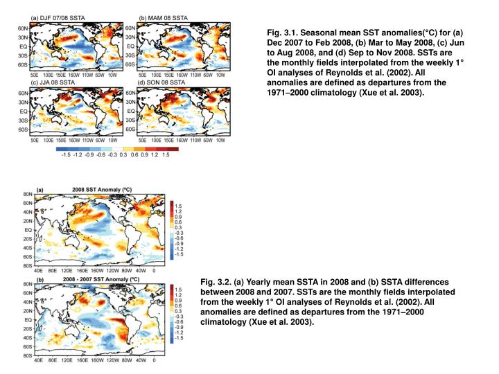
Fig. 3.1. Seasonal mean SST anomalies(°C) for (a) Dec 2007 to Feb 2008, (b) Mar to May 2008, (c) Jun to Aug 2008, and (d) Sep to Nov 2008. SSTs are the monthly fields interpolated from the weekly 1° OI analyses of Reynolds et al. (2002). All anomalies are defined as departures from the 1971–2000 climatology (Xue et al. 2003). Fig. 3.2. (a) Yearly mean SSTA in 2008 and (b) SSTA differences between 2008 and 2007. SSTs are the monthly fields interpolated from the weekly 1° OI analyses of Reynolds et al. (2002). All anomalies are defined as departures from the 1971–2000 climatology (Xue et al. 2003).
Fig. 3.3. (a) Monthly standardized PDO index (bar) in the past four years and (b) yearly mean of the monthly PDO index (bar) overlapped with the 5-yr running mean of the index (black line) in 1950–2008. The PDO index was downloaded from University of Washington at http://jisao.washington.edu/pdo. Fig. 3.4. Yearly mean SST anomalies (°C) averaged in (a) the global ocean, (b) tropical Pacific Ocean, (c) tropical Indian Ocean, (d) tropical Atlantic Ocean, (e) all three tropical oceans, (f) North Pacific, and (g) North Atlantic in 1950–2008. SSTs are the ERSST v.3b of Smith et al. (2008). All anomalies are defined as departures from the 1971–2000 climatology (Xue et al. 2003).
Fig. 3.5. (a) Combined satellite altimeter and in situ ocean temperature data estimate of upper- (0–750 m) ocean heat content anomaly OHCA (109 J m−2) for 2008 analyzed following Willis et al. (2004) but relative to a 1993–2008 baseline. (b) The difference of 2008 and 2007 combined estimates of OHCA expressed as a local surface heat flux equivalent (W m−2). For panel comparisons, note that 95 W m−2 applied over one year results in a 3 × 10⁹ J m−2 change of OHCA. Fig. 3.6. Change of ocean mixed layer heat content estimated following Schmid (2005) expressed as a surface heat flux equivalent (W m−2). The map is based on subtraction of a yearly mean of ocean mixed layer content for calendar year 2008 from that for calendar year 2007.
Fig. 3.7. Time series of quarterly (red dots) and annual average (black line) global integrals of in situ estimates of upper OHCA (1022 J) for the 0–700-m layer from 1955 to 2008, following Levitus et al. (2009). Error bars for the annual values are 1 std dev of the four quarterly estimates in each year. Additional error sources include sampling errors (Lyman and Johnson 2008) and remaining uncorrected instrument biases (Levitus et al. 2009). Fig. 3.8. (top) Annual mean latent plus sensible heat fluxes in 2008. The sign is defined as upward (downward) positive (negative). (bottom) Differences between the 2008 and 2007 annual mean latent plus sensible heat fluxes.
Fig. 3.9. Year-to-year variations of global-averaged annual mean latent plus sensible heat flux (blue line), latent heat flux (red line), and sensible heat flux (black line). The shaded areas indicate the upper and lower limits at the 90% confidence level. Fig. 3.10. Global anomalies of TCHP corresponding to 2008 computed as described in the text. The boxes indicate the seven regions where TCs occur: (left to right) southwest Indian, north Indian, west Pacific, southeast Indian, South Pacific, east Pacific, and North Atlantic (shown as Gulf of Mexico and tropical Atlantic separately). The black lines indicate the trajectories of all tropical cyclones Category 1 and above during Nov 2007 through Dec 2008 in the Southern Hemisphere and Jan through Dec 2008 in the Northern Hemisphere. The Gulf of Mexico conditions during Jun through Nov 2008 are shown in detail in the insert shown in the lower right corner.
Fig. 3.11. (left) Tropical cyclone heat potential and surface cooling given by the difference between post- and prestorm values of (center) tropical cyclone heat potential and (right) sea surface temperature, for (from top to bottom) Hurricane Gustav, Hurricane Ike, Typhoon Sinlaku, Tropical Cyclone Nargis, and Tropical Cyclone Ivan. Fig. 3.12. (left) Tropical cyclone heat potential and surface cooling given by the difference between post- and prestorm values of (center) tropical cyclone heat potential and (right) sea surface temperature, for Hurricanes (bottom) Katrina in 2005 and (top) Gustav in 2008. The scales are the same as in Fig. 3.11.
Fig. 3.13. (a) Map of the 2008 annual surface salinity anomaly estimated from Argo data (colors in PSS-78) with respect to a climatological salinity field from WOA 2001 (gray contours at 0.5 PSS-78 intervals). (b) The difference of 2008 and 2007 surface salinity maps estimated from Argo data [colors in PSS-78 yr−1 to allow direct comparison with (a)]. White areas are either neutral with respect to salinity anomaly or too data poor to map. While salinity is often reported in PSU, it is actually a dimensionless quantity reported on the PSS-78. Fig. 3.14. OSCAR monthly averaged zonal current anomalies (cm s−1), positive eastward, with respect to seasonal climatology for Jan, May, Sep, and Nov 2008.
Fig. 3.15. Daily (thin black) and 15-day low-passed (thick black) zonal currents (positive eastward) measured at the equatorial TAO mooring at 110°W, at a depth of 10 m. Also shown are the mean seasonal cycle (gray) and OSCAR monthly mean zonal currents (black dots) at this location. Fig. 3.16. Principal EOF of surface current (“SC”) and SST anomaly variations in the tropical pacific. (top) Amplitude time series of the EOFs normalized by their respective std devs. (bottom) Spatial structures of the EOFs.
Fig. 3.17. Trends in geostrophic EKE for 1993–2008 in (top left) the Gulf Stream region and (top right) the Brazil–Malvinas Confluence, calculated from satellite altimetry. (bottom) Location of the Brazil Current separation with respect to its mean position over the period 1993–2008. Circles with bars indicate annual means and 2 std devs of the values in each calendar year. Fig. 3.18. Daily estimates of the strength of the upper 1,000-m transport (green solid) as measured by the United Kingdom’s NERCRapid Climate Change Program, the National Science Foundation’s Meridional Overturning and Heat transport Array, and the long-term NOAA-funded Western Boundary Time Series Program. The interior volume transport estimate (accurate to 1 Sv; Cunningham et al. 2007) is based on the upper-ocean transport from Mar 2004 to Oct 2007 (adapted from Fig. 7 from Kanzow et al. 2009), with a 10-day low-pass filter applied to the daily transport values. Dashed black horizontal lines are the Bryden et al. (2005) upper-ocean transport values from the 1957, 1981, 1992, 1998, and 2004 transatlantic hydrographic sections. The total heat transport (estimated error 0.2 PW for monthly averages) is adapted from Baringer and Molinari (1999), including the mean heat transport components from Molinari et al. (1990).
Fig. 3.19. (a) Daily estimates of the transport of the Florida Current for 2008 (red solid line) compared to 2007 (dashed blue line). The daily values of the Florida Current transport for other years since 1982 are shown in light gray. The median transport in 2008 increased slightly relative to 2007 and 2006 and is slightly above the long-term median for the Florida Current (32.2 Sv). (b) Two-year smoothed Florida Current transport (red) and NAO index (dashed orange). The daily Florida Current transport values are accurate to 1.1–1.7 Sv (Meinen et al. 2009, manuscript submitted to J. Geophys Res.) and the smoothed transport to 0.25 Sv (a priori estimate using the observed 3–10-day independent time scale). Fig. 3.20. Seasonal SSH anomalies for 2008 relative to the 1993–2007 baseline average are obtained using the multimission gridded sea surface height altimeter product produced by Ssalto/Duacs and distributed by Aviso, with support from CNES (www.aviso.oceanobs.com).
Fig. 3.21. (top) The 2008 SSH anomaly (Ssalto/Duacs product) from the 1993–2007 baseline is compared to the 2008 anomaly computed for tide gauge data (dots) obtained from the University of Hawaii Sea Level Center (http://uhslc.soest.hawaii.edu/). (bottom) The difference between 2008 and 2007 annual means. Fig. 3.22. (top) Monthly GMSL (seasonal cycle removed) relative to a linear trend of 3.5 mm yr−1. (bottom) Monthly GMSL (linear trend removed, red) versus the MEI (blue). SSH data provided by the NASAPO.DAAC at the Jet Propulsion Laboratory/California Institute of Technology (http://podaac.jpl.nasa.gov/).
Fig. 3.23. Time series of GMSL, or total sea level, is compared with the two principal components of sea level change, upper-ocean steric change from Argo measurements, and mass change from GRACE measurements (Leuliette and Miller 2009). In this figure, black lines show the observed values and gray lines the inferred values from the complementary observations (e.g., the inferred steric sea level is obtained from observed total sea level–observed ocean mass). Fig. 3.24. (top) Extreme sea level variability is characterized using the average of the top 2% mean daily sea levels during 2008 relative to the annual mean at each station. (bottom) The extreme values are normalized by subtracting the mean and dividing by the std dev of past-year extreme values for stations with at least 15-yr record lengths.
Fig. 3.25. Plots of sea–air pCO2 difference and air–sea CO2 flux in the equatorial Pacific between 1997 and 2007 based on underway CO2 measurements collected on the TAO service cruises. The nominal cruise track lines are shown in black. Acomplete survey of the region is completed approximately every six months. The black and dark purple areas indicate where the atmosphere and seawater pCO2 values are nearly balanced. The pink areas indicate ocean uptake of CO2, and the blue to red colors indicate areas of ocean CO2 out-gassing. Fig. 3.26. Maps of (a) net air–sea CO2 fluxes and (b) air–sea CO2 flux anomaly for Sep–Dec 2007. Coastal pixels and those with ice cover are masked in gray. Negative fluxes represent uptake of CO2 by the ocean. Output and graphic provided by J. Trinanes.
Fig. 3.27. Sections of dissolved inorganic carbon (μmol kg−1) nominally along 105°W in (top) 2008 and (middle) 1994. The bottom section shows the DICchange between the two cruises (2008–1994). Black dots show sample locations. Inset map shows cruise track in red. Fig. 3.28. Column Inventory changes as a function of latitude along ~90°E in the eastern Indian Ocean. The blue line is the average annual change between 2007 and 1995. The green line is the average annual change between 1995 and 1978. The red dotted line is the global-average annual uptake of anthropogenic CO2 divided by the surface area of the ocean.
Fig. 3.29 (after Feely et al. 2008). Distribution of the depths of “ocean acidified” undersaturated water (aragonite saturation <1.0; pH <7.75) on the continental shelf of western North America from Queen Charlotte Sound, Canada, to San Gregorio Baja California Sur, Mexico. On transect line 5, the corrosive water reaches all the way to the surface in the inshore waters near the coast. The black dots represent station locations. Fig. 3.30. (a) Average MODIS–Aqua Chlsat for 2008. (b) Average MODIS-Aqua ΣChl for 2008. (c) Percentage change in ΣChl from 2007 to 2008. Heavy black lines demark permanently stratified oceans (2007 average SST >15°C) from higher-latitude regions (2007 average SST < 15°C). Because data were only available through day 320 of 2008 at the time of our analysis, here and in the main text annual values are for Julian dates 321 of a given year to 320 of the following year (e.g., the 2008 period = Julian day 321, 2007 to Julian day 320, 2008). Photic zone chlorophyll content calculated following Behrenfeld et al. (2006).
Fig. 3.31. (a) Monthly photic zone chlorophyll concentrations (= average ΣChl times area) for the permanently stratified oceans (SST >15°C; Fig. 1c). Solid symbols are SeaWiFS data. Open symbols are MODIS–Aqua data. (b) Monthly anomalies in stratified ocean photic zone chlorophyll for SeaWiFS (solid symbols) and MODIS–Aqua (open symbols). Anomalies represent the difference between photic zone chlorophyll for a given month and the average value for that month for a given sensor record. (c) Monthly anomalies in mean SST for the stratified oceans based on AVHRR-quality 5–8 data (solid symbols) and MODISSST4 data (open symbols). Fig. 3.32. Comparison of monthly anomalies in photic zone chlorophyll (black and gray symbols, left axis) and SST (red symbols, right axis). (a) Northern waters with 2007 average SST < 15°C. (b) Permanently stratified waters with 2007 average SST > 15°C. (c) Southern waters with 2007 average SST < 15°C. (a–c) Solid black symbols are SeaWiFS data. Gray symbols are MODIS–Aqua data. MODIS–Aqua data are spliced into the SeaWiFS record beginning on Julian day 321, 2006, to be consistent with Fig. 1. Horizontal dashed line in each panel corresponds to monthly climatological average values. (Note, left axes increase from bottom to top, while right axes decrease from bottom to top.)