Download
1 / 39
390 likes | 474 Views
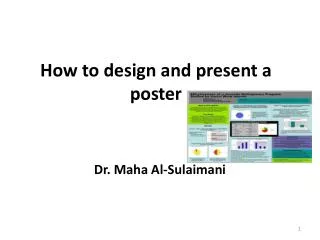
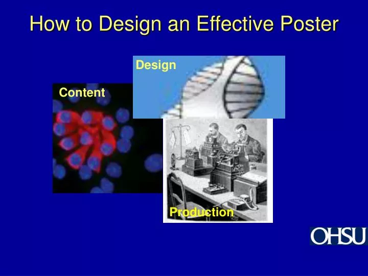
How to Design an Effective Poster. Design. Content. Production. The Anatomy of a Poster. Title Abstract (check requirements) Introduction Hypothesis Purpose Methods Results Summary Conclusion References Acknowledgments. www.cdc.gov/nccdphp/ conference/photos.htm.

E N D
How to Design an Effective Poster Design Content Production
The Anatomy of a Poster • Title • Abstract (check requirements) • Introduction • Hypothesis • Purpose • Methods • Results • Summary • Conclusion • References • Acknowledgments
www.cdc.gov/nccdphp/ conference/photos.htm www.csm.ornl.gov/ SC2K/eunokpix.html Posters should quickly orient your audience to your content Lots of images help Grab them with a snappy title
Grab attention with your title • Make it assertive, clear and interesting • Questions often work well • For example: Why do dogs scratch flea bites? • Not so good: Studies of the effects of Siphonaptera bites on canine motor neurons.
Introduction • No more than 3 brief paragraphs • 1st paragraph lays out the problem • 2nd paragraph gives background/history • 3rd paragraph gives justification for work (“Therefore this study was designed to…”)
Hypothesis and Purpose • Hypothesis • State the testable question (“Proteases are involved in ovulation.”) • Purpose - The specific problem that you tested (“We tested for the presence of a specific protease in the ovulatory process.”) (will overlap with last paragraph of intro)
Methods • Subcategories (keep these brief and to the point!) • Animals • Tissue extraction • Real-time PCR (include diagram of the portion of the sequence that you used in your work), immunocytochemistry or other specific technique that was employed (acknowledge the source of specific reagents) • Statistical analysis
Results • Report your major findings as Fig. 1, Fig. 2, etc. • Use graphs, pie charts or other good visual presentation methods. • Avoid tables, if possible. • Include a one to two sentence “punchline” (legend) under each figure. • Check with Joel to see if there are special printing issues you need to address with any symbols you have typed in PowerPoint.
Summary • Prose version of the Results listed in three or four bullets
Conclusions • How did your findings address your hypothesis? (conceptual rather than descriptive) • What is the BIG PICTURE (clinical relevance, etc.)? • Two to four bullets max. (i.e., overall concept and clinical relevance)
References • What are the key papers in this area? (most will be in the Introduction, perhaps a few in the Methods section of your poster) • Format: • In text: can be numbers or authors. • In the Reference Section: list authors, journal, date of publication. Title may or may not be included, as you prefer.
Acknowledgments • Recognize those individuals not included as authors on your poster • Lab technicians • Animal technicians • Joel Ito • Anyone who donated reagents, protocols by name and affiliation • Funding sources (Murdock Trust, NIH grants, Saturday Academy, etc.) • Any personal acknowledgments (not usually included in scientific meetings).
http://lunar.arc.nasa.gov/printerready/science/results/lunarice/eureka.htmlhttp://lunar.arc.nasa.gov/printerready/science/results/lunarice/eureka.html Content should be easy to find People do not read word for word or even linearly, they skip around. Scientists and engineers are most likely to read goals and results.
Thomas Curtis 2004 Your poster design should be simple and engaging How long will your poster be up? Can your audience read it in sections as they pass by?
Leave plenty of blank space (up to 50%) People won’t stop to read a poster that looks too crowded and complex
Aligning objects makes them easier to follow • Align objects along sight lines • The eye looks for edges
Arrows or numbers indicate how to read your poster You can use numbers or arrows to indicate the order
Dress up your poster! Use colored borders, drop shadows or three-dimensional mounting to make elements stand out
swfsc.nmfs.noaa.gov/. Make your text visible • Title should be visible from 15 to 20 feet • Main headings should be visible from 8 to 10 feet • Supporting text should be visible from 6 to 8 feet
http://lunar.arc.nasa.gov/printerready/science/results/lunarice/eureka.htmlhttp://lunar.arc.nasa.gov/printerready/science/results/lunarice/eureka.html www.sfwmd.gov/newsr/ district_rain_board.gif Graphs, diagrams & images are an effective way to telegraph your data
Your choice of color can attract (or distract) your audience • Avoid bright colors • Restrict the color palette • Use colors of similar value & saturation • Use a color wheel • Experiment with different backgrounds www.realcolorwheel.com/final.htg/RCWautog500x513.jpg
Harmonious colors areeasy on the eye • Use analogous colors (they are side by side on a color wheel)…
Or complementary colors …(any two colors which are directly opposite each other on the color wheel, such as red and green and red-purple and yellow-green)…
Colors can unify your poster • Bright colors attract attention but can detract from your message • A limited number of colors unifies • Use colors of similar value and saturation
Mixed cases and serif fonts make scanning easier Use caps and lower case -- Mixed Cases ARE EASIER TO READ THAN ALL CAPS Serif font is easier to scan than sans serif font
Here are recommended fonts Times New Roman Garamond Palatino Century Schoolbook Courier Times New Roman Garamond Palatino Century Schoolbook Courier Distance reading 20pt not bolded Times New Roman Garamond Palatino Century Schoolbook Courier Times New Roman Garamond Palatino Century Schoolbook Courier Times New Roman Garamond Palatino Century Schoolbook Courier
The text and image can reinforce each other The example above provides visual evidence to support text message
Sentences orient the audience much better than phrases do. Remember the three “C”s of writing: content, clarity, and cohesion There are a few rules of writing that can improve your poster presentation.
neuroseries.info.nih.gov Content: your poster should convey the results of your research • Make sure content is appropriate for the audience. • Get to the major point of your work right away.
Viewers can quickly grasp a simple subject-verb construction. Clarity: make sure your audience can comprehend your brilliant ideas! • Keep sentences short. • Don’t use jargon and minimize use of abbreviations. • Keep subjects and verbs close together.
Keep subject and verb close together • It should be noted that these studies with apomorphine in DARPP-32 mutants, for practical reasons, that is, the requirement for multiple groups of ‘knockouts’ so as to include a range of challenge doses, had to be confinedto a single gender, in this case females. • These studies on apomorphine in DARPP-32 mutants were confinedto female rats to meet the requirement for including a range of challenge doses in multiple groups of knockouts.
Posters need OHSU Visual Identity Posters from OHSU units should include graphic elements specified by University News and Publications Graphic elements can be downloaded fromhttp://www.ohsu.edu/newspub/visid.shtml OHSU logo OHSU word mark Where Healing, Teaching and Discovery Come Together
Software Options • Macromedia FreeHand 10 • Adobe CS • Microsoft PowerPoint
Images should be clear • Make sure any bitmap files you use will be at least 150 dpi at finished (print) size. • Many page layout programs will not allow you to build a page larger than, say, 40". In this case, build the page proportionate to its final printed size. • For instance, if you create an 8"x 10" file, you can print it at 16"x 20", 32"x 40" or any other size that maintains proportions. • Make any graphic alterations to images in a program like Photoshop not in the publishing program itself.
How to present your poster • Be enthusiastic and HAVE FUN! • If someone appears interested in your poster, ask “Would you like me to walk you through this?” Don’t just stand quietly by the poster! • If the person says no, fade back, but remain available for questions. • Stop when you have finished, let people move on if they want to: People like to maneuver quickly at poster sessions. Don’t be offended at quick comings and goings. • If you become very engaged with someone, and other people come to see the poster, let everyone know that you are aware of them, and will get to them as soon as possible.
Resources • http://www.kumc.edu/SAH/OTEd/jradel/Poster_Presentations/PstrStart.html • http://www.asp.org/education/Howto_onPosters.html