Download

1 / 15
150 likes | 244 Views
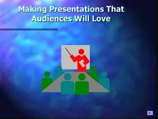
Making Presentations That Audiences Will Love. Use a Template. Use a set font and color scheme. Different styles are disconcerting to the audience. You want the audience to focus on what you present, not the way you present. Fonts. Choose a clean font that is easy to read.

E N D
Use a Template • Use a set font and color scheme. • Different styles are disconcerting to the audience. • You want the audience to focus on what you present, not the way you present.
Fonts • Choose a clean font that is easy to read. • Roman and Gothic typefaces are easier to read than Scriptor Comic. • Stick with one or two types of fonts.
Bullets • Keep each bullet to one line, two at the most. • Limit the number of bullets in a screen to six
Bullets & Cueing • Bullets allow you to “cue” the audience in on what you are going to say. • Cues can be thought of as a brief “preview.” • This gives the audience a “framework” to build upon.
Caps and Italics • Do not use all capital letters • Makes text hard to read • Conceals acronyms • Denies their use for EMPHASIS • Italics • Used for “quotes” • Used to highlight thoughts or ideas • Used for book, journal, or magazine titles
Colors • Reds and oranges are high-energy but can be difficult to stay focused on. • Greens, blues, and browns are mellower, but not as attention grabbing.
Backgrounds • A white on a dark background is used for this presentation as: • The author assumes most users will view the presentation on their own computer. • Having a darker background on a computer screen reduces glare. • White on dark background should not be used if the audience is more than 20 feet away.
The Color Wheel • Colors separated by another color are contrasting colors (also known as complementary) • Adjacent colors (next to each other) harmonize with one another. e.g. Green and Yellow
Attention Grabber To make a slide stand out, change the font and/or background
Illustrations • Use only when needed, otherwise they become distracters instead of communicators • They should relate to the message and help make a point • Ask yourself if it makes the message clearer • Simple diagrams are great communicators
Flipcharts • Make letters at least a 1/4 high • Flipcharts with lines are much easier to write on
Screen Size for Readability Screen 6’ 8’ 10’ 12’ 15’ 1/4 inch 30’ 40’ 50’ 60’ 90’ 3/8 inch 45’ 60’ 75’ 90’ 135’ 1/2 inch 60’ 80’ 100’ 120’ 180’ Examples 1/4” type shown on a screen size of 6’ can be seen 30’ away (20 point Times Roman equals 1/4” type) 1/2” type shown on a 10’ screen can be seen 75’ away (40 point Times Roman equals 1/4” type)
YOU • Do not use the media to hide you • The audience came to see you • The media should enhance the presentation, not BE the presentation • If all you are going to do is read from the slides or overheads, then just send them the slides • Remember, only you can prevent “Death by PowerPoint”
Presentationsby Donald R. Clark FOR MORE INFORMATION • http://www.nwlink.com/~donclark/leader/leadpres.html • http://www.nwlink.com/~donclark/hrd/templates/presentation.rtf • donclark@nwlink.com