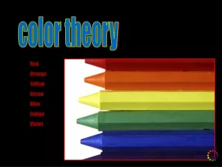
Download
1 / 33
340 likes | 560 Views
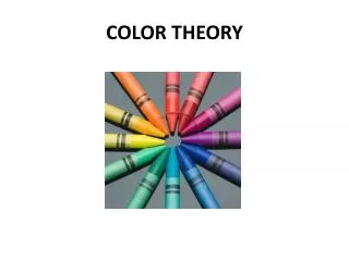
Color Theory II. Additive and Subtractive. Additive Color Theory states that in the natural world white light is made up of three basic components: red , green , and blue light In theory adding these three primary colors of light, red, green, and blue, together achieve white

E N D
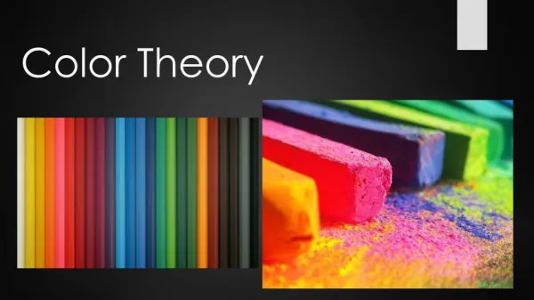
Color Theory II Additive and Subtractive
Additive Color Theory states that in the natural world white light is made up of three basic components: red, green, and blue light • In theory adding these three primary colors of light, red, green, and blue, together achieve white • This is where we get RGB which is used by computer monitors Additive Color Theory
Subtractive Color Theory explains how cyan, magenta, and yellow pigments or inks on paper subtracts white light components • Since white light is made up of red, green and blue light, the inks subtract out that particular portion or color of light • Whatever light that is left is recognized by the eye as a particular hue • This is where we get CMYK which is used in the printing process Subtractive Color Theory
Cool colors • Cool colors are made mostly of green, blue and violet (purple). • This family of colors is called cool because they remind you of cool things like a cool forest or a cold lake. This painting by Claude Monet uses cool colors to suggest a quiet pond. • Cool colors can even make you feel cooler because they can slightly decrease your circulation and body temperature!
Warm colors • Warm colors are made mostly of red, orange and yellow. This family of colors is called warm because they remind you of warm things like the sun or fire. Warm colors can even make you feel warmer because they can slightly increase your circulation and body temperature!
Neutral Temperature Colors Yellow-green • The two Neutral temperature colors appearing on the color wheel are: Yellow-green and Red-violet. • They are neutral because they depend upon the temperature of the colors they are placed next to. Red-violet
What is the Feel (temperature) of the Neutral colors? • Notice how the neutrals feel cool or warm depending on which color temperatures you group them with.
Complementary colors • Complementary colors are located directly across from each other on the color wheel. • Complementary pairs contrast because they share no common colors. For example, red and green are complements, because green is made of blue and yellow. • Complementary colors can appear very exciting and seem to vibrate when placed side by side. By placing brilliant orange flowers against a bright blue background, Vincent van Gogh's painting buzzes with visual energy. • Because van Gogh did not smooth his brush strokes, it's easy to see how he used complementary pairs. The red of the flowers contrasts with the green of the leaves. He also included dashes of violet which interact with the yellows.
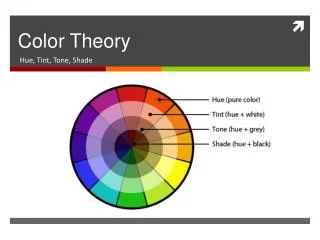
Tint = color + white • Tints are light values of a color. One usually makes tints by mixing a color with different amounts of white. • Or, a tint can be made by allowing the white of the paper, canvas or board to show through the color. • In water color paint, just thin with water and watch the tint come through.
Shade = color + black • Shades are dark values of a color. • One usually makes shades by mixing a color with different amounts of black.
Side note: Pigments • Pigments give color to paint. In the past, pigments were powders made by grinding up minerals, plants and animal parts. The most expensive pigments used to be gold, vermilion (a red pigment made from sulfur and mercury) and ultramarine (a blue pigment made from a stone called lapis lazuli). Modern pigments are made from chemicals which come in brighter colors, resist fading, and are less expensive. • Pigments are mixed with a "binding agent" such as egg, oil, animal fat, water or synthetic resin to make a paintable liquid that dries.
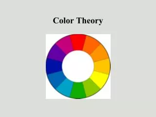
Color Schemes and Harmonies • Color Schemes are a systematic way of using the color wheel to put colors together… in your art work, putting together the clothes you wear, deciding what colors to paint your room…. • Monochromatic, • complementary, • analogous, • warm and cool.
Color Harmonies • Think of a color wheel as a map for locating colors. The route you travel between the colors is what you use to create your color scheme. • Or use it like a clock and symbols to remember the color harmonies.
Complementary Color Harmony • Complementary colors are those colors that appear opposite each other on the color wheel. Y V
Complementary Color Harmony • Paul Cézanne has used complementary colors of blue and orange to create this composition of onions and wine.
Split-Complementary Color Harmony y • Split complement is taking the two colors on either side of the complement. • i.e. Split-complement of yellow is blue-violet and red-violet BV RV
The Scream • Edvard Munch was a Norwegian artist whose brooding and anguished paintings and graphic works, based on personal grief and obsessions, were instrumental in the development of expressionism.
Three or four colors that are adjacent or next to each other on the color wheel. • Analogous colors are ‘similar’ in that they all share one primary color in their composition or make up. Analogous Color Harmony
Analogous • Henri Rousseau was a self-taught Sunday painter who began intensive painting when he was 40 years old.
Triadic Color Harmony is three colors equidistant (the same distance from one another,) on the color wheel. Triadic Color Harmony
Mondrian was one of the most original thinkers of early twentieth century art, as he pushed for a simplification in art, restricting his palette to the ‘plastic’ essentials of the primary colors. Piet Mondrian
Tetrad Color Harmony • Tetrad Color Harmony is four colors equidistant on the color wheel. • Sometimes called a double complement because there are two complementary color harmonies together.
Henri Matisse • Instinct must be thwarted just as one prunes the branches of a tree so that it will grow better. -- Henri Matisse Madame Matisse, "The Green Line" ( La Raie verte). 1905. Oil on canvas. Statens Museum for Kunst, Copenhagen, Denmark.
Monochromatic Color Harmony • Mono (one) chromatic is one color and various tints (lighter) and shades (darker) of the same color. CHROMA means; The intensity or brilliancy of a color.
Monochromatic • Monochromatic can be very powerful for evening scenes where values are more evident. Also for scenes of the desert or Mountain scenes in the winter.
Tints • Tints are lightened colors. • Always begin with white and add a bit of color to the white until the desired tint is obtained. This an example of a value scale for the tints of blue.
Shades • Shades are darkened colors. • Always begin with the color and add just a bit of black at a time to get the desired shade of a color. • This is an example of a value scale for the shades of blue.
Color values are the lights and darks of a color you create by using black and white (“neutrals”) with a color. This makes hundreds of more colors from the basic 12 colors of the wheel. • White + color = tint • Color + black = shades Values of Color HUE is another name for color.
The principles of color mixing let us describe a variety of colors, but there are still many colors to explore. The neutral colors contain equal parts of each of the three primary colors. Black, White, Gray and sometimes brown are considered “neutral”. Gray is a neutral color made by mixing complementary colors or the primary colors. Semi-neutral colors such as browns are also made by mixing colors across the color wheel. Neutrally mixed Colors