Download
1 / 3
30 likes | 88 Views
T hey have let the reader know that it is for free to convince people even more that not only are you gong to be informed about things in the magazine but it is also for free.

E N D
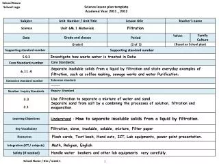
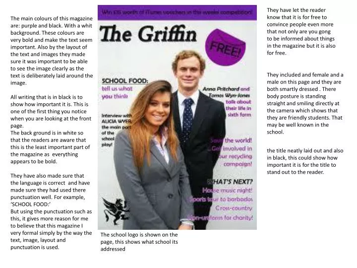
They have let the reader know that it is for free to convince people even more that not only are you gong to be informed about things in the magazine but it is also for free. The main colours of this magazine are: purple and black. With a whit background. These colours are very bold and make the text seem important. Also by the layout of the text and images they made sure it was important to be able to see the image clearly as the text is deliberately laid around the image. All writing that is in black is to show how important it is. This is one of the first thing you notice when you are looking at the front page. The back ground is in white so that the readers are aware that this is the least important part of the magazine as everything appears to be bold. They have also made sure that the language is correct and have made sure they had used there punctuation well. For example, ‘SCHOOL FOOD:’ But using the punctuation such as this, it gives more reason for me to believe that this magazine I very formal simply by the way the text, image, layout and punctuation is used. They included and female and a male on this page and they are both smartly dressed . There body posture is standing straight and smiling directly at the camera which shows that they are friendly students. That may be well known in the school. the title neatly laid out and also in black, this could show how important it is for the title to stand out to the reader. The school logo is shown on the page, this shows what school its addressed
Unlike the other magazines, this school went for a different approach for the back ground. As they photographed a school girl in her uniform out side her school. By doing this it connotes what type of magazine they are aiming to direct this to school pupils. She has her arms crossed and standing sideways looking up at an angle, her body language shows that she is thinking or day dreaming about something, as she is smiling It can be implied that she is happy. The text there choice of words were used to convince readers what they want. For example: ‘win £100 worth of revision’ this makes the want to know how to get this deal. As the ‘win £100’ is written in in larger letters than the others, this shows how they want the reader to see these first two letters because it will manipulate the reader to want more information on the offer. Other words this magazine includes are ‘FREE’, ‘10 WAYS TO’, ‘HOW TO..’ these words manipulate the reader and persuades them to believe that it is what they need or special techniques for school uniform The date is shown clearly so everyone is aware if the this issue is the newest or not. This text has been circled around with a bold colour. It is secluded from all the other text and does not fit in with the image either. This shows how far they are willing to make this piece of information stand out. ‘your free school magazine’ to remind you that it costs nothing. This may convince you even more that you should read it. All the text is in upper case, which makes the whole magazine seem exciting or as if it is a matter of urgency that you read this magazine to find out what else is mentioned inside. But, as you look at the title, it is in upper case. This gives of the impression of it seemly being laid back or cool. Its not in bright letters but it sis bold and is the first thing you notice. The next thing you do notice also is the image of the girl as these two are placed closely together. By only noticing these two important factors, The front dose give you the impression of it being laid back. or relieving stress will help. By making these words bolder and bigger it stands out on the page because it is clearly the most important on the front page to get the target to read the magazine.
As you can see in the example of my schools magazine, a lot of bright colours have been used this makes the magazine more appealing and attractive. The colour purple is used a lot on the front page as this is the colour of our school ties. This therefor shows how distinctive this colour is. This magazine gives of the impression of it being fun and interesting. This is because it has a lot of bright and attractive colours that stand out on the page. The banner has helpful information to let the reader know what issue you are reading so you are up to date with the latest copies. The logo links in with the title as a bee is well known to make a buzzing noise. The Logo is in a big font, bold and noticeable as you can see, the size of the writing for the title has been deliberately altered. ‘the BUZZ’ there is one word that has been clearly been put into attention in upper case letters to draw attention to the readers The images used for the front page have been laid out so that it has been surrounded by colourful text by doing this it brings more attraction to the display. The text is laid out all over the page, it does not guide you as to where you should be reading next. The layout of the front page for the text is every where to make the reader think that there is a lot of information, to read from. By the additional shapes and image borders it makes this issue seem very exciting and appealable towards younger years and also, older years. it covers both genders and it includes information about students and teachers. In this magazine they have made sure they have added something on there that every on can relate or have similar knowledge on. For example, they have an interview with a popular person one YouTube videos, included a student of the school, and also an image of the head teacher awarding students.