Download
1 / 39
390 likes | 487 Views
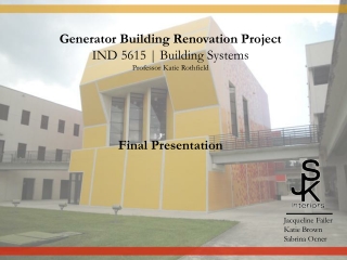
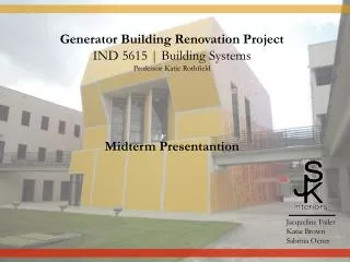
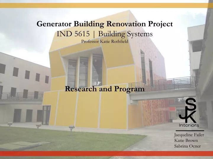
Generator Building Renovation Project IND 5615 | Building Systems Professor Katie Rothfield Research and Program. Jacqueline Failer Katie Brown Sabrina Ocner. Part I: Research Paul Cejas Architecture Building Research Paul Cejas Architecture Building Photographs

E N D
Generator Building Renovation Project IND 5615 | Building Systems Professor Katie Rothfield Research and Program Jacqueline Failer Katie Brown Sabrina Ocner
Part I: Research • Paul Cejas Architecture Building Research • Paul Cejas Architecture Building Photographs • Processes and Methods • Case Studies • Interviews • Summary of Ideas
Paul Cejas Architecture Building Research Project Identification Building name: Paul Cejas School of Architecture Location: 11200 SW 8th St. Miami, FL 33199 Year designed/planned: 1999 Year construction completed: 2003 Size: 102,000 sq. ft. Architects: Bernard Tschumi Architects & BEA International (Joint Venture) Client: Florida International University School of Architecture Consultants: Structural Engineer – BEA International Civil Engineer - CAP Engineers Mechanical Engineer – Tilden Lobnitz Cooper (TLC) Landscape Architect – Charles A. Alden http://www2.fiu.edu/~soa/cejas/press_release.htm
Paul Cejas Architecture Building Research Design Intent and Architectural Features The Paul L. Cejas (PCA) Architecture complex at Florida International University is a hub of student creative activity. Completed in 2001, it was designed by Bernard Tschumi Architects, its principal being a renowned Swiss architect. According to FIU’s School of Architecture (SOA) website, the yellow and red tiled building is speculated by many to be an homage to either Antonio Gaudi or the setting Florida sun. The concept was based on Tschumi’s idea that “Architecture can generate interaction” (http://www2.fiu.edu/~soa/cejas/press_release.htm). In essence, the building was designed to encourage social and cultural connection. The PCA complex is comprised of an administration building, the Generator, the student workshop/studio building, an auditorium building topped by an outdoor terrace, and an open courtyard connecting them all together. We will be renovating the interior spaces of the Generator, which is the central gathering space holding the student gallery, two critique rooms (rooms 240 and 340), and a large multipurpose space (room 341.) According to Bernard Tschumi’s team, “The building must act as a generator, activating spaces as well as defining them” (http://www2.fiu.edu/~soa/cejas/architecture.htm). The School of Architecture space as a whole is comprised of three generators and two “sober wings” made of concrete, which house the studios and offices. The area of palm trees behind the main generator, is considered the “landscape architecture” generator. Tschumi’s idea was to bring together these different types of buildings in such a way that Florida International University brings together cultures.
Paul Cejas Architecture Building Research • The interior of the Generator has many problem areas, outlined by room-type. Before we began our research, we identified these problem areas using our own points-of-view. • I. Gallery (140) • It lacks a true “museum” quality, and it has the potential to feel much more “special” than it • does. • Many works end up on the floor due to a lack of exhibit space. • There are inadequate lighting systems in place for the change between daylight and evening. • II. Critique Rooms (240 & 340) • The glare is unbearable, especially during the late afternoon hours, as the window-wall faces • west. • Due to the glare, the heat transference is uncomfortable as well. • There is inadequate seating and table-space. • The A/C ducts make a great amount of noise, and in combination with the concrete floors, this • creates a major acoustic issue during critiques.
Paul Cejas Architecture Building Research • III. Multipurpose Room (341) • NOTE: The issues in this room are very important to remedy, as this space is used for meetings and gatherings of stakeholders and advisory-board members, student-organizations, and visiting professionals, including panel/critique judges. This space must represent the dynamic and contemporary nature of FIU’s School of Architecture. • The carpet is very thin, dirty, and worn…and the color is unappealing. • Immediately upon entering the space, guests are greeted by a hulking six-foot rectangle directly • in front of the door. • The glare is unbearable all day, as floor-to-ceiling windows face north, east, and west. • Since there are many strange openings in the room (to be discussed and addressed in detail later • in the project) which lead to the gallery, noise pollutes the space and often banging and talking • can be heard. • The elevators make a lot of noise. • The strange angles of the space seem to bounce the noises around, rather than absorb them. • The walls are all white, adding to the glare. • The lighting is merely there, it does not make the space more appealing.
(NOTE: Images will be notated in the next phase of research.) Paul Cejas Architecture Building Photographs (Multipurpose/Reading Room - Rm. 341)
(NOTE: Images will be notated in the next phase of research.) • Paul Cejas Architecture Building Photographs • (Critique Rooms - Rm. 240 & 340)
(NOTE: Images will be notated in the next phase of research.) • Paul Cejas Architecture Building Photographs • (Gallery- Rm. 140)
Processes and Methods • Proposed Methods • To achieve our goals and objectives, research must be done to determine what needs to be done and how: • Student and administrative interviews must be conducted, as these people are the true users of the spaces. • Interviews with architects or those involved with the project may help answer important questions. • Current architectural plans must be analyzed to help determine interior design limitations and opportunities. • Case-studies involving the renovation of other college galleries and workspaces must be analyzed and compared, to further learn about limitations and opportunities or spark a new idea. • Furniture brands, ecologically-sound materials, acoustical diagnostics and products, etc. must be researched to find the best fit for the budget.
Processes and Methods • Actual Methods • This is the order in which we actually conducted our research, and how we plan on proceeding. We: • Researched the building and the goals and concept of the Architect. • Took photographs of each space. • Conducted loose case-studies involving the renovation of other college galleries and creative workspaces, noting novel ideas and design plans and issues. • Interviewed faculty members, stakeholders (department heads and dean), the facilities manager, and students from each school regarding their opinions concerning the utility of all generator rooms. • Analyzed architectural drawings and simplified them for future use. • Researched furniture brands, choosing some that are very functional and environmentally sound, and others that were innovative and creative. We also researched some space-saving and design options. • Will develop floor plans, 3D models, elevations, choose definitive furniture and finishes, and • anayze the budget for accuracy.
Processes and Methods • Available Resources • Site tours • Student interviews • Administration interviews • Other stakeholder interviews • Personal point of view • Personal digital images • Needed Resources* • List of “stakeholders” and contact information • for those willing to participate • Contact information for architect associates or • someone involved in the building/planning • process. • Set of architectural plans • Tour of rooms in which we are denied access • What are the limitations as far as the • stakeholders and faculty? *Currently, we have received all of the resources we deemed necessary at the inception of this project.
Processes and Methods • Deliverables • Full project overview with concept statement, etc. • Plans (Floor, RCP, FF&E only) • Elevations • 3D model(s) of new spaces (as time permits regarding the depth and detail) • Materials/furniture choice board • Budget analysis
Case Studies (Workspaces and Critique Areas) • 1. Aftermodern Gallery • Location: San Francisco, CA • Year construction completed: May, 2009 • Size: 8,500 square feet • Architect: Sand Studios (Larissa Sand, Principal) • Client: Larissa & Jeff Sand, Sand Studios • Consultants: DK Design • Design Intent • The Aftermodern Gallery, a renovated 1940’s warehouse, has become part of a multifunctional facility housing the gallery, studio spaces, and apartments. The concept revolves around a studio/living culture and combining innovation and conservation; the design was created from the “urban environmentalism” outlook of the architects and clients. Sands saved as much of the existing building elements she could, and used natural and recycled products in place of those she could not salvage. Additionally, she introduced “new elements that complement the building’s humble character.”
Case Studies (Gallery Renovation & Design) • (Aftermodern Gallery) • Architectural Features | Problems & Solutions • Its existing loft-like appearance contained many windows and skylights, which offered great amounts of natural light. Sculptural steelwork, fabricated by Sand Studios, minimalist plaster walls are the signature elements of the space. She removed existing partitions and drywall to reveal the structural concrete and wood beams, and added floating ceiling structures for the new systems equipment, and added wood flooring made from repurposed gymnasium floors. Additionally, she maximized space by creating a second floor in the high-ceilinged space. • Sand Studios also specializes in doors, hardware, and lighting, so there were many products for her to add to her new space. Many of the doors have special pivot-hinges to space and enhance its transformative quality. The gallery walls are also self-pivoting, moving a full 90 degrees to change as the gallery installations dictate. (http://www.sandstudios.com/afterModern.html 10-31-10)
Case Studies (Gallery Renovation & Design) • (Aftermodern Gallery) • Images and Notes These images show a most innovative idea for maximizing space. The pivot walls actually increase the square footage of the display space, yet take up only three inches of depth. We would like to implement some sort of pivot wall, similar to those shown. (http://www.sandstudios.com/afterModern.html 10-31-10)
Case Studies (Gallery Renovation & Design) • 2. Yale Sculptural Gallery • Location: New Haven, Connecticut • Year construction completed: September, 2007 • Size: 62,000 square feet • Architect: Kieran Timberlake and Associates • Client: Yale University • Environmental Consultants: Atelier Ten • General Contractor: Shawmut Design and Construction • Design Intent • The newly renovated Sculpture Gallery at Yale University, a LEED Platinum-rated building, is now a unique four-story art studio. The bottom floor is used as the gallery space, and the other three floors are designated for parking. The goal of the design was to incorporate the gothic style of • architecture of the Yale campus, while giving it a contemporary spin. (http://greensource.construction.com 11-1-10)
Case Studies (Gallery Renovation & Design) • (Yale Sculptural Gallery) • Problems & Solutions | Images & Notes • According to John Stoller, an associate of Kieran Timberlake Associates, it was important for the design team to “make the envelope do as much as possible so that the mechanical systems could do as little as possible;” they wanted to change the interior mechanics of the building (http://greensource.construction.com 11-1-10). As a solution, the gallery was surrounded by a large curtain wall that would transmit natural light, but still insulate the building’s core. Other architectural features include large, open transformational gallery space with ample storage and multiple ways of configuration to accommodate the rotating sculpture and installation shows, and display walls that hang on a pulley-system. The hanging partitions, also demountable, are a great idea for transforming space as the displays change. The perpendicular walls direct and pull the viewer to each exhibit piece as a story. http://greensource.construction.com/projects/0807_YaleSculptureGallery/Images/4.jpg
Case Studies (Workspaces and Critique Areas) • 3. Wong Doody Advertising • Location: Culver City, CA • Architect: Shubin & Donaldson Contemporary Architects • Client: Wong Doody Advertising • Consultants: DK Design • Design Intent • Wong Doody is an advertising/media/PR firm with offices in Seattle and Los Angeles. They chose Shubin & Donaldson (S&D) to design the interior of their newest office, located in Culver City, CA. As in all of their offices, they wanted the space to convey the image of the modern company as well as their values. • The key concepts were “1) a democracy of ideas, 2) having fun, 3) continuous improvement, 4) the development and cultivation of relationships with clients and colleagues, and 5) that the space reflect the quality of work that Wong Doody produces.” (www.fastcompany.com 10-31-10)
Case Studies (Gallery Renovation & Design) • (Wong Doody Advertising) • Problems & Solutions | Images & Notes • In response to their needs, S&D created multi-functional spaces such as conference rooms, “war rooms” (rooms where ideas are discussed and debated), editing bay, storage space, library, and most importantly, open workstations. The workspaces contain concrete flooring, skylights, recessed fluorescent lighting, and cork flooring throughout the remaining spaces. The walls of the war workrooms are multifunctional in that they are clad in idea-inducing materials such as cork, dry erase, and chalkboard paint, all of which are tools for brainstorming, teaching, learning, and presenting. We admire their use of “idea-inducing” materials like cork, dry erase, and chalkboard paint. We definitely want to include some sort of permanent writing surface in the critique rooms. http://www.sandarc.com
Case Studies (Workspaces and Critique Areas) • 4. Performance Capture Studio • Location: San Francisco, CA • Year construction completed: January 2009 • Size: 120,000 square feet • Architect: Kanner Architects & LorcanO’Herliby Architects • Client: ImageMoversDigital, Kanner Architects & Lorcan • O’HerlibyArchitects • Design Intent • A former aircraft hangar located in San Francisco was converted into a film production studio and architectural firm. The 120,000 square feet Hamilton Air Base closed in 1976, and was restored years later. The space was designed for the collaborative work of ImageMovers Digital and the two architecture firms: Kanner Architects and LorcanO’HerlibyArchitects. The concept of this project is a “strange loop,” a term often used in filmmaking to portray a continuous movement in a storyline that returns to the same moment it began.
Case Studies (Gallery Renovation & Design) • (Performance Capture Studio) • Architectural Features | Problems & Solutions • They developed a flexible, adaptable display wall made with 11-by-17-inch “flags” that display images of their current projects. The images are printed on magnetized vinyl and can be easily mounted and demounted. The wall is also comprised of cork material made from recycled plastic, where artists can pin-up their work for discussions. This wall system brings together the different departments to engage in collaborative work in a non-linear format. Additionally, strategically placed curvilinear nodes further promote collaboration and enhance the experience. This intricate wall system serves as a strong way-finding devise to move visitors through the space easily and efficiently. It also allowed for the addition of a suspended blackout curtain for flexible horizontal • light control in the different workstations. (http://archrecord.construction.com/projects/interiors/archives/09_Performance-Capture-Studio/default.asp) • For this program, the architects needed to consider an easy way to orient visitors and guide them through such a large the space; they needed to control the amount of daylight penetrating the space for the editors and animators working there, but at the same time keeping the interiors as open as possible. They also must consider sound control issues for a productive working environment. (http://www.designmind.co.za/profiles/blogs/incredible-architecture-of)
Case Studies (Gallery Renovation & Design) • (Performance Capture Studio) • Images and Notes (http://www.archdaily.com/55686/performance-capture-studio-kanner-architects-lorcan-herlihy-architects/05-nicolas-marques) This studio utilizes a variety of conceptual and transformative ideas for showcasing projects. The walls are made of multiple materials and allow for many different ways to display pieces of work.
Interviews • Each group member interviewed a stakeholder (a department head), three students (one from each school), and a faculty member. We also met with the dean and facilities manager as a group. We asked questions about their opinions regarding the utility of the space. • I. Stakeholders IV. Other: • Janine King (Interior Design) Brian Bergwall (Associate Dean of Arch.) • Marta Canaves (Landscape Architecture) Patty Ruiz (Facilities Manager) • Adam Drisin (Architecture) • II. Faculty • Phil Abbott • Katie Rothfield • Sarah Sherman • Students • Karissa Mason IsmabysSenra • Ryan Correia Isis Fumero • Jaime Soto Mario Rojo • Marcela Arbelaez Mohammed Elsayed
Summary of Ideas Each respondent’s answers were recorded and analyzed, and the common points were recorded. These commonalities are as follows: Each respondent mentioned that the acoustics (in every room) need improvement due to the HVAC system not being insulated enough, but funding and preserving the intent of the space may be an issue. The gallery lighting needs improvement, possibly spot lighting or track lights. Student work in the gallery needs some sort of transformable display system, but needs to take into account the storage space and must fit there. The walls of all rooms (unanimously) need to stay light-colored, as are most gallery and pin-up walls. The heat and glare in 240, 240, and 341 are especially an issue. Another major issue is the amount of pin-up space in room 341. While the system they have in place now works, it is an eye sore; a common comment is there must be a better way to increase space. The furnishings were also an issue that was brought up several times. Common thoughts were that the multiple types or furnishings look like a mixture of different collections. The studio is very short on chairs because many have been moved to any of the referenced rooms. Obviously, the number or types of seating are inadequate. Many respondents also mentioned the need for carpeting instead of concrete. Ultimately, the four biggest issues are: 1. Glare in rooms 240, 340, and 341 2. Lighting system needs improvement or more variety 3. Pin-up space needs to be increased 4. Acoustic improvement
Part II: Program • Gallery (Rm.140) • Critique Rooms (Rm. 240 & 340) • Reading Room (Rm. 341) • Materials and Furnishings Options
Gallery (Rm. 140) Program Added storage space (possibly same size as existing) Pivot walls (quantity: 3 @ 12 sq. ft., locations TBD) Remove non-structural pin-up blocks. 3. Walls – use homosote (as is already being used) and keep white 4. Small groupings of seating , lounge or ottoman-like, (quantity: 4 to 6) 5. Carpet tiles throughout 6. Pivot shelving – to be designed – pivot 90 degrees from floor, student work display Acoustical ceiling panels – hanging/floating, so as not to disrupt open-ceiling condition Track lighting that allows multiple lights to be “strung” and moved as displays change
Critique Room (Rm. 240 & 340) Program 1. Pivot walls (quantity: 1 or 2 @ 3sq. ft., located in middle of north and south walls to increase surface area.) 2. Walls – use homasote(as is already being used) and keep white Seating – Stackable chairs (quantity: 10-15) 4. Carpet tiles throughout 5. Pivot shelving – to be designed, located on east and west walls (depending on space after pivot walls – pivot 90 degrees from floor, student work display (for architecture students) 6. Acoustical ceiling panels – hanging/floating, so as not to disrupt open-ceiling condition Track lighting that allows multiple lights to be “strung” and moved as displays change White erase board attached to wall (4’ x 6’) Meeting tables (quantity: 2 to 3, foldable)
Multipurpose/Reading Room (Rm. 341) Program 1. Pivot walls (quantity – 1 or 2 @ 3 sq. ft., located in middle of north and south walls to increase surface area, made of homasote) Remove large pin-up block. 2. Seating – Stackable chairs (quantity: 20-25) 3. Meeting tables (quantity: 4 to 6, foldable) 4. Carpet tiles throughout 5. Pivot shelving – to be designed, located on east and west walls (depending on space after pivot walls – pivot 90 degrees from floor, student work display (for architecture students) 6. Acoustical ceiling panels – hanging/floating, so as not to disrupt open-ceiling condition Track lighting that allows multiple lights to be “strung” and moved as displays change White erase board attached to wall (4’ x 6’) Roll-up projection screen to be placed above triangular (northeast corner) ceiling Wall-mounted projector
Herman Miller Caper Chair To develop a better solution for hard-working, multiuse spaces, Herman Miller built on its extensive work chair research base and applied it to secondary seating. The result, the lively Caper chair, was designed by Jeff Weber of Studio Weber + Associates, using universal design principles to create one seating product that accommodates the diversity of people, tasks, and behaviors in a multitude of work areas. Weber believes that design is "the connective tissue" between people and the environment, and that the quality of that design--whether of a building or a chair--profoundly effects the quality of life. The Caper chair, he says, achieves its high level of performance and comfort by "using standard materials in novel ways." The Caper family provides all this at an affordable price. "Too much good design seems expensive," Weber says. "I wanted to break that cliché.“ Chairs used as secondary seating in spaces like conference, project, training, and multipurpose rooms have traditionally been designed for some other purpose. They have lacked important capabilities - easy mobility, light scale, compact footprint, and simple-to-use adjustments. Mobility and FlexibilityThese days, people are doing more work outside their individual offices or workstations. They often work in spaces used throughout the day by lots of other people too. As a result, so-called secondary seating now often acts as primary seating. Workers move, businesses move - furniture should move easily with that constant flux. Caper chairs provide the kind of flexibility active workers crave. Lightweight, portable, stackable, movable - they help people come together, move around - whatever the work demands. General Dimensions stacking chair height: 32.5 in. width: 17.5 in. depth: 16.5 in. multipurpose chair height: 32.5 in. width: 17.75 in. depth: 17.5 in.
Human-Centered DesignSmall but mighty comfortable. The contoured, flexible seat and back evenly distribute weight, minimize pressure points, and let the user move freely. Both the seat and back are perforated with small holes to help keep the sitter cool. Seats are available with FLEXNET, a strong, breathable suspension material that enhances comfort and distributes weight evenly. Multiple OptionsMultiple uses. One chair provides a variety of solutions - in meeting spots, multipurpose rooms, as workstation guest seating, in drop-in and hoteling workstations, conference rooms, team areas, breakout spaces, and training areas. With ganging connectors, Capers make a tidy presentation space. Connectors come installed and don't interfere with stacking. Multiple places. Caper also works in retail, hospitality, education, healthcare, and recreational environments. They are ideal for informal, flexible spaces where reconfiguration is encouraged, smaller scale is important, and budget matters. Earth-FriendlyEach Caper chair is 100% recyclable and made of 21% recycled material. Because all Caper chairs, including the multipurpose chair, weigh about half as much as competitive models, fewer materials and less energy are required for their manufacture. Caper chairs adhere to McDonough Braungart Design Chemistry (MBDC) Cradle to Cradle Design Protocol and are GREENGUARD certified and may contribute to LEED credits. http://www.hermanmiller.com/Products/Caper-Chairs
Herman Miller Eames Wire Chair Having achieved success with their plywood and molded plastic chairs, Charles and Ray Eames challenged themselves to make a reasonably priced, strong but lightweight, quality chair out of bent wire. Introduced in 1951, it was an immediate hit. Distinctively, unmistakably Eames, the wire chair has stood the test of time and is as popular today as it was half a century ago. Wire only. Wire with a one-piece leather seat pad. Wire with a criss-cross two-piece leather pad (the "bikini"). The seat and base are chrome, and the leather pads are available in a range of colors. Glide choices. Standard glides feature a durable plastic bottom and can be ordered with felt bottoms to protect bare floors; both styles tilt slightly to help with leveling General Dimensions height: 32.75 in. width: 19 in. depth: 21.25 in. http://www.hermanmiller.com/Products/Eames-Wire-Chairs
Herman Miller Setu Chair Technology has changed how and where we work. Now we work anywhere and everywhere. No matter where we work we want a comfortable chair. Introducing Setu. Its innovative kinematic spine bends and flexes to your every move. There's nothing to tilt, nothing to tweak. Setu's finely tuned elastomeric fabric provides superior suspension and conforms to your contours. It's comfort now. General Dimensions height: 36 in. (5-star 37.125–38.375) width: 25.125 in. depth: 17.25 in. The details are in the materials. From the tip of Setu's polypropylene kinematic spine down to its category-first H-Alloy base, there isn't a molecule we haven't mulled. Because, as with every Herman Miller design, our products and materials are one. This honesty in materials has long been the cornerstone of design at Herman Miller, and Setu firmly holds true to this principle. 93% Recycled. The first thing you'll notice once you sit in Setu? Nothing. There's nothing to tilt, nothing to tweak. It's mathematics in place of mechanisms. From the moment you sit down, you and the chair move as one. It's form and function working together in harmony. It's elegance in the name of performance. Design for how we live and work now. A good fit for anybody, anywhere Setu is designed to fit all shapes and sizes. But, equally important, Setu is designed to fit virtually all spaces and places. Adaptable like no other chair in its category. Setu appeals to your functional needs as well as your design aesthetic. It can be the feature of any room or simply be noticeably unnoticeable. It's adaptability now. Designed for how we live and work now. http://www.hermanmiller.com/Products/Setu-Chairs
Herman Miller Everywhere Tables Feel Better. Work Better.Everywhere tables with adjustable height give you an easy and ergonomically sound way to vary posture throughout the day. As one of the performance tables in our Thrive portfolio, all the Everywhere tables are designed to help people work safely, effectively, and comfortably. These tables work anywhere you decide to use them, so it's logical they'd be called Everywhere tables. Two traits give them their anywhere versatility. Fine lines—a refined, single aesthetic means they complement any space, bringing unity and visual calm. No boundaries—a simple kit of top shapes and leg styles can be combined in nearly limitless ways. And if these choices aren't enough for you, feel free to create your own because Everywhere tables are easy to customize. Adaptable to ChangeEverywhere tables adapt to big changes and small ones. Whether you're moving or reconfiguring, use Everywhere tables in different ways to make the most of a new space—or an old one. Rearrange the tables—without disrupting power applications—to change a conference room to a training center. Move grouped tables to single workstations to accommodate new employees. Or group tables to support impromptu gatherings. General Dimensions height: 22-48 inches width: 24-84 inches depth: 18-42 inches Nearly Limitless ChoicesBegin with your table shape—even a shape you design. Choose your finish, then select from among several leg styles and finishes. Then choose a height—standard, adjustable, or standing. Choose casters or glides. Add power and data with Connect inserts which allows for easy access to power and data. You can even specify tops that flip, so that the tables can be nested for efficient storage—perfect for education areas. Earth-FriendlyEverywhere tables are made of 67 percent recycled materials and are up to 27 percent recyclable at the end of their useful lives. They are also GREENGUARD certified. The simple kit of 15 parts also provides environmental benefits: Not only is replacing components easy on you, but replacing a part instead of an entire table is easier on the environment. http://www.hermanmiller.com/Products/Everywhere-Tables
Herman Miller Supporting Power and Data Technology is so much a part of our lives we often use it without thinking. That is, until we need to unplug a power cord or disconnect a data line. We think it makes good sense to locate outlets and ports either on the work surface or just below it, so that they're easy to access. Easy access makes life more pleasant for people who need it. It does the same for organizations by giving them ways to maximize space on the work surface and allowing flexibility in planning where to locate power and data access. http://www.hermanmiller.com/Products/PowerData-Support
Hakan GÜRSU Dr.Ind. Eva chair Floger Chair The chair’s inner space allows you to place books, magazine, hand bags, etc. underneath them. Made of a single molded acrylic sheet. Designer: Helena Bueno & Heinz Muller (Brazil) Manufacturer: searching for manufacturer Inspired By: Versatility, inner space Material: acrylic, anodized aluminum Colors: transparent acrylic, silver anodized aluminum Dimension: 450 x 450 x 90 mm FLOGER designed by Hakan GÜRSU Dr. Ind. Flogeris a simple and modern chair with its compact and unique form. It is an example of uniformity in variety concept. It is a dynamic seating unit with its sharp lines and its aesthetic appearance differs from other seating units. It can be used in the offices, homes and fits perfectly in the dynamic spaces because of its various color options. It is stackable, closing the back rest provides smaller size and easy storage. http://www.designspotter.com/product/2009/11/EVA-chair.html http://designnobis.blogspot.com/2006/10/floger.html
Tamaris screen Cubba-Bubba 5 in 1 chair and table Tamaris screen is a domestic and contemporary forest-inspired shape providing an original solution for subdividing spaces. Designer: Emmanuel Gallina (Italy) Manufacturer:Clen (France) Inspired By: the idea to walk in a nice forest, artificial ambiance Material: Fabric, mdf and metal Colors: green, red, blue, white Dimension:Height 160cm Cubba-Bubba is designed as a play system. The main idea was to design 5 chairs and a table. Here you will find a chair (armchair), stool, lounge chair, easy chair and a bench. There is a table too! Just rotate it. Designer:VelichkoVelikov Material: Fiber-glass Colors: white, red Dimension: 90 cm X 90 cm X 70 cm http://www.designspotter.com/product/2009/08/Cubba-Bubba-5-in-1-chair-and-table.html http://www.designspotter.com/profile/Emmanuel-Gallina.html#
Innozense Workshop Design Flatmate A contemporary interpretation of the classic secretary's flatmate: At only 12 cm depth, functional equipment and connections for a portable computer, the graceful furniture a complete workstation. flatmate has a working area lighting, the interior is fully configurable and behind the narrow side doors hide your folders .... Materials;polished clear acrylicstainless steel fittingsDimensions:length: 122 cmwidth: 70 cmheight: 72 cmthickness: 3cmThis suspended transparent table maximizes space. It's cantilevered design allows chairs to be placed anywhere around it. The table can be hung from the wall or ceiling by stainless steel cables and fittings. It provides a contemporary modern atmosphere. Designer:UliKutschka (United States) Manufacturer: salamander-design (United States) http://www.designspotter.com/product/2008/10/innozense.html http://www.designspotter.com/product/2005/04/workshopdesign_1.php
References (These are not in order yet, we are keeping a list until the end.) • http://www.sandstudios.com/afterModern.html 10-31-10 • http://greensource.construction.com/projects/0807_YaleSculptureGallery.asp 10-31-10 • www.fastcompany.com 10-31-10 • http://www.greenwichlibrary.org/blog/library_news 10-31-10 • http://goldwaterlibrary.typepad.com 10-31-10 • http://www.designmind.co.za/profiles/blogs/incredible-architecture-of 11-1-10 • http://archrecord.construction.com/projects/interiors/archives/09_Performance-Capture-Studio/default.asp 11-1-10 • http://www.archdaily.com/55686/performance-capture-studio-kanner-architects-lorcan-herlihy-architects/05-nicolas-marques 11-1-10 • http://www.designspotter.com/product/2008/10/innozense.html • http://www.designspotter.com/product/2005/04/workshopdesign_1.php • http://www.designspotter.com/product/2009/08/Cubba-Bubba-5-in-1-chair-and-table.html • http://www.designspotter.com/profile/Emmanuel-Gallina.html# • http://designnobis.blogspot.com/2006/10/floger.html • http://www.designspotter.com/product/2005/04/workshopdesign_1.php • http://www.designspotter.com/product/2009/11/EVA-chair.html • http://www.hermanmiller.com/Products/PowerData-Support • http://www.hermanmiller.com/Products/Everywhere-Tables • http://www.hermanmiller.com/Products/Setu-Chairs • http://www.hermanmiller.com/Products/Eames-Wire-Chairs