Download
1 / 26
260 likes | 265 Views
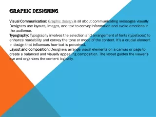
Approaches in Designing the Graphic Mark. Good Logos: Simple & Clean. Simple & Clean (KIS Rule: Keep it simple) Simplicity allows easy recognition and memorability Cleanness allows for easy reproduction – avoid gradients, filters, shadows and effects. Good Logos: Simple & Clean.

E N D
Approaches Approaches in Designing the Graphic Mark
Logos Good Logos: Simple & Clean • Simple & Clean(KIS Rule: Keep it simple) • Simplicity allows easy recognition and memorability • Cleanness allows for easy reproduction – avoid gradients, filters, shadows and effects
Logos Good Logos: Simple & Clean • Minimalist Illustrations • Avoid unnecessary details – eliminate anything you can • Strive for clean, non-complex edges • Use clean, simple, legible typefaces. • Unmistakable Visuals • Keep visuals clear (easy to understand) and unambiguous. Viewers should have no doubt about what they’re looking at. All viewers should see the same “big idea.” • Adhere to Production Standards • Avoid small shapes, type and negative spaces – they don’t scale well • Cleanness allows for easy reproduction – avoid gradients, filters, shadows and effects • Avoid using strokes - they don’t scale well. Use solid shapes instead. • Use vectors to design logos
Logos Good Logos: Simple & Clean • Many new/upstart corporations begin with logos that don’t adhere to logo design standards. As the corporation grows, they begin to understand the importance of proper branding – and the importance of designing good logos. Many corporations end up revising and simplifying their original logos to incorporate these best practices in logo design which enable powerful branding.
Logos Good Logos: Simple & Clean
Logos Good Logos: Intelligently Designed • Make smart use of an idea • Must be appropriate to the brand • Must convey meaning • Should be enduring (avoid using trending design styles for logo design) • Successful logos are often witty or contain a conceptual visual that gives viewers the “ahhh” moment when they “get it”
Logos Good Logos: Intelligently Designed
Logos Good Logos: Intelligently Designed
Logos Good Logos: Adaptable • Adaptable to Different Media, Sizes, Colors • Scalable – work at small and large sizes (use vectors) • Should work in color and black & white • Should work across a variety of media
Logos Good Logos: Adaptable • Work well at small sizes- test your logo by zooming out in Illustrator until the size appears less than half-inch on screen. If you lose the details or text readability – if ur looking at a blurry smudge – simplify the design!
Logos Good Logos: Adaptable • Work well in monochrome or black & white
Logos Good Logos: Unique • Avoid visual clichés • (Light bulbs for 'ideas', mouse for ‘technology', globes for 'international‘). These are usually the first ideas you think of when brainstorming and too many other logos feature these clichés. Take it further and come up with something nobody else would think of. Make your logo something your client knows only you could have done! • Don’t copy/borrow ideas – it’s unethical and illegal
Logos Good Logos: Unique • DO NOT: Use the obvious solutions/ clichés
Logos Good Logos: Unique • DO:Take your ideas further, push the creative limit
Logos Techniques in Logo Design • Use a grid • Use geometric shapes • Use negative space
Logos Techniques in Logo Design • Active (not passive) visuals
Logos Techniques in Logo Design DO: • Consider cultural differences – avoid offense • Make sure it works on dark backgrounds • Simplify – subtract unnecessary elements • Vet your designs with peers and colleagues – they might see something you don’t! DON’T:
Logos Techniques in Logo Design • Define exclusion zones • Specify size and horizontal/ vertical arrangements • Create a style guide • Dictate color options
Logos WORDMARKLettering and TypeformLogos
Logos Creating Wordmarks • Adapt an existing typeface • Avoid gimmicky fonts • Maximum of 2 fonts • Legibility is mandatory (at all sizes) • See the negative space (turn your design upside down!)
Logos Creating Wordmarks • Use strokes • Create ligatures • Use eliminations • Look for more tips and tricks in room 2016!!
Logos GRAPHIC MARKSymbols and IconsLogos
Logos Creating an Icon • Active not passive • Be clever AND simple • Visual double entendre • Connect to the brand’s core values • Use negative space • Use a grid, proportion and symmetry
Logos Combining Type and Symbol
Logos Marrying Type + Symbol • Type must match symbol • Avoid the easy solution of dropping the type below/next to the symbol. Try to marry them.
Logos Assignment 3 – Logo Design • PART 1: Scalable Design • Use a small ruler and locate FIVE (5) well-known logos that are sized at no more than half-inch wide or high, and FIVE (5) well-known logos that are taller than you. • Photograph both instances – with your ruler in the photos of the small logos, and with you in the photos of the large logos. Your photos should serve to indicate the size of the logos. • In a 2-page analysis paper (double spaced, TNR, 12 pts), with your photos attached: • Explain all the possible reasons the logos were printed so small or so large. • Also comment on the quality and resolution of the logo (eg. are the details in the small logos clear/readable; and are the larger logos pixelated? Explain how/why.) • PART 2: B&W Design • Locate FIVE (5) logos printed entirely in solid black (no shades or grays, no background colors. Hint: look at the back/underside of products, and at stationery) and write a 2-page paper explaining the possible reasons the designers used only black • DUE: Wed Sept 16, 2015