Download
1 / 16
160 likes | 170 Views
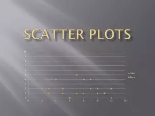
Scatter Plots. Information. Drawing a scatter plot. A scatter plot can be drawn to show the relationship between two variables. When drawing a scatter plot:. give the graph a title. draw a small cross on the graph for each data pair.

E N D
Drawing a scatter plot A scatter plot can be drawn to show the relationship between two variables. When drawing a scatter plot: give the graph a title draw a small cross on the graph for each data pair draw an x-axis and a y-axis, both with appropriate scales and labels
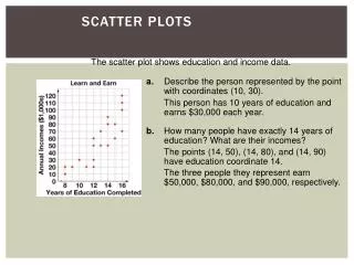
We can use scatter plots to find out if there is any relationship, or correlation, between two sets of data. Scatter plots and correlation For example: • Do tall people weigh more than short people? • If there is more rain, will it be colder? • If you study longer, will you get better grades? • Do used cars get cheaper with age? • Is more electricity used in cold weather? • Are people with big heads better at math?
When one variable increases as the other variable increases, we have a positive correlation. Positive correlation The relationship between the length of a spring and the mass attached to it This scatter graph shows that there is a strong positive correlation between the length of a spring and the mass of an object attached to it. Mass attached to spring (g)
Sometimes, the points in the plot are more scattered. Weak positive correlation We can still see a trend upwards. The relationship between scores on a math test and scores on a science test This scatter plot shows that there is aweak positive correlation between scores on a math test and scores on a science test. Math test score
When one variable decreases as the other variable increases, we have a negative correlation. Negative correlation The relationship between rainfall and temperature This scatter plot shows that there is astrong negative correlation between rainfall and the temperature. Rainfall (in)
Sometimes the points in the plot are more scattered. Weak negative correlation We can still see a trend downwards. The relationship between temperature and the amount of electricity used This scatter plot shows that there is aweak negative correlation between the temperature and the amount of electricity a family used. Electricity used (kWh)
Sometimes a scatter plot shows that there is no correlation between two variables. No correlation The relationship between age and the number of hours worked This scatter plot shows that there isno correlation between a person’s age and the number of hours they work per week. The points are randomly distributed. Age (years)
Clustering and outliers The following terms also help us describe data on scatter plots. clustering Clustering – this describes where data points are grouped together. Outliers – these are points that do not appear to fit the trend. outlier
Linear and non-linear patterns Some scatter plots have a linear pattern of association, as they appear to follow a linear pattern. Others will have a non-linear pattern of association, meaning that they will not appear to follow a linear pattern. For example, they may follow a curved pattern.
Interpreting scatter plots This scatter plot shows the relationship between average hours of math study per week and average math test score. What can we add to this graph to help us see the general trend of the data more easily?
Lines of best fit Aline of best fit (or a trend line) is drawn on a scatter plot to show the linear trend in a set of data. It is drawn so that there are roughly an equal number of points above and below the line. weak positive correlation strong negative correlation weak negative correlation strong positive correlation The stronger the correlation, the closer the points are to the line.