Download

1 / 27
270 likes | 367 Views
Tutorial on Risk Adjusted P-chart. Farrokh Alemi, Ph.D. Have Changes Led to Improvement?.

E N D
Tutorial on Risk Adjusted P-chart Farrokh Alemi, Ph.D.
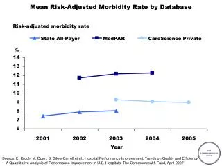
Have Changes Led to Improvement? Common cause variation (changes in outcomes because of chance) is everywhere. Decision makers often mistakenly attribute positive outcomes to their own skills and negative outcomes to others, while in reality both could be a chance outcome
Why Chart Data? • To discipline intuitions • To communicate data in vivid graphical ways
Data Needed • Data collected over time • Risk (expected outcomes) for each patient • Outcomes for each patient The purpose is to improve not to get so lost in measurement to loose sight of improvement.
What Is Risk? • A patient’s condition or characteristics that affects the expected outcomes for the patient • A severity index used to predict patient outcomes • Clinicians’ consensus regarding expected outcomes • Patient’s self rating of expected outcomes
MI Patients Over 8 Months in One Hospital Observed mortality during this time period Number of cases Expected probability of mortality for case 8 in time period 1. Estimated from severity indices or experts’ consensus.
Elements of a Control Chart • X axis shows time • Y axis shows probability of adverse events • Observed rates are plotted against time sequence • Upper control limit is a line drawn so that points above it are rare to be observed by mere chance • Lower control limit is a line drawn so that points below it are rare to observe by mere chance Lets take a look
An Example of P-chart Upper control limit Lower control limit Observed rate
Steps in Creating P-chart for Mortality • Check assumptions • Calculate observed rates and plot them • Calculate expected rates and plot them • Calculate expected deviation • Calculate control limits and plot them • Interpret findings • Distribute chart and interpretation
Step One: Check Assumptions • We are examining discrete events that either happen or do not happen, e.g. mortality among MI patients, falls among nursing home patients, error in medical record entry, etc. • The event is not rare, meaning the probability of it occurring exceeds 5% for each time period. • Observed events are independent from each other. The probability of the event occurring does not change over time. This assumption is violated if one patient’s outcomes affects the outcomes for others, e.g. when dealing with infectious diseases.
Step Two: Calculate Observed Rates and Plot Pi = Mortality rate in time period “i” Oi = Mortality in period “i” ni = Number of cases in time period “i” Pi = Oi / ni
Observed Mortality Rates for All Time Periods Plot of mortality rates
Plot of the Observed Rates • Time period 7 and 3 seem different but don’t rush to judgment. • Wait, until you see control limits of what could have been expected.
Eij = Expected mortality of case ‘j’ in time period “i” Ei = Expected mortality for time period “i” Ei = (j=1,…,niEij ) / ni Sample calculation: E1= (.18+.88+.33+.29 +.14+.24+.15+.04)/8 Step Three: Calculate Expected Mortality
Plot of Expected Mortality Plotting expected mortality helps interpret the observed rates but does not settle the question of whether differences are due to chance.
Step Four: Calculate Expected Deviation Eij = Expected mortality of case ‘j’ in time period “i” Di = Standard deviation of expected mortality in time period “i”, called by us as the Expected Deviation Di = ( j=1,…,niEij(1-Eij))0.5 / ni See sample calculation
Expected Deviation for Time Period 1 A B C Expected deviation D
Step Five: Calculate Control Limits UCLi = Upper control limit for time period “i” LCLi = Lower control limit for time period “i” t = Constant based on t-student distribution UCLi = Ei + t * Di LCLi = Ei - t * Di Where for 95% confidence intervals:
Calculation of Control Limits for Time Period 1 • UCL = .28 + 2.37 * .13 = .59 • LCL = .28 –2.37 * .13 = -.03 t-value Negative limits are set to zero as negative probabilities are not possible
Plot Control Limits UCL LCL
Step Six: Interpret Findings • There are no points above UCL. There is one point below LCL. • In time period 3, mortality is lower than what can be expected from patient’s conditions. • All other time periods are within expectations, even time period 7 with its high mortality rate is within expectation.
Step Seven: Distribute Control Chart • Include in the information: • How was severity measured and expected mortality anticipated? • Why are assumptions met? • What does the control chart look like? • What is the interpretation of the findings?
Index of ContentClick on the Slide You Wish to Review • Check assumptions • Calculate and plot observed mortality • Calculate expected mortality • Calculate expected deviation • Calculate and plot control limits • Interpret findings • Distribute control chart