Download
1 / 6
60 likes | 166 Views
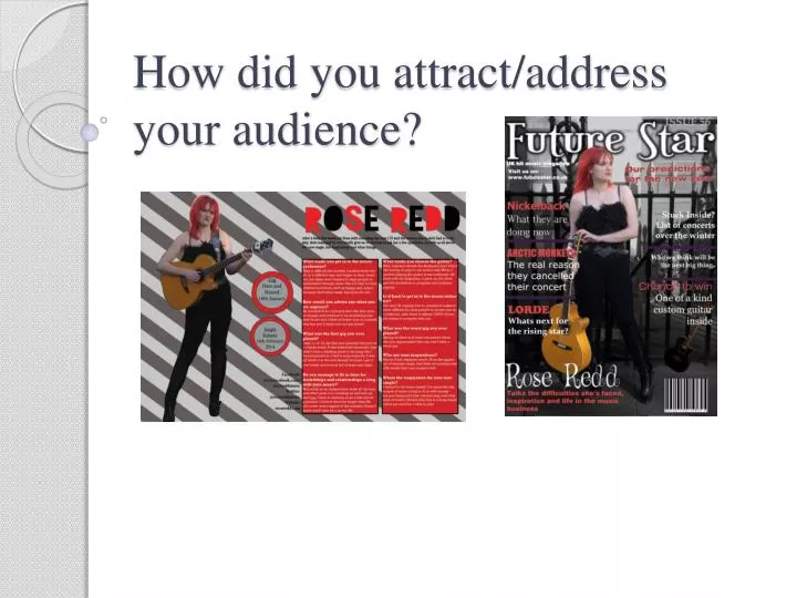
How did you attract/address your audience?. Colour Usage. I used a lot of red, black and white for my magazine I did this because I think it’s an eye catching colour and it fits in with my models hair

E N D
Colour Usage • I used a lot of red, black and white for my magazine • I did this because I think it’s an eye catching colour and it fits in with my models hair • Another reason why I used this colour scheme is because when I did my questionnaire I go the majority responses saying that people would prefer to see red and black and white on a music magazine.
Image • For my front cover I chose this cover model because I know she’s a new singer in the music industry and I thought she would fit in with the tone I wanted for my magazine. • I also used her for my double page spread as I knew that I’d be able to write my double page spread about her easily as I know her quite well. • For my contents page background I needed a picture with a light background and I thought the clouds would look good and then fade them, so I thought it would work well especially with it looking symmetrical.
Eye catching cover lines • I put my most interesting cover lines on the left side third, these will draw the attention of the reader while its on the shelf in a shop • I did the cover line in bright red and then a bit of information about them underneath in white so they could find out more, but knew which bit was most important. • Then I did the least important cover stories on the right and the competition to win a guitar with a picture underneath to draw the attention after with the picture.
Masthead • I made my masthead so that it was behind my cover models head showing that she was the most important thing on the page. • I chose my font from dafont.com because they’ve got a wide variety of font to choose from and then I edited it on Photoshop. • I chose this specific font and colour because it stood out from the background because it had a shadow • For the name I called it ‘future star’ this is because its aimed at young aspirers who are interested in becoming a star in the future and want to be linked with something called that.
Front Cover • My magazine represents people who are interested in listening to music and enjoying it, also finding out about all the new bands and expanding their knowledge on music. • It also represents young aspirers who may also be interested in going in to the music industry themselves. This is mainly shown in the main story and the mast head ‘future star’ • I think I am fitting with stereotypes, such as using the black, white and red colour scheme, which a lot of other music magazines may use, these colours usually represent rock music.