Download
1 / 19
190 likes | 284 Views
Alison Doyle Disability Officer Print Accessibility. Accessibility. Everyone benefits from clear, readable text content. People with visual impairments benefit particularly.

E N D
Alison Doyle Disability Officer Print Accessibility
Accessibility Everyone benefits from clear, readable text content. People with visual impairments benefit particularly. Dyslexia is a disability which is very sensitive to particular typefaces, both in print and on screen. Whatever materials you are creating, they should be accessible to as broad an audience as possible. Many of the difficulties that occur with dyslexia result in a barrier, although symptoms can vary between individuals, difficulties do result in similar patterns of problems.
Neurological Experimental studies now provide evidence of some perceptual difficulties in dyslexia for tasks involving the processing of rapidly changing information, such as the perception of flicker or motion (Stein, 1994). Such difficulties in processing rapid visual information implicate the magnocellular visual system (Stein and Walsh, 1997). The magnocellular system is particularly important for the control of eye movements and visual attention. Neuroanatomical abnormalities relating to this visual pathway have been reported in the brains of dyslexic people (Livingstone et al., 1991).
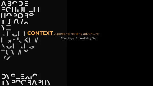
Fonts Serif Serif fonts have worked well for hundreds of years. They tend to look more old-fashioned and 'establishment'. The serifs - the flowing marks at the points of letters - work by leading the eye on to the next letter, making for a smoother and easier read. However, this only works at high resolutions (e.g. print). At low resolutions, the extra complexity decreases clarity, and the reduced whitespace between letters makes recognition slower. Sans-serifs are literally fonts that don't have serifs. They look more modern and open. Sans-serif fonts are more readable than serifs on pixel-based displays, because they are simpler, which translates well to low-resolutions.
Page format Text should be justified to the left hand side only as fully justified blocked text disrupts the spacing like this: I den tify t heben fits ofde leg ation forbo thethe or gan is at ion an ditsemPloyees an dout l ine th ereson sfo ran lac kof de gation th at myocur ffrom th eit her pesuriors o rsubdinor ates p e r sp ecive When what it really says is this: Identify the benefits of delegation for both the organisation and its employees and outline the reasons for any lack of delegation that may occur from either the superiors or subordinates perspective
Universal Design "I’m surrounded by thousands of books and not able to read any of them. I’m not asking for anything special, just the same as everyone else – to be able to read the book I want.”
What information should be accessible? All information circulated within, and outside College should be accessible, including: • academic materials (including lecture notes and handouts) • administrative information (including website material, prospectuses, course handbooks and timetables) • general information, including that from student services, the Students’ Union and clubs and societies.
Colour Contrast (black and white) Black font on white background can give too much reflection. This is a particular difficulty for dyslexic students, especially those who also suffer from scotopic sensitivity syndrome. The following are some suggestions for visually impaired and dyslexic readers.
DO NOT USE ENTIRELY BLOCK CAPITALS – VERY DIFFICULT TO READ • IT IS NOT POSSIBLE TO DISTINGUISH BETWEEN LETTERS WITH UPSTROKES AND DOWNSTROKES WHEN ALL LETTERS ARE THE SAME SIZE. • USE CAPITAL LETTERS FOR ISOLATED LETTERS ONLY AND FOR SOME HEADINGS • FOR MAIN TEXT USE UPPER AND LOWER CASE LETTTERS, AS WORDS RETAIN THEIR SHAPE FOR EASY READING • USE LETTERS IN A PLAIN TYPE FONT (ARIAL), ITALICS CAN BE DIFFICULT • FAT LETTERS ARE MORE EASILY SEEN THAN THIN LETTERS. KEY WORDS SHOULD BE HIGHLIGHTED IN BOLD TYPE • COLOUR CONTRASTING OF THE LETTERING AND THE BACKGROUND SHOULD BE CONSIDERED
Colour Contrast (green and navy) More muted colours can improve visibility
Colour Contrast (green and black) More muted colours can improve visibility, they remove the ‘glare’.
Colour Contrast (dark red and cream) More muted colours can improve visibility
Colour Contrast (grey and red) More muted colours can improve visibility