Download
1 / 20
200 likes | 288 Views
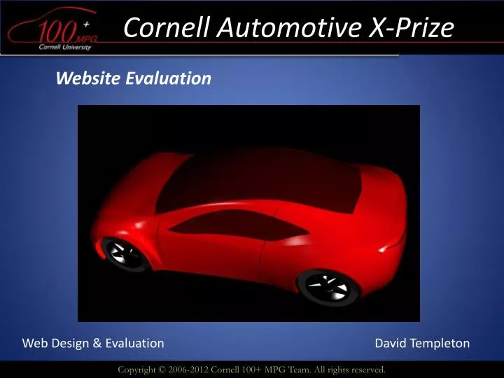
Cornell Automotive X-Prize. Website Evaluation. Web Design & Evaluation. David Templeton. Agenda. Website Overview Target Audience Competitive Analysis Expert Analysis Data Collection Data Analysis Conclusions Recommendations. Cornellaxp.com. Website Overview.

E N D
Cornell Automotive X-Prize Website Evaluation Web Design & Evaluation David Templeton
Agenda • Website Overview • Target Audience • Competitive Analysis • Expert Analysis • Data Collection • Data Analysis • Conclusions • Recommendations
Website Overview • Cornellaxp.com or Cornell100mpg.com • Public presence for the CUAXP Team (Cornell Automotive X-Prize Hybrid Car Team) • Used by current sponsors, prospective sponsors, current team members, and team alumni • Generate Interest and Support
Target Audience • Current business and private sponsors • Prospective sponsors of all kinds • Current Team Members • Team Alumni • Competitors • General Public
Competitive Analysis • Aptera Motors (aptera.com) • Edison2 Motors (edison2.com) • Both companies design high efficiency, high mileage cars and competed in the Automotive X-prize competition • Edison2.com is very similar to CUAXP • Aptera Motors website is quite different
Competitive Analysis • Aptera Motors (aptera.com)
Aptera Motors • No pictures of their cars • Very difficult to navigate and find desired information • Navbar has very small text • Very text heavy • Employs grouping techniques well • Creative layout • State of the art photos, high quality • Vertical scroll bar keeps everything on one page • Green color scheme promotes efficiency feeling
Competitive Analysis • Edison2.com
Edison2.com • Very similar feel to Cornellaxp.com • Has mouse over options on the main page • “Active” page is highlighted in green • Better multimedia • Scrolling/looping pictures in the margins • Site has a “tighter” and “cleaner” feel • Contains much more information • Technology in the car • Facts and figures
Expert Analysis • Heuristics: • The design is minimalist – does not take advantage of space • Drab coloring in free space • Fast loading site • Easy navigation with toolbar and highlights • Changing banner picture but consistent toolbar provides superb feedback • Mouse over options provide additional information without a mouse click
Expert Analysis • Checklist: • Error when opening in IE • Could contain more technical information • More about the hybrid, aerodynamics, etc. • No site map / search of just the site • Excellent graphics and text • Load time is fast
Data Collection • Tasks: • 1) Determine different sponsor levels and make a donation • 2) Locate the most recent news about the CUAXP team • 3) View pictures of team activity • 4) View Member profiles • Observed: • Number of clicks • Time • Mouse direction / comments
Survey Results • Navigation Score (1-5, 5 = best): • User a: 4 • User b: 4 • User c: 3 • Overall Layout (1-5, 5 = best): : • User a: 5 • User b: 4 • User c: 4 • Level of Frustration (1-5, 5 = least frustration): : • User a: 3 • User b: 4 • User c: 2 • Comments: • Open Source Website Button? • Scrolling through the pictures is cumbersome / doesn’t fit
Conclusions • Overall layout is positive – simple yet effective • Drop down menus reduce clicks / time • Highlighting current page • Color scheme implies efficiency • Quick links to social media • Banner wordings are misleading • Changing images results in poor contrast • Too much blank space • Change color of blank space • Doesn’t fit with rest of color scheme
Recommendations • Use scrolling pictures in the open space in the sidebars • Change color of empty space to match color scheme (green / blue) • Change banner names to be more intuitive • Media Photos & Media • Move the twitter feed up on the page • - Update news more frequently • Align the banner when opening the site in Internet Explorer
Recommendations • Fix the “click here to help support the team!” button • When the banner image changes – lose contrast • Add a technology page • Describe what type of car was built • What new technology? / Advancements? • Add another page for sale of memorabilia • T-shirts • Bumper Stickers
Works Cited • Aptera.com • Cornellaxp.com • Edison2.com • Brink, Tom. Gergle, Darren. Wood, Scott D. “Usability for the Web”. Designing web sites that work. 2002.
Thank You Questions?