Download
1 / 16
160 likes | 274 Views
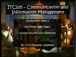
ITC105 Assessment Item 2. http://csusap.csu.edu.au/~smccar08/. Intended Audience. The aim of this website is to capture the attention of like-minded people to myself, ie . those interested in literature, and to present myself in a way that other people who know me personally would appreciate.

E N D
ITC105 Assessment Item 2 http://csusap.csu.edu.au/~smccar08/
Intended Audience • The aim of this website is to capture the attention of like-minded people to myself, ie. those interested in literature, and to present myself in a way that other people who know me personally would appreciate. • Generally, the target audience would fall between the 17-45 age bracket, with exceptions. • Due to the various genres and types of literature, the site may appeal to more than one specific interest group.
Goals • To allow people who know me greater insight into my interests • To provide an entertaining yet somewhat intellectual introduction to my love of literature • To explore basic XHTML • To be of high quality for submission as Assessment Item 2 for ITC105
Main - content • Tables to control layout and uniformity of webpages: menu table with links and personal image (using CSS to control font size and weight), body table containing main text and other links • A list to present assessment items in an organised manner (using CSS to control font style and colour) • Centering to draw attention to a particular section of text
Main - layout • Main menu table at top of page, body table directly beneath • Main menu reading left to right for easy navigation • Table for body to keep text positioning uniform across the site • Centered text is a quote highlighting the personal significance of the topic • Assessment item links are presented in list format with CSS styling to draw attention to the items
Main - function • The heading and body tables allow the website uniformity so that the reader is not struggling to focus on layout unnecessarily, rather than the content • The centered section is eye catching, and therefore ensures the reader will give it attention • The colours and font used are easy on the eye, encouraging the reader to explore the site further
Literary Lover - content • Tables to control layout and uniformity of webpages: menu table with links and personal image (using CSS to control font size and weight), body table containing main text, image and other links • Include eye catching image to break up monotony of text • Text written in an entertaining manner to present literature as being fun • Link to separate page using description
Literary Lover - layout • Main menu table at top of page, reading left to right for easy navigation • Table for body to keep text positioning uniform across the site • Centered image within the body to break up the text, a kind of placeholder • Use of list to make the text more visually appealing • Link contained in text, the text provides a description of what the link leads to
Literary Lover - function • As with the main page, the heading and body tables allow the website uniformity so that the reader is not struggling to focus on layout unnecessarily, rather than the content • The centered image is eye catching, and breaks up monotony so the page doesn’t appear to be boring. It almost works as a separator. • The colours, font and text link used are easy on the eye, encouraging the reader to explore the site further
References - content • Tables to control layout and uniformity of webpages: menu table with links and personal image (using CSS to control font size and weight), body table containing all pages/books referred to for information or images • References provided as separate paragraphs rather than a list, using individual italicising for the names of each reference
References - layout • Main menu table at top of page, reading left to right for easy navigation, with a table for the body to keep text positioning uniform across the site • Each reference is individually edited rather than listed (italics and links) for more accurate APA style referencing
References - function • As with the main page, the heading and body tables allow the website uniformity so that the reader is not struggling to focus on layout unnecessarily, rather than the content • The references need to be included in APA format so that all information and images used within the site are cited and can be easily found
Twilight vs Dracula - content • Tables to control layout and uniformity of webpages: menu table with links to Literary Lover and personal image (using CSS to control font size and weight), body table containing main text, and an image • Include eye catching image and paragraphs to break up monotony of text and emphasise the point the text is making • Text written in an entertaining manner to present personal argument
Twilight vs Dracula - layout • Main menu table at top of page, reading left to right for easy navigation, with a table for body to keep text positioning uniform across the site • Centered image within the body to break up the text, and emphasise the argument • Use of paragrahs to empahsise points and breaks up the text into sections for easier reading
Twilight vs Dracula - function • As with the other pages, the heading and body tables allow the website uniformity so that the reader is not struggling to focus on layout unnecessarily, rather than the content • The purpose of this page is to get the reader to think about literature critically, and prove via argument (presented in easy to read layout) that critical analysis of novels can be fun, or funny. The goal won’t work if the text isn’t easy to read