Download
1 / 17
170 likes | 177 Views
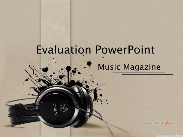
Evaluation PowerPoint. Music Magazine. Target audience. My chosen target audience is mainly aimed at girls, ages 16-26. Throughout my magazine my main theme is sexy and empowering. ladies.

E N D
Evaluation PowerPoint Music Magazine
Target audience • My chosen target audience is mainly aimed at girls, ages 16-26. Throughout my magazine my main theme is sexy and empowering ladies In my magazine I have got pictures which represent my target audience. I have had pictures and text of women who have achieved their life dreams.
Technology • While making my magazine, I used 2 new software's that where new to me. The first, Photoshop, I had never used before. I really didn’t like Photoshop, I found it very difficult to use, and I found that it kept freezing, and was very slow. The second piece of technology that was new to me also, was a program called In Design. I Found I liked this a lot more than Photoshop, however I still wasn’t 100% On it. I Found that it was hard to find the correct button to complete what I wanted it to. 3
My Chosen Image Medium close up shot. The background is very plain, yet very affective, its up against a oyster white door. This colour connotes calming. This works well for my magazine, as it’s the effect I was going for. Not too wild. Wearing a grey top with rose lipstick. The rose lipstick is used as it’s a very feminine colour, and as my magazine is aimed mainly for females, it works very well.
The Title Original I chose the title, ‘Rhythm’ because it came back the most popular title name for a Music Magazine. Downloaded the font from ‘DaFont’. I Picked the colour, a calming yellow, because of the feminine look going for the magazine, the yellow I chose connotes happiness, and cheerfulness. However, on my original image, the colours I wanted didn’t show up as much, where as on my final image, it showed very well.
Tag Line ‘Bringing music together’- is a tag line I made up, I thought it was really effective, as my magazine is about how the chat music is all different kinds of genre’s and its all come together in one magazine. You can find everything you wanted to know in this magazine. I chose the colour Grey, as the colour for the tag line, as I thought it was very fitting to the outfit my model was wearing.
Information For my text I decided to go with 3 colours, Grey, pink and light yellow. Pink to match the lipstick, grey to match the top, and light yellow to blend in with the earrings. I have made it clear who is on the front of the cover with this information. Fiona-Lee However I have noted that Fiona-Lee twice in the information, this give an impression that the whole magazine is about her, which isn’t what I wanted.
Photo’s I didn’t use • I Didn’t use these images because .....
Front Cover Conclusion I believe that my front cover was successful, the first attempt I wasn’t happy with, however the final draft, I am very happy with, I believe that the picture is appropriate and the title stands out. I believe that the colours I chose were very appropriate and fitting for the target audience for my magazine. I believe that my tag lines, and selling pointsworked very well, because they were very clear, and effective. However, there are some points that I believe that I could improve on, I think that I could have included a banner at the bottom of the page, to attract more people. I also think that I could have made it more clear, to show that there are more people in the magazine than just the one being mainly advertised.
Content page For my content page, I had the idea to split it into 4. One section with information about what’s inside One section with Content written down the side, pictures with it. One smaller section just with a picture advertisingwhat’s going to be inside. And the last section is what will be in next weeks issue, with a cover of next weeks issue to go with it.
Information I chose 2 different colours for the information on the content page. Pink to match the front cover, and a new baby blue. I chose this colour because it connotes being peaceful and tranquil.
Content Conclusion Over all I believe that my content page was very successful, the original design worked really well, and I believe that the colours and pictures I used worked very well. I believe to have improved my work I would have had to make it more space efficient, so that I could fit more information into it. Also I could have put more things on it which attracts people to read on.
Double page spread I believe that the most elegant part of the magazine was my double page spread. I thought that I was simple, yet very effective. The colours used were consistent throughout the magazine, with Blue and pink writing. On one page was the writing, and the content used. In my case it was an interview with Fiona-Lee, the main attraction of my magazine. On the other page, was a picture of the main attraction. This photo is of Fiona led down, I chose this picture because I think its really fitting to the image of my magazine, the colours really match with the ones used in my text, and very feminine.
Photo I chose this photo as my final photo for my double page spread. I chose this photos over others, because its clear, strong, and represents a sexy smart female who has got her dreams. Other photos.
I didn’t chose this photo because there is no face in the picture, i really like this photo, however i think that if there was a head shot in it, this would be a great photo. 15
What have I learnt ? • Through out my time creating my magazine, I have learnt a lot, for starters how to use the software's, In Design, and Photoshop. But I believe the thing of most value of which I have learnt, is how to take good photos, what backgrounds to use, and what lighting. All the techniques used to do so. 16
Overall Conclusion I believe that as an overall conclusion for my magazine, I believe that it is very successful. I think that the colours I used really work, they really worked for the target audience I was trying to get. I believe that the pink really connoted feminism, and the baby blue, really showed authority. I think that to improve my magazine, I could have added more information, and text into the front cover and the content. I also think that I could have entered different information, so that it doesn’t look like the whole magazine is very laborious, and all about the same thing.