Download
1 / 7
100 likes | 262 Views
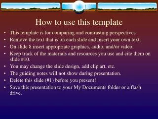
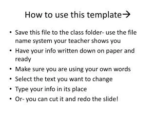
How to use this template. THIS SLIDE IS FOR REFERENCE ONLY. Delete Slides 1-3 upon completion of your final presentation. QUESTIONS? Call x6734. This template provides fonts, colors, logo and background graphics suitable for District presentations.

E N D
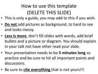
How to use this template THIS SLIDE IS FOR REFERENCE ONLY. Delete Slides 1-3 upon completion of your final presentation. QUESTIONS? Call x6734 • This template provides fonts, colors, logo and background graphics suitable for District presentations. • These templates are provided by Communications & Community Relations, intended to be used as general presentation guidelines, and will not guarantee a flawless presentation. When in doubt, please contact CCR (John Gonzalez x6734) to have your draft file reviewed for possible format conflicts or graphics concerns. • Delete any unused or blank slides, or copy the slides with your desired background graphics as needed.
PowerPoint TIPS 1 of 2 THIS SLIDE IS FOR REFERENCE ONLY. Delete Slides 1-3 upon completion of your final presentation. QUESTIONS? Call x6734 • NUMBER OF SLIDES: Best to keep simple and direct. • COLORS: If adding your own slides, use a DARK background with LIGHT text for optimum visibility. It’s easier on the eyes. • LOGOS: Please use the official District logo as it appears in this presentation. This white version is best for dark backgrounds. • FONTS: Block-style fonts (like this one, Tahoma) are easier to read on-screen than book text (like Times New Roman). • POINTS PER SLIDE: With a standard size 28 or 32 font, try to keep your bullet points to one line each, with no more than seven bullet points per slide. Consider brief statements instead of complete sentences.
PowerPoint TIPS 2 of 2 THIS SLIDE IS FOR REFERENCE ONLY. Delete Slides 1-3 upon completion of your final presentation. QUESTIONS? Call x6734 • IMAGES: To ensure your photographs are completely visible, reduce the size (by clicking-and-dragging one of their corner points) to fit inside this dotted line. *Any part of the photograph that is not within the boundaries of the slide will not be visible when it is projected as a slideshow. • MASTER SLIDES: Please use the Master Slide and Title Master to ensure proper text box alignment. SAFE PHOTO BOUNDARY VISIBILITY BOUNDARY