Download
1 / 14
140 likes | 146 Views
A responsive website can be a powerful asset to your business. Your site will load faster, rank higher on search engines, and present a more professional image of your company to new and current customers.<br><br>If you have considered redesigning your site or creating a new one from scratch, don't hesitate! Start building today so that you're ready for tomorrow. As always, you have the freedom to reach out to a WordPress Development Company in India for anything along the way. Good luck!

E N D
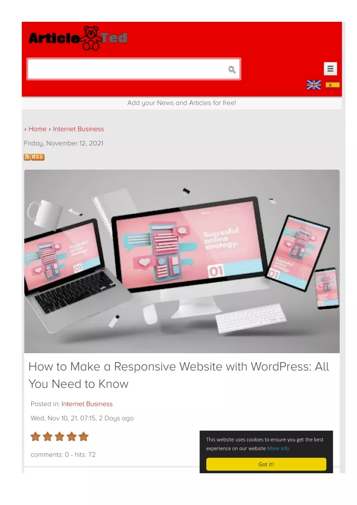
Add your News and Articles for free! » Home » Internet Business Friday, November 12, 2021 How to Make a Responsive Website with WordPress: All You Need to Know Posted in: Internet Business Wed, Nov 10, 21, 07:15, 2 Days ago This website uses cookies to ensure you get the best experience on our website More info comments: 0 - hits: 72 Got it!
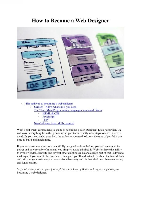
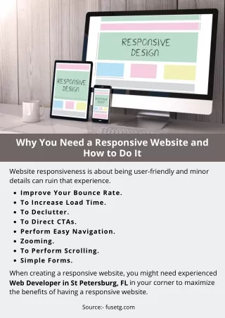
Responsive website have become a must today. Let us talk about its benefits and how to make your Responsive website have become a must today. Let us talk about its benefits and how to make your website responsive using WordPress website responsive using WordPress WordPress is the most popular blogging platform with 35% also one of the easiest to use and most accessible. It makes WP a preferred way to get your website up and running without any specialized coding or design skills. 35% of web usage in the world, and it's By choosing WordPress as your web software, you'll have a user-friendly framework on which to build a website that looks great on desktop computers, tablets, and smartphones alike. As simple as ABC, it means creating a responsive website. It seems like everyone's talking about responsive design right now, but what exactly does it mean? Responsive design means that your website automatically regulates or adjusts its layout based on the device it gets viewed on. If you're using responsive design, this means that your website will look good no matter if someone accesses it on their desktop computer, tablet, or smartphone device. How does Google Define Responsive Web Design? How does Google Define Responsive Web Design? Google says that a responsive website automatically adapts its layout to work well on devices of all screen sizes, from mobile phones to desktop computer monitors. It means your website can maintain consistency across all platforms and devices. For example, you won't have different home pages for your website, depending on what device people visit. Google views responsiveness as one of their top web design criteria, & they will penalize sites that aren't mobile-friendly, so be sure you choose a web design company that specializes in responsive development.
This way, you won't lose ranking and search engine traffic because of something as simple as not having a mobile site. A responsive web design agency can help you build an attractive, high-converting website optimized for every screen size. Top Benefits of Creating Responsive Websites Top Benefits of Creating Responsive Websites The benefits of creating responsive websites are numerous, so it's no wonder that responsive design is becoming one of many vital elements of mobile-first website design. While offering a superior user experience across all devices is always beneficial, other critical reasons are to pursue responsive website design. Have a look at the list below depicting the top benefits of creating responsive websites: 1. Broad Market Appeal 1. Broad Market Appeal When you build a responsive website, you're able to reach mobile users in addition to desktop users. With 61% of mobile searches resulting in immediate action, that's certainly something to think about. You can cater your marketing efforts toward mobile devices if you have a responsive website, which will allow you to reach more potential customers. Your information is also much more accessible for people on the go when they search online, making it easier for them to find what they need. 2. Search Engine Friendliness 2. Search Engine Friendliness SEO is a significant part of any online marketing campaign. Developing a responsive website means you won't have to learn and execute an entirely new set of rules when optimizing your site for search engines. Instead, much of what you'll be doing will be similar to what you do now. The only difference is that instead of working with one website, you'll have three different versions: desktop, tablet, and mobile. That doesn't seem like a considerable section until you realize that most people perform smartphone searches. 3. Save Money on Development 3. Save Money on Development Designing separate websites for desktops and smartphones can cost more than twice as much as designing for just one. However, a responsive website saves you money because it works across all devices, requires less coding, has fewer development resources, and translates into significant savings over time. Highly Engaging: People looking for information on your site should be able to find it quickly and easily. If they get frustrated with long load times or navigation that's overly complicated, they'll bounce, meaning they won't look at other pages on your site—they'll leave immediately. Having a responsive website will keep people engaged so you can increase sales. 4. Smooth Navigation 4. Smooth Navigation When users visit your site on a mobile device, they're often searching for one reason only: to accomplish a specific task. If you can make your site load quickly and be easy to use on their phone, you won't lose customers when they need your help. A responsive website is also more user-friendly than sites that use separate mobile versions since it doesn't require users to pinch and zoom to read text or navigate through an awkward UI.
5. Higher Conversion Rates 5. Higher Conversion Rates Having a responsive website is crucial, with mobile devices accounting for more traffic to your website than desktop computers. On average, 50% of mobile visitors will leave a site that doesn't display correctly on their device. And if you're not mobile-friendly, it doesn't matter how many other great features your website has – no one will come back if they can't interact with it. Role of Themes while Building a Responsive WordPress Role of Themes while Building a Responsive WordPress Website Website Choosing a responsive theme plays a vital role in making sure your site looks great on all devices. We recommend avoiding themes that rely on heavy flash usage, but if you choose one with flash (like some popular ones), make sure it's lightweight and only used for elements that aren't critical to your web design. For example, if your theme uses flash for background colors or parallax effect on images, it won't be affected by different resolutions or screen sizes. And avoid using too many plugins or widgets per sidebar—overloading your sidebar will only cause performance issues down the road. A simple HTML layout is also helpful because you can change it via CSS rather than more complex programming languages like PHP or JQuery. As themes play a crucial role while building a responsive WordPress website, you must ensure you are going with the right option.
But, How can You Choose a Responsive WordPress But, How can You Choose a Responsive WordPress Theme? Theme? One of my favorite things about using WordPress is that it's constantly evolving. The CMS (content management system) continuously improves, adds new features, and provides more ways for users to customize their websites. However, with all these updates comes confusion over what themes are supported by new features—mainly if you're not working with an experienced designer or developer. Look for the following essential factors to ensure you are choosing the suitable responsive WP theme for your website: Whether it supports customizing through CSS Whether it supports customizing through CSS: The most significant benefit of using CSS instead of HTML to change fonts, colors, padding, margins, and sizes is that it's unnecessary to know any code to accomplish it. You can even create your custom CSS styles if you don't find what you need already available for purchase. That said, you can also use HTML tags instead of CSS if you want— there are plenty of design elements that are impossible or difficult using CSS alone. Whether it supports customizing through page builders Whether it supports customizing through page builders: There are several front-end page builders for building custom layouts, including Visual Composer (free), Divi Builder ($89), and Beaver Builder (free). If you want more freedom than what's offered by your WordPress template, it might be worth paying for one of these builders. They provide an easy way to implement anything from simple image grids to complex animations on your site. Whether it's easy to use Whether it's easy to use: Aside from being beautiful, a good WordPress theme should also be easy to use. Check out customer reviews on any potential theme and look for some active support forums. It is often a good sign that there's some active developer support for that particular template. You can also check whether it got updated in recent months, which is another good sign that you won't get stuck with an out-of-date design. Whether they have a robust back-end editor Whether they have a robust back-end editor: Back-end editors are handy if you want to customize your website. It allows you to change fonts, color schemes and edit HTML elements without knowing how to code them. If you have no experience with these kinds of back-end editors, try searching for themes that have strong ones. If you want your website to appear stunning & do what you need it to do, it's time to learn how to create a WordPress website in easy & simple steps. Steps for Creating a Responsive WordPress Website Steps for Creating a Responsive WordPress Website
Step-1: Sign Up Step-1: Sign Up To create your website, you'll need to create an account on a hosting web service. A web host is simply a firm that provides space on its servers for you to store your site, as well as bandwidth and other services necessary for your website to function correctly. It can be done by either purchasing a domain name from hosting providers or from third parties. Step-2: Choose your Responsive Theme Step-2: Choose your Responsive Theme The first thing you'll need to do is choose your theme, which acts as your website's look and feels. There are plenty of free responsive themes available, but consider paying for premium options if you want something with more design elements. It can be time-consuming trying to find what you want—so take your time looking around and browsing through reviews and demos before you decide. Step 3: Install Responsive Plugins Step 3: Install Responsive Plugins You can extend your website's functionality with plugins. Plugins are small pieces of software that, once installed, give you access to new features on your site. For example, if you have an eCommerce store, some plugins can help you accept payments online. It would help if you preferred installing responsive plugins on your site. WordPress has an easy-to-use plugin library, so there are plenty of options. Your situation will dictate which ones you need. If you're just getting started, start with Google's most popular plugin—Google Analytics— which allows you to track your website traffic and optimize it based on your findings.
Step 4: Add Content Step 4: Add Content Once you have your theme set up, it's time to add content. The quickest way is with a tool like Copyscape or Google's rewriter tool if you need unique content for your site, and it will help you get indexed by search engines. Step 5: Stay Updated Step 5: Stay Updated WordPress is an evolving platform, so it's essential to stay current with updates and new plugins. If you use a theme from a reputable designer, you don't have much to worry about— their themes get updated regularly. You should manage plugins, but if there are popular themes or plugins that other people recommend using, be sure they work together before you implement them. Wrapping Up Wrapping Up A responsive website can be a powerful asset to your business. Your site will load faster, rank higher on search engines, and present a more professional image of your company to new and current customers. If you have considered redesigning your site or creating a new one from scratch, don't hesitate! Start building today so that you're ready for tomorrow. As always, you have the freedom to reach out to a WordPress Development Company in India for anything along the way. Good luck! FAQs FAQs Question: What Other Choices Do I Have Apart from Choosing a Responsive WordPress Question: What Other Choices Do I Have Apart from Choosing a Responsive WordPress Theme? Theme? It is straightforward to customize your website when you choose a responsive WordPress theme. On the other hand, when you do not want to go with a responsive theme, you will have to make a responsive WordPress theme, and you can learn it via tutorials. Alternatively, you can also hire a WordPress Developer to do the job on your part. Question: What are some of the top responsive WP themes available out there? Question: What are some of the top responsive WP themes available out there? Answer: WordPress has tons of responsive themes available for free & on a chargeable basis. My pick for the top 5 includes the following: 1) X Theme X Theme is a mobile-first theme based on Bootstrap. It uses a responsive design to look good on any device, and it's easily customizable. You can start using X Theme immediately without installing or configuring any additional plugins or frameworks, making it great for developers to create new projects. It also provides you with multiple pre-built demos that you can use as starting points for your site. The standard demo shows off all of its features, while others are optimized for eCommerce, blogging, portfolios, and other everyday use cases. It also comes with popular functionality, including sliders, dropdowns, and parallax scrolling effects. 2) Avada Theme Avada is a premium responsive WordPress theme that's loaded with features and beautiful design. It features multiple sliders, full-width page templates, custom widgets, Google Fonts,
and more. Avada has numerous options for customization, including unlimited color schemes. It's built on Twitter Bootstrap 3 (meaning it's mobile-friendly) with loads of shortcodes to help you create all kinds of layouts for your content. 3) Ultra Theme Ultra has so many options. You might feel overwhelmed! It is exciting news for people who are serious about setting up their site just right. Ultra comes with multiple predefined color schemes, multiple sliders, and a generous assortment of widgets. They have custom menus, custom post types for portfolio items, team members, and videos. You can customize everything from fonts to headers to footers. If that doesn't describe you at least a little bit, check out one of our other recommendations. But if you like complete control over your website design. Give Ultra a try if you want your customers or clients to see what you want them to see. 4) Twenty Seventeen Theme This responsive theme's tagline looks just as good on a phone as it does on a desktop, and indeed, that seems to be true. Bloom also includes Google Fonts integration and social media buttons for sharing posts from your site, offering plenty of customization options. The only feature missing from Bloom is a gallery-building tool—but you can add a plugin for that. It supports both WooCommerce and Easy Digital Downloads for eCommerce stores or membership sites. You can customize colors in multiple ways, with choices in every aspect of its look, including post thumbnails and post excerpts. 5) Bloom Theme Designed with simplicity in mind, Bloom is one of our favorite responsive themes for bloggers and online publishers. Use Bloom to set up a sleek website with enough features to display your content in a modern way, all without having too many bells and whistles getting in your way. One unique feature we like about Bloom is that it doesn't include a header image. Instead, it has a large rectangular logo that you can style with CSS to get more use from the less real estate on smaller devices. There are free and premium versions of Bloom; if you choose to go pro, you'll get access to more customization options, including advanced typography settings. Question: What is the difference between a WordPress theme and a template? Question: What is the difference between a WordPress theme and a template? Answer: A WordPress theme is a collection of files that determine how your website will look. On the other hand, a template is just one file that serves as a starting point for building your website. While you can develop a website with just a template, using a full-featured theme is much easier. To create a web page in a WordPress theme, you need an HTML file and a PHP file. The HTML file contains all of your content and images, while the PHP controls any dynamic elements—such as pulling data from an external source or displaying featured posts from your archives. With WordPress themes being so popular today, there are thousands to choose from—and m
Share Share Sponsor Sponsor About Author About Author Varun Bhagat Member since Apr 6, 2020 Location: India
Follow Following Following User not following anyone yet. You might also like You might also like How To Create a Marketplace Mobile App? How To Create a Marketplace Mobile App? How to build a competitive marketplace app? What should you watch out for this? Find out in this article. It will be useful in your marketplace app development. The Connection Between Blockchain & Mobile App development The Connection Between Blockchain & Mobile App development In the past few years, Blockchain has been widely used in almost every aspect including Mobile App Development. How Mobile App Development Strengthens Your eCommerce Business? How Mobile App Development Strengthens Your eCommerce Business?
The e-commerce industry is driving its highest revenues from mobile apps. Isn’t it excellent for the e- commerce industry? Things You Might Not Be Aware Of You Can Do With WordPress Things You Might Not Be Aware Of You Can Do With WordPress WordPress is the most widely-used CMS. Mainly it is used for blogging websites but not many are aware of other ways it can help you. In this blog, let's delve it other uses and benefits of WordPress Can AI Combine With AR/VR For A Better & Exciting Future? Can AI Combine With AR/VR For A Better & Exciting Future? Ai is a technology which is rocking the world. AR and VR are also making waves. What would happen if they combine? Lets check out. DevOps Success Stories in the Financial Services Industry DevOps Success Stories in the Financial Services Industry DevOps has proved to be very beneficial for the financial industry. Let us have a look at some its success stories. What Are Enterprise Apps & What Separates Them From Consumer-end Apps? What Are Enterprise Apps & What Separates Them From Consumer-end Apps?
Mobile apps are ruling the world both from business and user's perspective. In this blog, let us find out the similarities and differences between Enterprise apps and Consumer-end Apps Top Ways AI is Revolutionizing The Fitness Sector Top Ways AI is Revolutionizing The Fitness Sector AI is contributing to the fitness sector by providing its smart assistants. Let us check out the different types of ways through which AI is affecting the fitness sector. Predicted! Top Software Development Trends for 2021 Predicted! Top Software Development Trends for 2021 Catching up with the latest trends is very important for success. Let us check out the top software trends you need to keep in mind for the year 2021. 5 Top Reasons To Choose ASP.NET For Web Application Development 5 Top Reasons To Choose ASP.NET For Web Application Development Choosing the best framework for web app development is a tough task indeed. In this blog, let us check out the businesses and developers prefer ASP.NET for their project.
5 Top Web Design and Development Tips for an Awesome Web App 5 Top Web Design and Development Tips for an Awesome Web App First impression is the last impression. This statement is absolutely correct when we talk about web design and development. In this blog, let us talk about the tips for a great web web app. Ethereum is Flying High: Will it Keep Flying or Crash? Ethereum is Flying High: Will it Keep Flying or Crash? Ethereum is an open-source platform that uses blockchain technology to create and run decentralized digital applications. Let us check out the liveability of Ethereum in this blog. CopyRight ArticleTed - News and Articles · Advertise · Privacy · Contact Us · Terms of Use