Download
1 / 41
410 likes | 631 Views
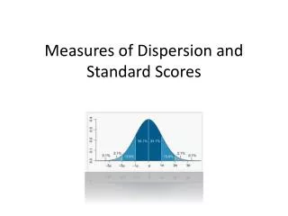
Standard Scores. Comparisons across normal distributions Z -Scores. Overview. Plan for the night Z-scores Definition Calculation Use Graphing Data/Distributions Frequencies/Percentages Charts/Graphs. Last time…. Last week we covered Measures of Central Tendency Mean, Mode, Median

E N D
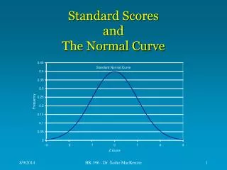
Standard Scores Comparisons across normal distributions Z-Scores
Overview • Plan for the night • Z-scores • Definition • Calculation • Use • Graphing Data/Distributions • Frequencies/Percentages • Charts/Graphs
Last time… • Last week we covered • Measures of Central Tendency • Mean, Mode, Median • Measures of Variability • Range, IQR, SIQR, Standard Deviation • The most commonly used of the above are Mean (SD) • These two measures can be combined to further describe the “position” of a score/datapoint
Is that a good score? • Mean and SD are useful, but sometimes we need to make comparisons between different measures • Example (w/ same units of measure): • SAT vs. ACT vs. GRE • 10-yd dash time vs. 40-yd dash time • Free-throw% vs. FG% vs. 3-Point% • Example (w/different unit of measure): • ERA vs. WHIP • VO2max vs. Vertical Jump • BMI vs. %BodyFat vs. Waist Circumference
Minimal Statistics Describe the “typical” score, the “spread” of scores, and the number of cases • Mean • SD • m Z-scores • Combine the mean w/ SD to create a new unit of measurement (Standardizes Scores) • Clearly identifies a score as above or below the mean AND expresses a score in units of SD • Examples: • z-score = 1.00 (1 SD above mean) • z-score = -2.00 (2 SD below mean)
Z-score = 1.0: GRAPHICALLY 84% of scores smaller than this Z = 1 Recall – 50% of scores are below the mean + 34% of scores between the mean and 1 SD above
Calculating z-scores OR Calculate Z for each of the following situations:
Other features of z-scores • 1) The Mean of a distribution of z-scores = 0 • Recall the mean is the balance point of a distribution, where deviation scores sum to 0 • A z-score of 0 is equivalent to scoring the mean
Here is our normal distribution example from last week X = 70 SD = 10 If a subject scored 70, their z-score would be 0 34.1% 34.1% 13.6% 13.6% 2.3% 2.3% Z = -3 40 50 -2 -1 60 70 0 80 1 2 90 100 3
Other features of z-scores • 1) The Mean of a distribution of z-scores = 0 • Recall the mean is the balance point of a distribution, where deviation scores sum to 0 • A z-score of 0 is equivalent to scoring the mean • 2) The SD of a distribution of z-scores = 1 • Since SD is unit of measurement, when the mean is z=0 then the mean + 1 SD = a z-score of 1
Here is our normal distribution example from last week What is the z-score of a subject that got: 80? 50? 100? X = 70 SD = 10 34.1% 34.1% 13.6% 13.6% 2.3% 2.3% Z = -3 40 -2 50 -1 60 0 70 80 1 2 90 100 3
Other features of z-scores • 1) The Mean of a distribution of z-scores = 0 • Recall the mean is the balance point of a distribution, where deviation scores sum to 0 • A z-score of 0 is equivalent to scoring the mean • 2) The SD of a distribution of z-scores = 1 • Since SD is unit of measurement, when the mean is z=0 then the mean + 1 SD = a z-score of 1 • 3) A z-score distribution is same shape as raw score distribution • Even though you are changing the unit of measurement, this does not change the “look” of the distribution when plotted
Here is our normal distribution example from last week 34% of scores still fall between 0 and 1 z-score X = 70 SD = 10 34.1% 34.1% 13.6% 13.6% 2.3% 2.3% Z = -3 40 -2 50 -1 60 0 70 80 1 2 90 100 3
Z-score Comparison • As stated, z-scores standardize different distributions allowing you to make comparisons regardless of the unit of measure • Bart’s score • SAT Exam 450 (mean 500, SD 100) • Lisa’s score • ACT Exam 24 (mean 18, SD 6) • Who scored higher? Bart: (450 – 500)/100 = - 0.5 Lisa: (24 – 18)/6 = 1
Z-scores & the normal curve • For any z-score, we can calculate the percentage of scores between it and the mean; all scores below it & all above it • Tons of online calculators: • http://www.measuringusability.com/normal_curve.php
Example: Mean BMI and WC in elementary school boys What upper and lower limits include 95% of BMI scores? If one boy’s BMI is 22 kg/m2 and another’s WC is 70 cm, which of the two has the highest adiposity?
Nomenclature/Terminology • Frequency: number of cases or subjects or occurrences in a distribution • Represented with f • i.e. f = 12 for a score of 25 • 12 occurrences of 25 in the sample
Nomenclature/Terminology • Percentage: Number of cases or subjects or occurrences expressed per 100 • Represented with P or % • Ex. f=12 for a score of 25 when n=25 • P = 12/25*100 = 48% (of scores were 25)
Warning • Should report the f when presenting percentages • i.e. 80% of the elementary students came from a family with an income < $25,000 • different interpretation if n=5 compared to n=100 • Reported in literature as • f = 4 (80%) OR • 80% (f = 4) OR • 80% (n = 4)
Numerator Monster Pantagraph reported that State Farm paid out over 1 Billion in dividends to customers in the United States Pantagraph, 6/13/00
Numerator Monster How much do you pay in car insurance every 6 months? So…how much is State Farm keeping?
Frequency Distributions • Graphically displaying the data should ALWAYS come before any type of statistical analysis • Measures of central tendency and variability will give you a feeling for the distribution of the data – but it’s always easier to visually examine it • Check for normality (are data normally distributed?) • Check for outliers (are any subjects sticking out as odd?) • Check of potential associations (might two variables relate to each other?)
Frequency Distribution of Math Test Scores: SPSS Output • 40 items on exam • Most students >34 • skewed (more scores at one end of the scale)
Cumulative frequencies &, Cumulative percentages • Cumulative Percentage: how many subjects atand below a given score? • i.e., 33.3% of students scored a 32 or lower
Eyeball check of data: Intro to (brute force) graphing with SPSS • Stem and Leaf Plot: quick viewing of data distribution • Boxplot: visual representation of many of the descriptive statistics discussed last week • Bar Chart: frequency of all cases • Histogram: malleable bar chart • Scatterplot: displays all cases based on two values of interest (X & Y) • Note: compare to our previous discussion of distributions (normal, positively skewed, etc…)
Stem and Leaf Plots • Fast look at shape of distribution • shows f numerically & graphically • stem is value, leaf is f Frequency Stem & Leaf 2.00 Extremes (=<25.0) 2.00 28 . 00 2.00 29 . 00 1.00 30 . 0 1.00 31 . 0 3.00 32 . 000 1.00 33 . 0 6.00 34 . 000000 3.00 35 . 000 4.00 36 . 0000 8.00 37 . 00000000 Stem width: 1 Each leaf: 1 case
Stem and Leaf Plots • Another way of doing a stemplot • Babe Ruth’s home runs in each of 14 seasons with the NY Yankees • 54, 59, 35, 41, 46, 25, 47, 60, 54, 46, 49, 46, 41, 34, 22 2 25 3 45 4 1166679 5 449 6 0
Stem and Leaf Plots • Back-to-back stem plots allow you to visualize two data sets at the same time • Babe Ruth vs. Roger Maris MarisRuth 0 1 2 25 3 45 4 1166679 5 449 6 0 8 643 863 93 1
Boxplots Maximum Q3 Median Q1 Minimum Note: we can also do side-by-side boxplots for a visual comparison of data sets
Format of Bar Chart Y axis f X axis scores/categories
Format of Histogram (similar to Bar) Y axis f X axis Can be manipulated scores/categories
Scatterplot • Quick way to visualize the data & see trends, patterns, etc… • This plot visually shows the relationship between BMI and WC in a group of elementary school boys
Scatterplot Somebody shook their pedometer for 2 hours a day… • Here’s the relationship between females Steps/day and waist circumference
Scatterplot • Outlier removed • This will impact any statistical tests you run (correlations, regression, etc…)
Take home message • Z-scores: • A simple combination of Mean and SD • Allow comparisons regardless of unit of measurement • Always plot your data first! • Descriptive statistics (like Mean/SD) are generally presented along with graphical representations of the distribution • A histogram (for single variable) and scatterplot (for paired variables) are most commonly used • Check for outliers! Is the value plausible?
Upcoming… • Homework = Cronk 3.5 & all of Chapter 4 • Blackboard description upcoming • We will examine relationships between variables next week • Think about those scatterplots…do statistical relationships exist between those variables? How strong? In what direction? • In-class activity 3…