Download
1 / 18
200 likes | 586 Views
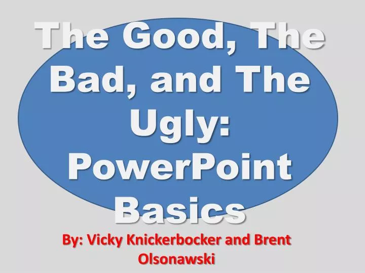
The Good, The Bad, and The Ugly: PowerPoint Basics. By: Vicky Knickerbocker and Brent Olsonawski. Purpose of PowerPoint. To keep audience’s attention Organization Visual Aids Help explain something the presenter cannot Such as diagrams, charts, pictures, etc. GOOD. BAD. UGLY.

E N D
The Good, The Bad, and The Ugly: PowerPoint Basics By: Vicky Knickerbocker and Brent Olsonawski
Purpose of PowerPoint • To keep audience’s attention • Organization • Visual Aids • Help explain something the presenter cannot • Such as diagrams, charts, pictures, etc. GOOD BAD UGLY
Purpose of PowerPoint • So students do not have to take notes in class • So instructors have something to read to class • To entertain students • Demonstrate computer literacy GOOD BAD UGLY
Text • Dark colored text • Large print (28 point or larger) • Common font type (Arial, Times New Roman, etc.) • Avoid slang • Check spelling http://www.imgsrv.worldstart.com/download/spellchck-big.jpg GOOD BAD UGLY
Text • Use fancy-dancy writing styles because it add s character to the presentation • Useavarietyofcolorsoftext =Looks pretty! • The smaller the text, the more you can cram onto the page = Less slides • Evarybudynos how too speelcorectle! GOOD BAD UGLY
Color • Simple, light-colored backgrounds • Avoid colors on opposite positions of color wheel • Remember individuals with colorblindness • Colors reflect mood of presenter • Green = Relaxing • Red and Yellow = Urgent colors • Blue = Sad and Relaxing • Black = Power Color • Preview the color in presentation room GOOD BAD UGLY
Color • Use your favorite colors because it shows your character • Any color will look great in every room for every presentation • Colors add to the excitement • Honestly, how many people are colorblind? GOOD BAD UGLY
Animation • Use consistent transition throughout presentation • Keep transitions short and attention grabbing • Do not use sound bites with transitions • Old text dimmed when new text arrives • Use in moderation GOOD BAD UGLY
Animation • The effects add to the presentation • Students like to be entertained and distracted from boring lectures • Sound bytes are cool! • Little bells, whistles, or horns will keep the students awake. GOOD BAD UGLY
Sources or Citations • Give credit where credit is due • Put little disclaimer at bottom of page • Cite sources used at the end of presentation http://lib1.uwec.edu/TILT/module3/images/citing.GIF GOOD BAD UGLY
Sources or Citations • Who cares? • I put together this PowerPoint, I did all the work. GOOD BAD UGLY
Information Overload • Use the 6 by 6 rule • Six bullets/lines consisting of six words • Only have headings or concepts • Don’t include all of the notes/presentation • Avoid too much animation or pictures • Timing of slides • 1 slide per minute = Too fast! GOOD BAD UGLY
Information Overload • I can cram a lot of information onto one page and that way the students will not have to print off so many copies of these powerpoints and all of my notes will be nice and organized and I won’t have to worry about anything I missed in class because all the notes will be right here in front of me all on one page and plus I don’t have to go to class because of all the notes being here on this one page and I don’t know why the professor is even here because all I do in this class is read the notes from this PowerPoint presentation and copy them down word for word and plus my hand is really starting to hurt because the instructor is soon going to flip to the next slide which will be packed with just as much, if not more information. By the way, what did the last slide say? Oh, well, at least I have a copy of it. GOOD BAD UGLY
Creativity • Hyperlinks can be used to create games • Pictures and animation can be used (Moderation) • Lack of creativity = Boring!!! • Do not use black font with white background GOOD BAD UGLY
Creativity GOOD BAD UGLY
Summary • Purpose : To enhance presentation • Text: Large, dark colored, common font type • Color: Pick colors that are appropriate for setting • Animation: Use in moderation • Sources: Give Credit • Information Overload: Limited and complimentary to presentation • Creativity: Use, but not a distraction
Questions, Comments, Concerns? • Is there a way you can use PowerPoint in your class? • How can it benefit or enhance a presentation? • Does everybody need to use PowerPoint? • What is one way you as a PowerPoint user can change to make your presentations better?
Sources • http://www.wtvi.com/teks/luddites/imgs/powerpoint02.jpg • http://www.imgsrv.worldstart.com/download/spellchck-big.jpg • http://lib1.uwec.edu/TILT/module3/images/citing.GIF • http://www.biblepicturegallery.com/Thumbs/ca/teaching/x_teach/lifestyl/Mr%20Me%20pointing%20to%20himself%20Remember%20me.jpg • http://www.cartoonstock.com/newscartoons/cartoonists/cbo/lowres/cbon2l.jpg • Shriner, Wally and Michael Russell. 2001. Community College Instructors at Mount Hood Community College. Access complete study at http://www.gst-d21.com/TLC/TLCProj.html#S6